It’s been busy, lemme tell you. I do my best to keep up with consistent posting, but sometimes life gets in the way, and you know, I gotta remind myself that that’s okay. This isn’t my job – I have a full time job, as well as doing freelance on the side, so lord, sometimes it gets busy over here. But no matter what, I love nail polish and makeup, and I always love coming back to these posts and this community. So even if it’s a couple days or a week, I’ll always be wearing and buying too much nail polish and I’ll be posting.
But now, it’s a wonderfully stormy night as I’m sitting wrapped up writing this, watching old seasons of America’s Next Top Model, and life is good, y’all. And I’ll stop getting mushy now.
Life is good because Sally Hansen has expanded their Crayola line! Last summer Sally Hansen put out the first collection of the Crayola Insta-Dri polishes. There were 12 colors of bright pops of primary and traditional crayon colors. (You can still find these at stores and on Target’s website – they’re fantastic).
So of course when it was suddenly announced that they were expanding the line with 6 pastels for spring, I had to jump on it immediately.
I picked up these lovely beauties as soon as they showed up on Target’s website. There, they were $3.99 but they seem to be sold out now. But all 6 colors are still available on Ulta’s website for $4.99. (And you might still be able to find these in displays in stores).
So let’s get right into it, shall we? We’ve been waiting long enough for more of these pretty Crayola beauties.
Right away, I have to say my one gripe with these polishes is the brush. It’s a wide paddle brush – which I don’t normally have a problem with. It makes it easy to swipe the color on with one swipe, and for me, cover the entire nail. But it’s the way that it’s cut, that makes it harder when it gets to my cuticles.
I have rounded out nail beds, so the way this is cut with a squared off edge, caused me to get polish everywhere as I was trying to round out along that cuticle line. So it’s a little awkward to manuever. If you have squared off nails, you’ll love this. For me, I’ll have to see if I can trim and make it a little more friendly for my nails. Definitely something to judge based on your own nail shape and width.
Now onto the colors!
514 – ‘Sky Blue’ is a lovely, well, sky blue. What more can I say to describe the color? It’s a lovely, sunny, clear blue skies as far as the eye can see color.
I did thinner coats with these, so I found they had mostly all the same formulas. You could get it opaque in 1 thicker coat, however, I did prefer thinner coats. Especially with the wider brushes, I found with less polish on the brush, I made (a little) less of a mess.

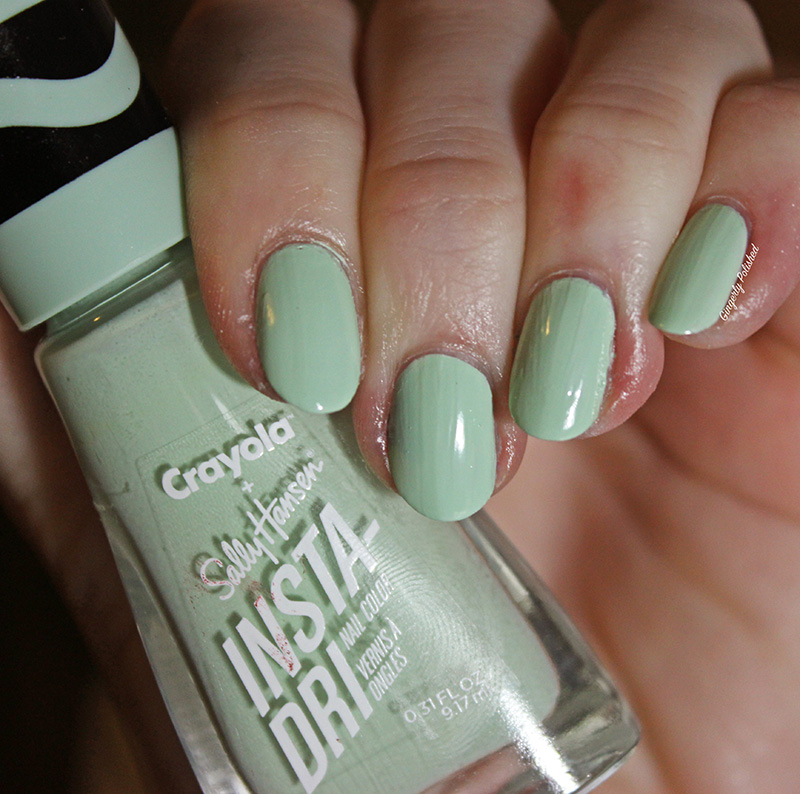
515 – ‘Sea Green’ is a light pastel green. This is a cool-toned green shade. This one seemed to have a little thinner formula than the others, so it just dripped down the brush a little more. It also seemed to dry faster than the others, so if you did have to do more coats it wasn’t an issue.
This was pretty well good on 2 coats, although it can get some uneven patches if you manipulate it too much – but 3 coats isn’t too bad to do if you have to.

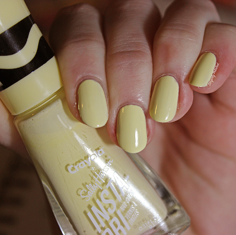
516 – ‘Canary’ is a of course, light canary yellow. This was another with a thinner formula, so it’ll just run down the brush a little more. This was good on a 2nd thicker coat on some nails – but some needed a 3rd. Unlike ‘Sea Green’ up above, this didn’t dry as fast, so the 3 thinner coats can be a little work but it’s pretty normal for such a light yellow. The overall finished product is so smooth and leveled on the nail that those 3 coats almost seem to breeze by.

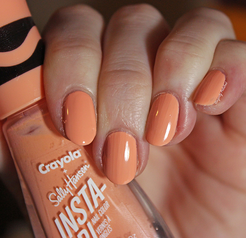
517 – ‘Melon’ is a light, cool-toned orange pastel. Like a cantaloupe.
After the first coat, I could tell it definitely needed a 2nd, but that 2nd coat was easy and made it completely opaque. Make sure you have enough on the brush when doing the 2nd coat, or it can skip and be a little uneven. But overall, it was a nice easy formula for a beautiful pastel.

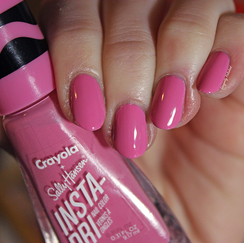
518 – ‘Cotton Candy’ is a bright punchy pink cream. This was another with a little smoother formula. I found this one didn’t apply as smoothly as the other, and when I used a thicker coat, the polish would almost “pool” at the bottom of the nails and dry unevenly. I did find it applied better on itself with the 2nd coat.
It was pretty well good on 2, but on some nails there were some uneven patches that needed a 3rd to finish it off.

Last but not least is 519 – ‘Wisteria’. This is a light pink shade with the slightest touch of purple to it. It’s such a soft, beautiful shade, and that little touch of purple keeping it unique amongst my other baby pinks.
This formula was so smooth, and with the wide brush applied like a dream. You will need 2 coats to even out such a light color, but it was a super easy 2 coats.

Overall, these aren’t the one coat wonders of the original 12 Crayola colors. If you’re expecting that, you will be a little disappointed when you have to do 2, and sometimes 3. But, these are lighter colors, so often the more white based polishes will have a little thinner formula.
I will say that the formulas do feel a little thinner than the last batch. Maybe it’s the color, maybe it’s the collection that just fell a little flatter. Either way, you’ll have to work a *tiny bit harder than the original ones.
Now, comparing them all on their own as polishes. I did like these! Even though they might take a few more coats, they’re Insta-Dri, so they dry fast in between coats, so it’s not difficult when you have to do 3. I do think they’re good pastel colors if you’ve been looking to add to your collection. They didn’t blow me away with formulas, but they weren’t terrible by any means! (Except those brushes, I still got beef with them personally).
I have to just collect every single Crayola polish. I just love them, don’t listen to me, I’ll tell you that you have to buy them.
Of course, immediately after I review the spring polishes it’s been announced they’re doing another 6 for summer called ‘School’s Out’. At this rate I’ll be filling a drawer with these striped caps and you know, I ain’t mad about that. So be sure to look out for that!
Summer collection reviews are on their way! Stay tuned for lots more posts coming soon!

I saw a display of these but I don’t wear these types of pastels often. I’m surprised how vibrant that blue is though.
I’m still bummed that I missed out on the original colours – they were so fun and the formulas sound perfect. Maybe they’ll release some similar colours in the Fall.
LikeLike