It’s finally getting chilly here in Chicago, and I’ve been loving it as it just feels so cozy all around. I’m typing up this post with my little slippers on, wrapped in a blanket, and I’ll do my best to remember this loving feeling when we’re deep into the months of winter. It’s also clearly the perfect setting to finish posting about a summer collection.
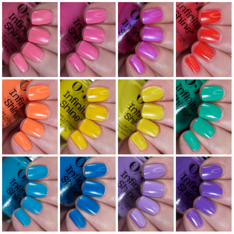
This is the OPI ‘Trip to the Brite Side’ collection for Summer 2026, and in this post we’re looking at the 12 Infinite Shine shades. I reviewed the lacquer half here, and I’ll be comparing individual shades from that set (and I pulled in some of the spring release as well) to different polishes in this Infinite Shine post. OPI describes this set as 12 vibrant, vacay-ready summer brights, and listen there are vacations in November, you could still be jetsetting away with your neon pinks. We won’t be stopping you from wearing bright polish at any point of the year.
At this point I have my set spiel about the Infinite Shine formula, so I’ll just be copying and pasting the same little description for the Infinite Shine formula that I have in my previous posts about this line!! No need to change it up, it’s all the same important information and thoughts I always have. “The Infinite Shine shades are the ones with the silver caps instead of black, and they run a few dollars more per shade than the regular lacquer. They’re more expensive as OPI claims they’re a long lasting formula that can deliver up to 11 days of “gel-like” wear. These are not gel shades, just gel-like. (If it’s a true gel formula, it’ll be in an opaque bottle as light can cure it). As always, I swatch so often that I can’t fully speak to the longevity. So I’ll be reviewing these shades by color and application, and from there you can make a purchasing decision! In the end you decide what to do with your own money!”: I also felt like this could have affected some formulas so I’ll also go more in depth my thoughts on that for any individual shades.
These are still available from Beyond Polish (code GingerlyPolished gets you 10% off when shopping at Beyond Polish, it is affiliated so I would earn a little money if you do, no pressure at all!). Now we’ve waited long enough, let’s get into the swatches!
***
OPI has decided that summer is the season of pink this year, so we’re starting out with 3 pinks again. ‘Lei Out in the Sun’ starts it all off and is a very bright, almost neon warm corally-pink shade. It has some definite orange tones to it.
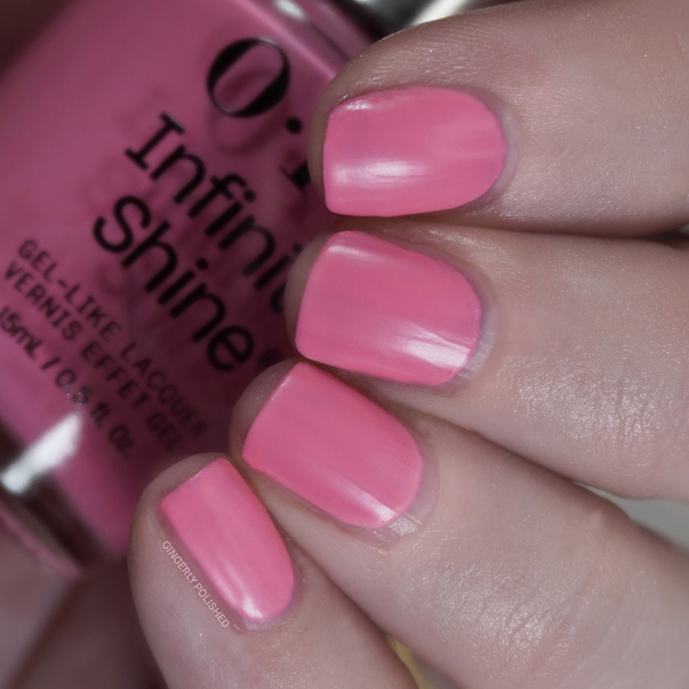
Because of that more neon finish, I did find this to have a thinner formula. It’s very streaky on that first coat, and can build up well with a thicker 2nd. I did still have some patches after 2 so I added a 3rd coat. Overall I do recommend thicker coats with this one, as less paint on the brush can cause it to drag and add patches on the nails. I’ve had better neon formulas from other brands, so this one is just fine.
As mentioned I like to post any shades from either the lacquer release (or previous sets) that I find similar so you can make a quick side by side comparison. To start I have the two neon cream pinks from each half. ‘Go With the Floatie’ from the lacquer half is cooler in tone, and the orange tones of ‘Let Out in the Sun’ really pop when compared next to it. This one isn’t as close of a comparison as a later one, but I still wanted to include it to show the difference in undertones.
***
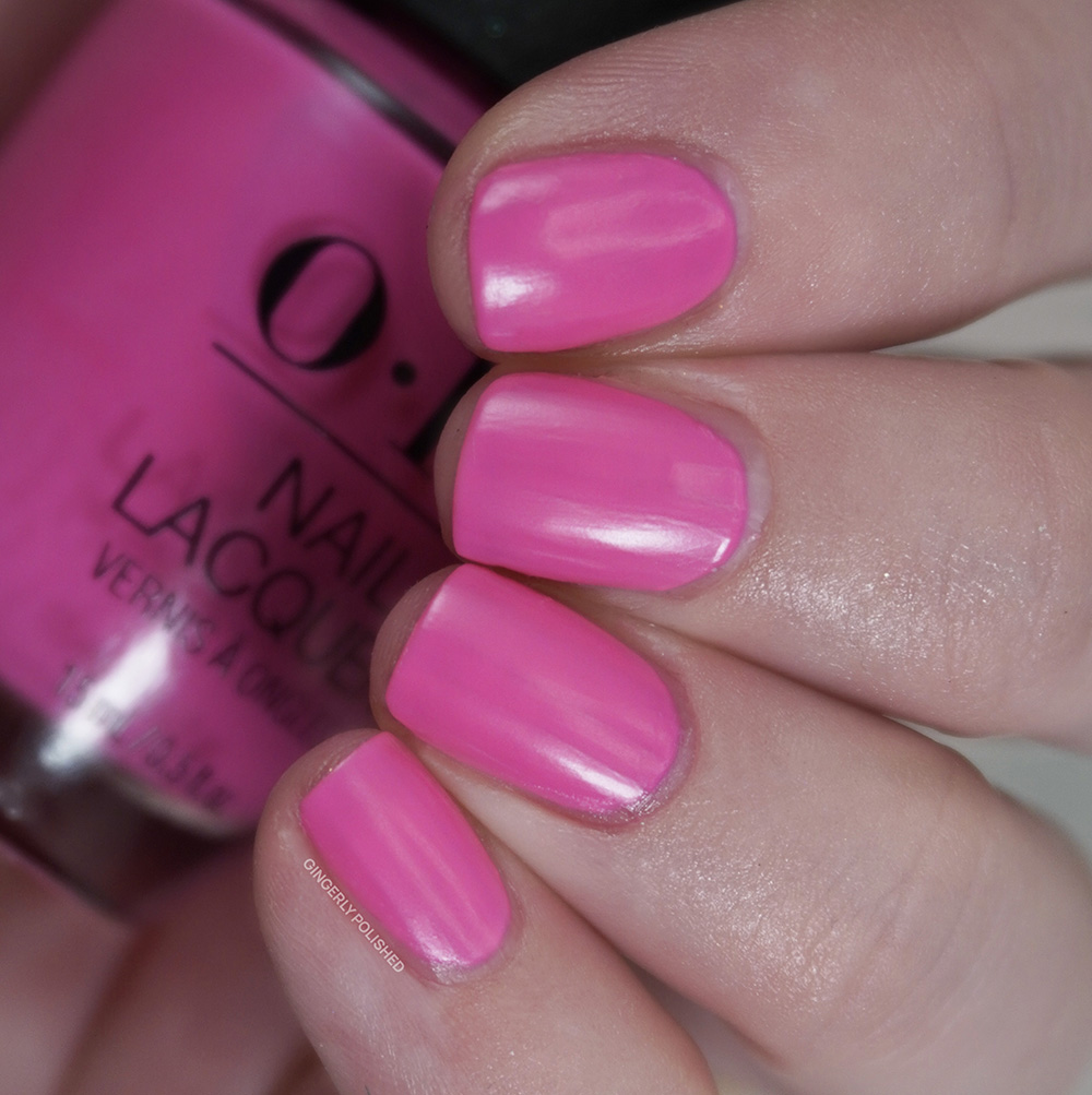
Our next pink is ‘Beat Goes Neon and On’ and it’s slightly cooler so we’re hitting both sides of a neon pink. This one is much more blue-purple leaning, especially when you look at the two pinks together. (In a 12 piece collection, do we need both, maybe not, but they clearly were in such a pink mood).
This has a similar formula to the shade above, being a touch more of a neon finish. I find that if you’re able to float on thicker coats on you’ll get a smoother finish, as the more you brush it on the more streaks you’ll add in. I had that issue with my 2nd coat so I did add a 3rd thicker one to further cover it and make it opaque. Again, not the most impressive neon formula I’ve ever used, so it’s just fine.
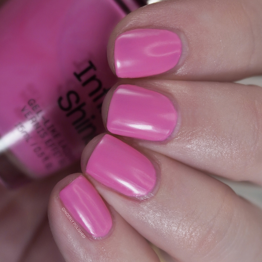
This next comparison is a much more similar set of pinks here. These are very close, and while I guess most people are not buying all shades from both the Infinite Shine and lacquer releases, it feels redundant to have both in one collection release. Especially because it was so pink heavy overall between the 24 shades. ‘Go With the Floatie’ is a touch more vibrant and warm, but these are close sister shades for sure.
***
We’ve got one more pink here, but this one does at least switch it up. This is ‘Brighter Daze Ahead’ and it features one of my favorite finishes aka a glowing little microshimmer. This is a warmer toned jelly pink base filled with a bright cool blue shimmer. That shimmer shifts the entire undertone to a cooler look overall, and I can see myself wearing this even outside of the summer season.
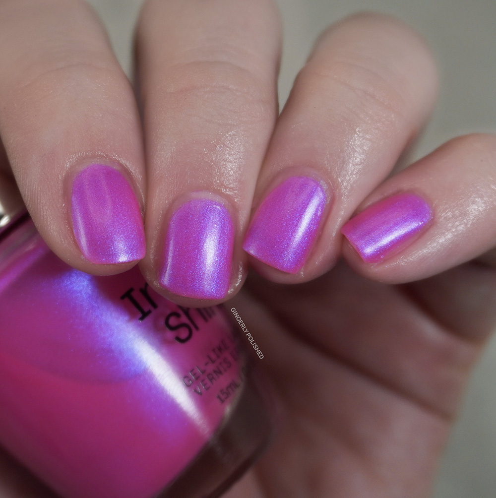
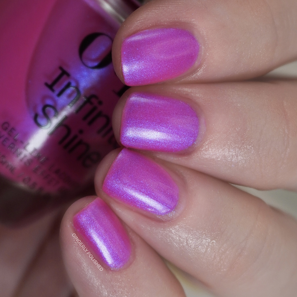
This one has a lovely formula as well. It’s a touch sheer yet smooth on the first coat, with a 2nd coat building up that color and shimmer. I did choose to add a 3rd coat as the base color continued to build even more and it was just a stunning finish overall.
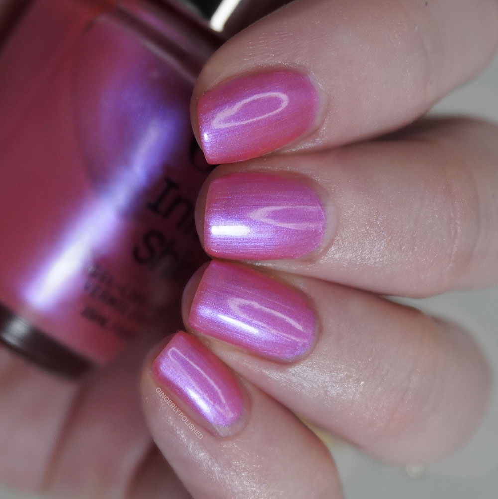
We didn’t have any sort of shimmer like this in the lacquer half, but I was curious to compare it to a shade from the Spring Infinite Shine release. ‘Good Nighty Aphrodite’ is similar, but ‘Brighter Daze Ahead’ takes that polish and amps up the color and shimmer.
***
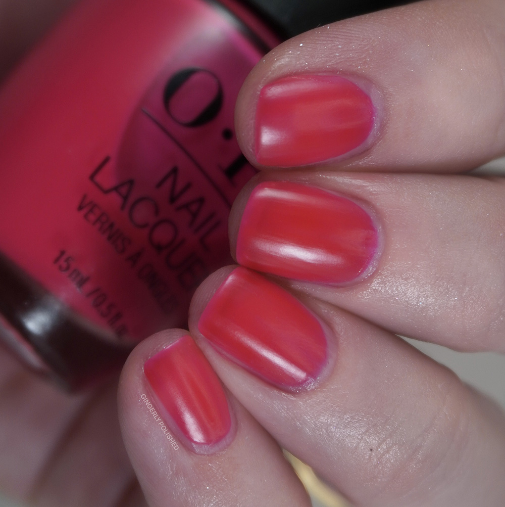
Alright we finally get out of the pinks and on into RED. This is ‘Pack a Cherry-On Bag’ and listen, I was tickled by that name, as I love a pun. This is of course a bright warm toned cherry red jelly shade (though usually I would describe this as tomato red. But I guess a maraschino cherry red also works). It’s definitely got those orange tones.
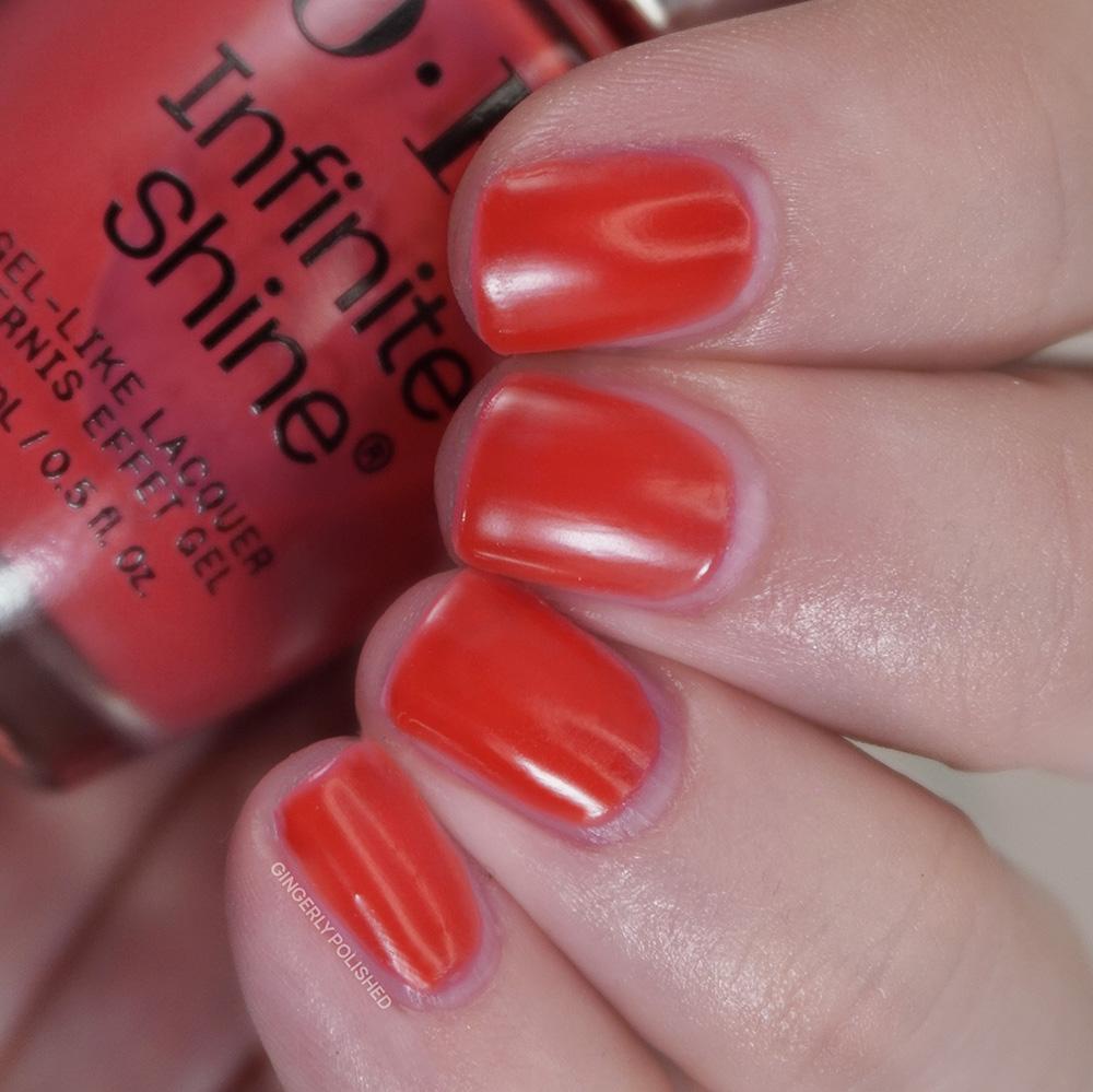
This is more of a squishy jelly, so it’ is a touch more sheer while being very even and pigmented in color. A 2nd coat builds it up well and it’s basically opaque and rich on the nails. It does dry more matte on the nails, which I’m guessing can be attributed to that that almost neon pigment within it. But it’s a gorgeous formula and a top coat will bring that shine right back.
Of course I’ll be showing you the two reds together from both halves. Interestingly, they’re both jelly finishes so you most likely won’t need both. So this is definitely an instance of pick the undertone that works best for you. ‘Bright Where You Belong’ from the lacquer formula is cooler and more blue toned, while ‘Pack a Cherry-On Bag’ will hit if you’re looking for those more orange tones.
***
‘You’re One in a Melon’ is the orange of the set and it’s a bright somewhat peachy orange cream shade. It’s very creamsicle orange with a lot of white pigment within.
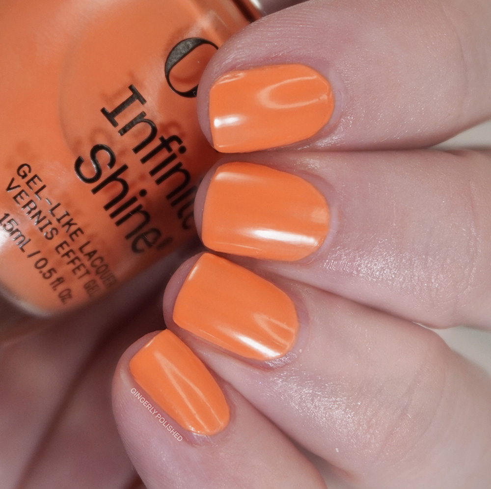
Because of that more white-based color I did find this one to be more streaky and uneven especially on the 1st coat. It built up well with a 2nd thicker coat but I did choose to add one more coat to even out any little patches. This is another one to float on as much as you can, as swiping more can pull polish off and make it more patchy. It’s a touch more finicky than other shades I have, so another that I’ll put in the “just fine” category. With all of my swatches I’m swatching on a very ridged nail, so it’s only how the formula applies on my specific nails. If you have smoother nails, you could have a much easier time with a lot of these polishes.
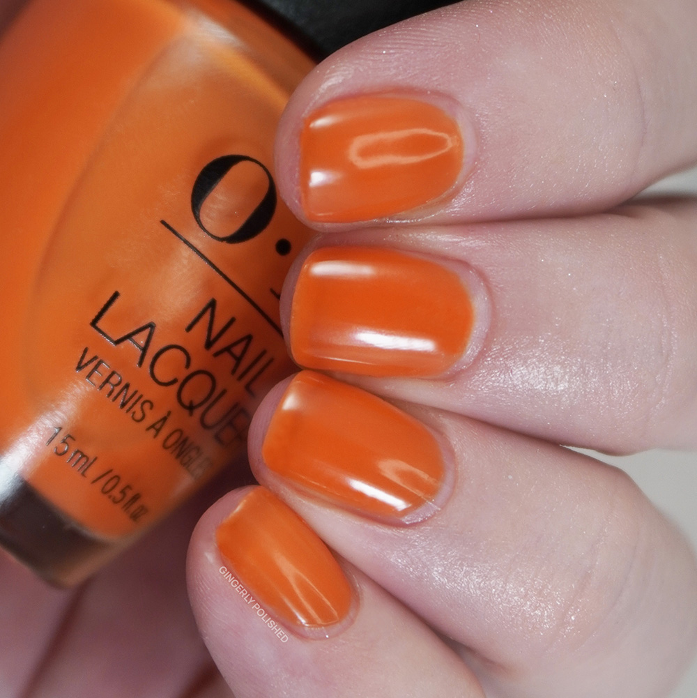
Luckily the two oranges of the collections are much more different and will give 2 very separate vibes. ‘Your Zestination Awaits’ from the lacquer collection is a bright, saturated jelly formula, while ‘You’re One in a Melon’ is a more pastel cream. I did prefer the formula of ‘Zestination’ but with as I said smoother nails you might have more luck with ‘Melon’.
***
We continue right on into yellow with this next shade, ‘Sunkissed and Tell’. This is an interesting yellow shade, as when you first apply it, it looks much cooler and more butter yellow but then fully dries to much warmer and more mustard-y color. Maybe not the most flattering shade for everyone, but I always like when OPI takes a swing.
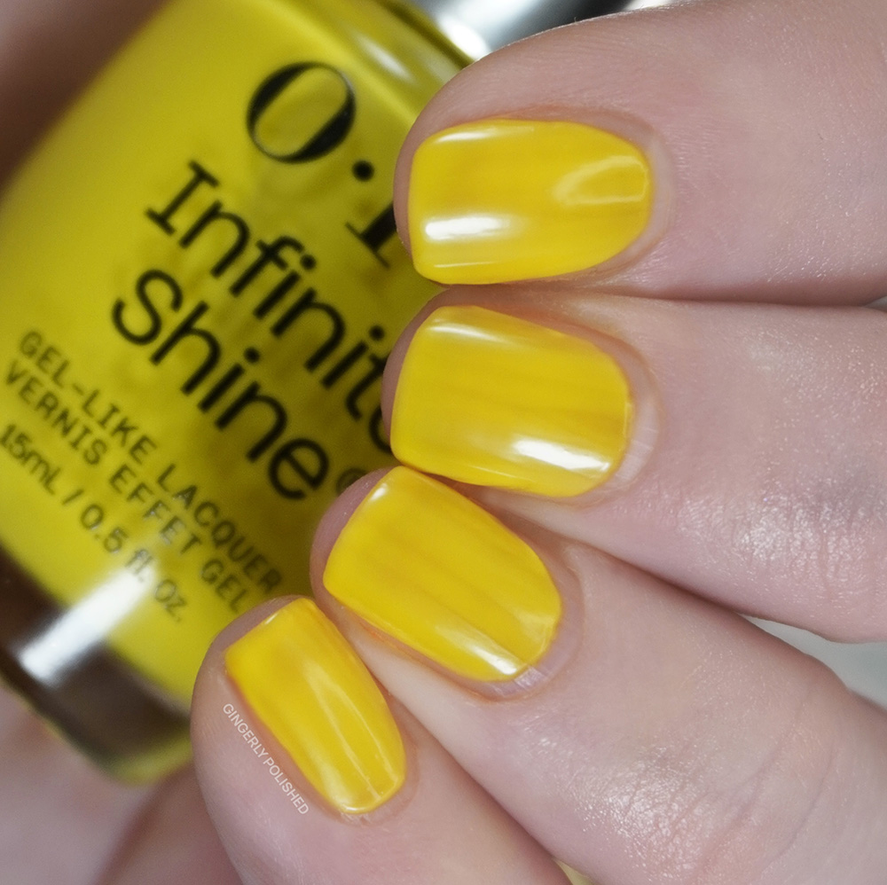
I always love a weird color, so I did wish I liked this formula more. You can see in this swatch video I was struggling to get it smooth and even overall. Even after 3 coats I had a lot of patches and it dried unevenly and it just doesn’t look quite right on the nails which is A TRAGEDY! In the video you can also really see the color change between the dried coats and the new applied polish as well.
***
Our other yellow of the set is ‘Limon-Yello!’. This one is a much more cooler toned, butter yellow base filled with a gorgeous champagne shimmer. This one feels more approachable with the tone and softness on the nails.
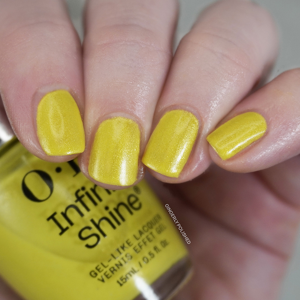
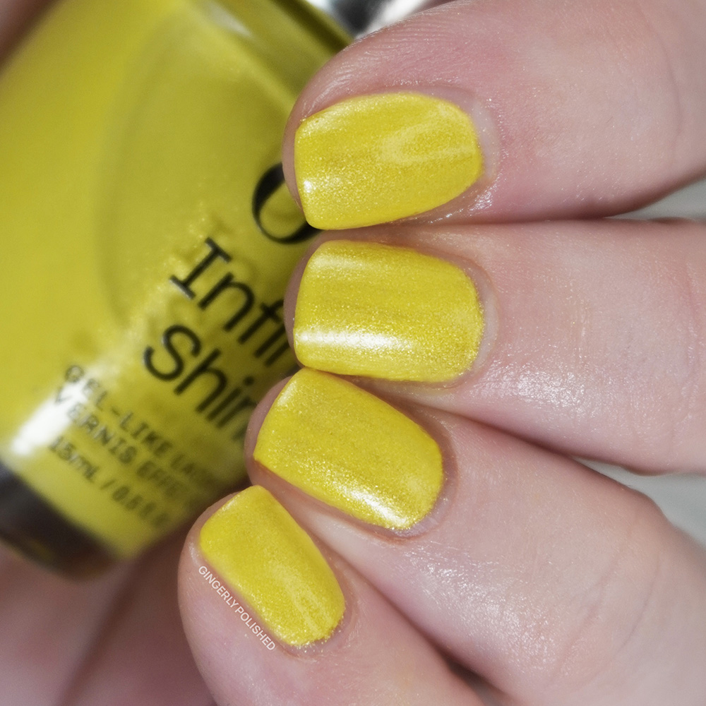
This one was definitely more streaky on the first coat, which I can often expect with any sort of yellow shade. It does build up well with a 2nd thicker coat. I had a few patches still so I did add a 3rd coat. After that it still wasn’t perfectly even, but it could be a shade I’m more willing to work for as it’s more unique in my collection. Which can be said for any of these, it all depends on your preferences.
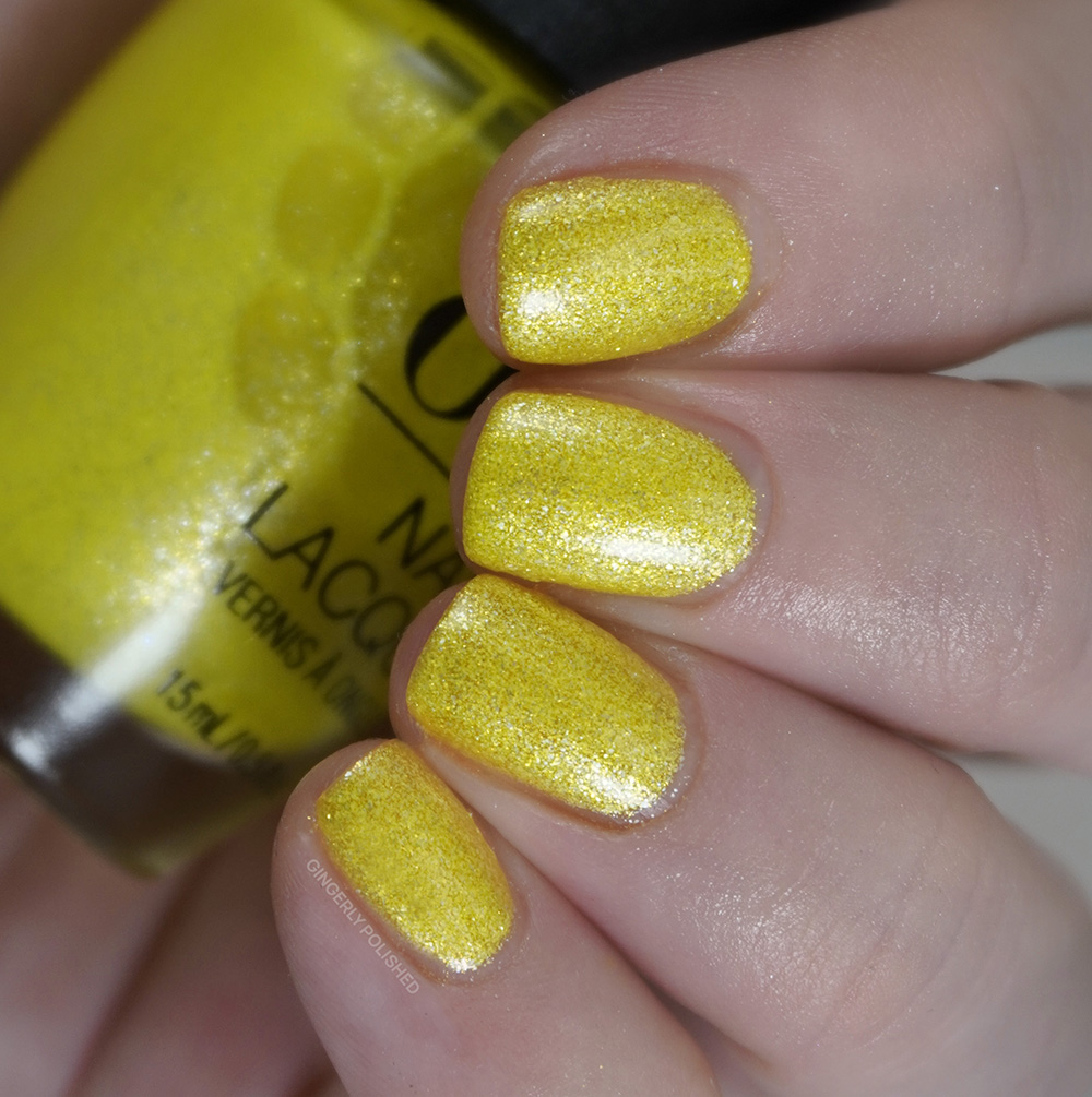
We have a shimmery yellow in each of the sets, so of course we must compare them. They’re in the same family but I would call these more cousins than siblings. ‘Paintin’ on Sunshine’ has larger shimmer all throughout that’s more of a silver. ‘Limon-Yello!’ has a smoother and finer finish.
***
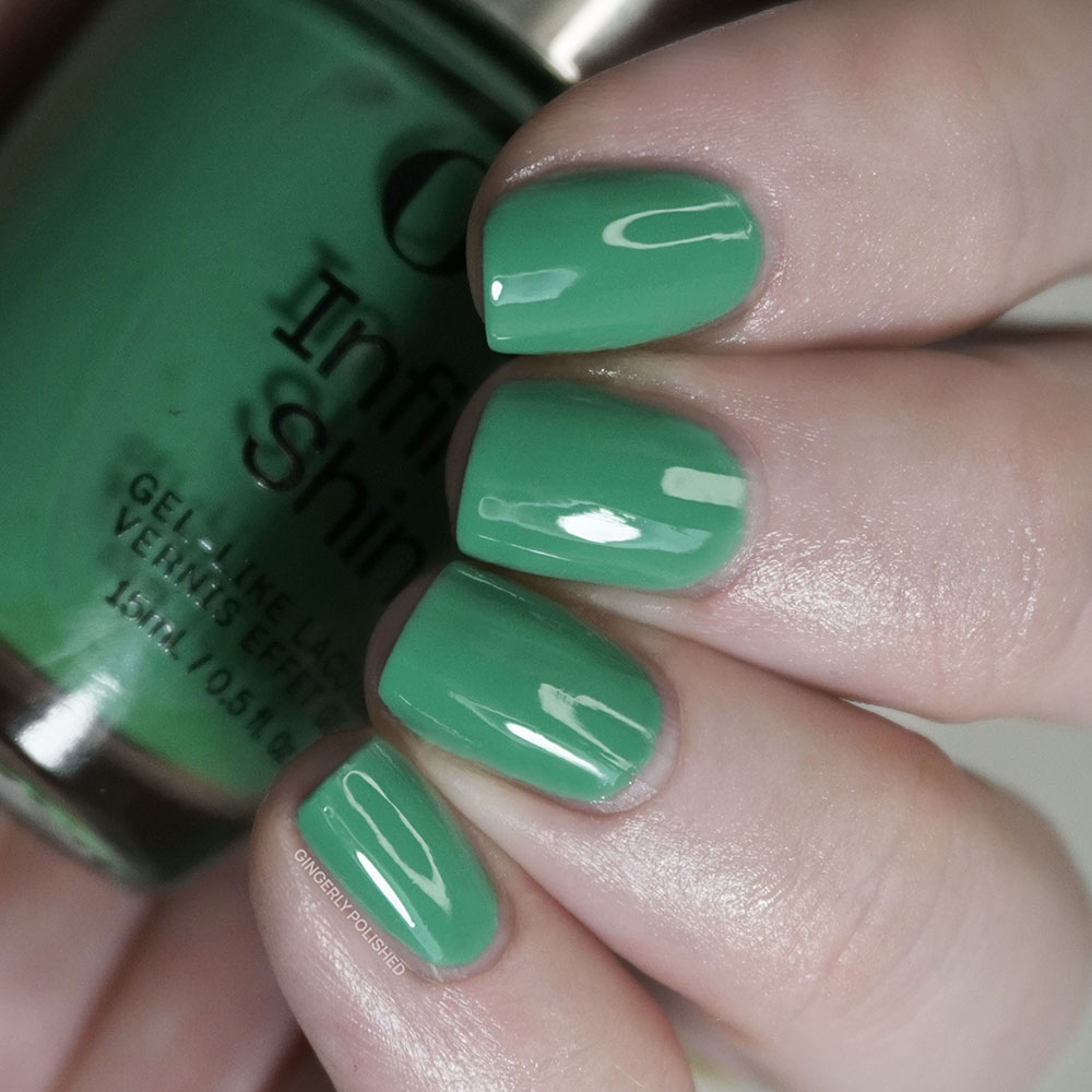
‘Follow the Ice Green Truck’ has my heart by both mentioning ice cream and by color. I was so surprised my camera cooperated with this one, as normally it hates to pick up turquoises correctly. This is a GORGEOUS bright, perfectly-turquoise turquoise shade. It’s got the greens, it’s got the blues, it’s nestled right in between both.
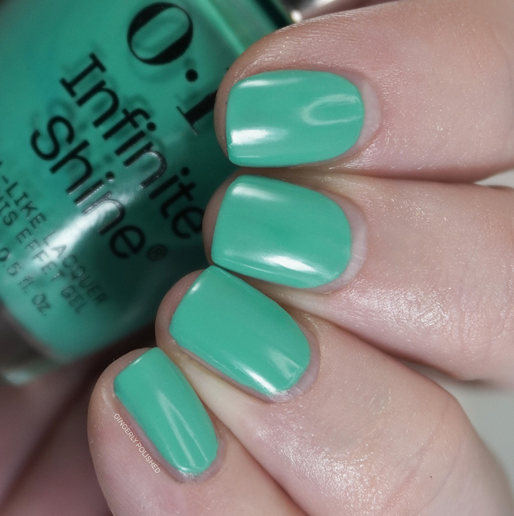
And luckily this has a nice little formula overall! It’s a touch more sheer and streaky on the first coat, but really builds up and is pretty well opaque with a 2nd thicker coat. Depending on application, you might want a 3rd coat, and it can’t hurt to touch up any last streaks. It dries smooth and bright on the nails and this one just might be my favorite of the whole set.
I didn’t notice any close colors in the lacquer set, so I pulled a swatch from the Infinite Shine Spring collection that I was interested in. On it’s own I swore ‘Big Apple Green’ had cooler, more minty tones to it, but those disappear and it looks even more green next to ‘Follow the Ice Green Truck’. COLOR THEORY.
***
We’re moving right along with ROY G BIV and starting on into the BIV with the blues. ‘Beach Party Teal Dawn’ is an interestingly named shade, as I really wasn’t noticing any sort of teal here. This one is a very cool toned medium blue cream and maybe it does have a tiny touch of green to it compared to other blues but it just feels like a nice saturated blue to me.
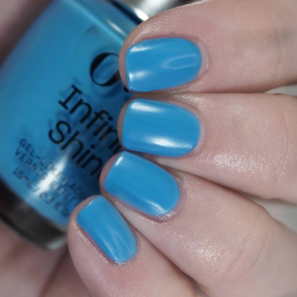
This has another more squishy cream formula. It builds up well, but you can see I did end up adding a 3rd coat to cover any last patches. The final look is fully opaque and pigmented, but like ‘Follow the Ice Green Truck’ above, it takes 1-2 more coats than “traditional” cream formulas and that’s where I wonder if it’s because of the Infinite Shine claims and ingredients.
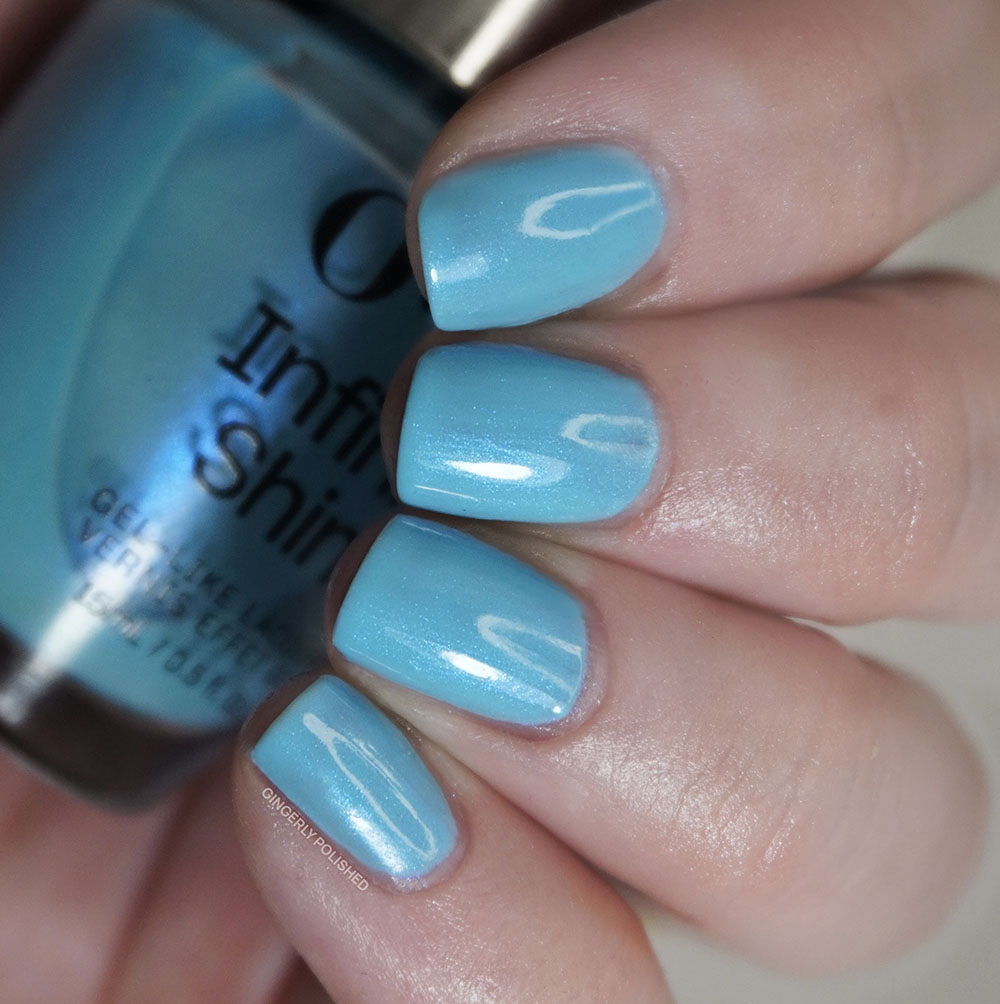
The closest blue comparison I pulled was for a shade from the Spring Infinite Shine collection and even then they’re still pretty different.
***
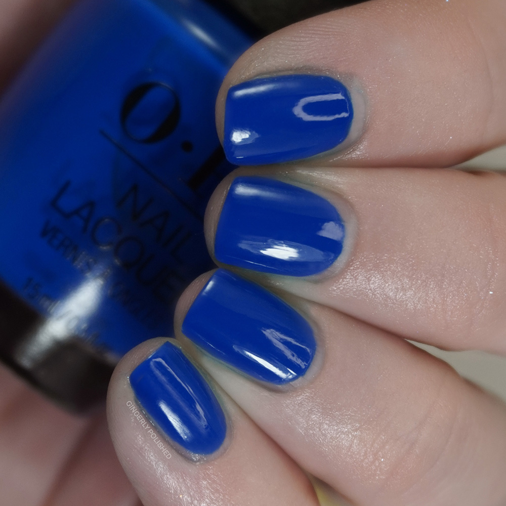
Now after my trauma of swatching ‘Seaze the Day’, a deeper blue from the lacquer set (see my stained fingers in that post) I’ll admit I was nervous with this next Infinite Shine shade. I’m now wary of any sort of deeper blue polish. But I’m happy to report I had ‘No Summer Blues’ while putting this shade on – do you see what I did, that’s the polish name too.
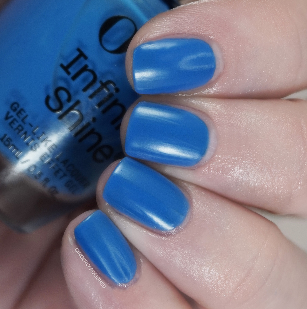
Again it’s one of those cream formulas that seems to have more squish to it and I find this situation a lot with the Infinite Shine creams. It’s incredibly uneven on the first coat, but a 2nd comes in and builds it up well. Once again, I chose to add a 3rd to cover any last patches. I did find this drying more satin overall, maybe because of the brighter pigments? I like guessing as if I’m some sort of cosmetic chemist.
I’m comparing it to the CULPRIT from the lacquer collection, the one who gave me the trauma, and they’re very different in tone and VERY different in removal (thank God). I had no issues with any sort of staining with ‘No Summer Blues’.
***
We finish out this collection with a duo of purples. First we begin with ‘Learn to Fly-lac’ and it’s a pretty accurate name, being a soft medium purple shade with more pink tones to it.
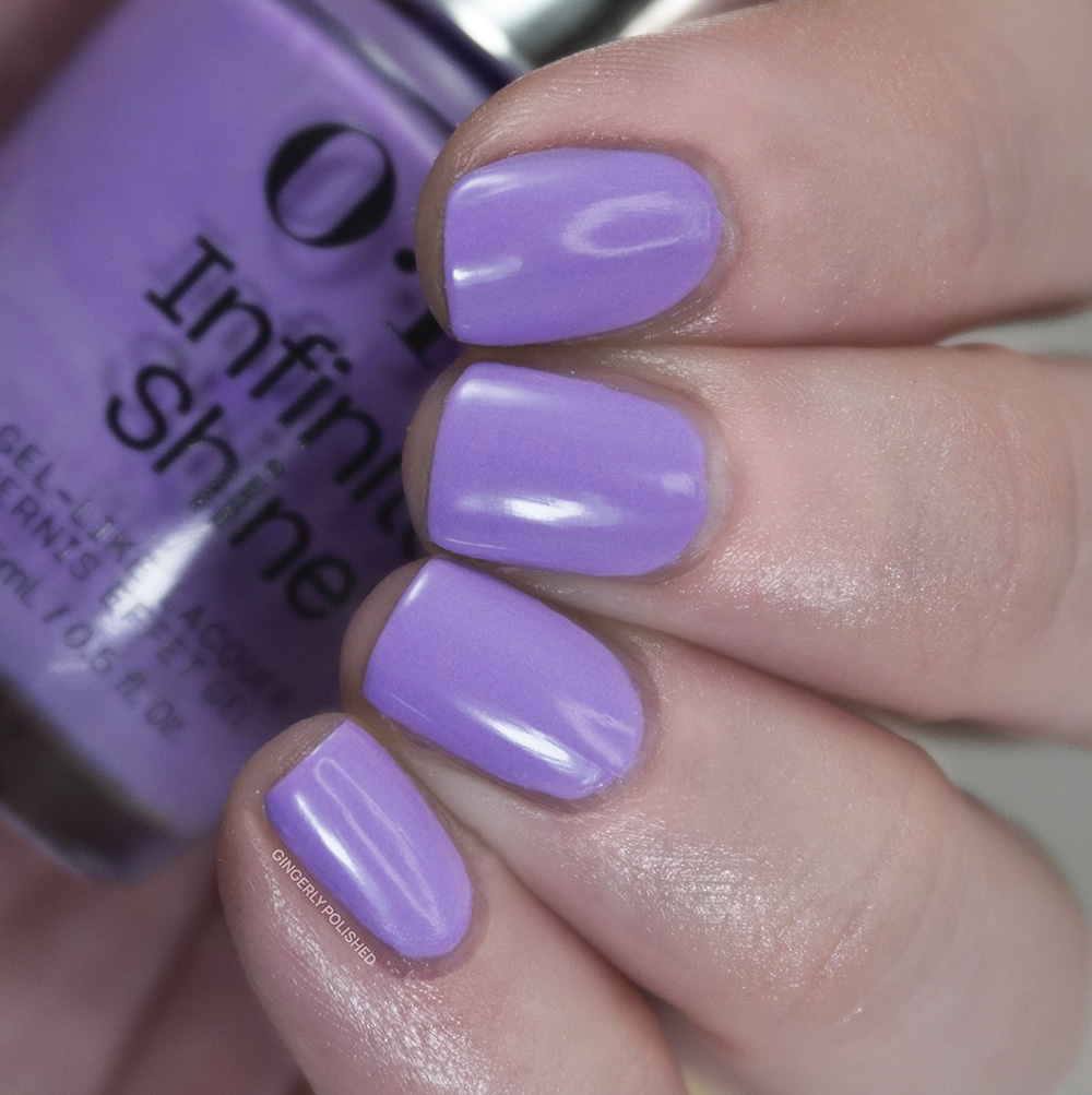
This is very similar in formula to the previous creams, being more streaky on the first coat. But I did find this one to be a touch more pigmented and opaque and pretty well good with just 2 coats. I did manage to pull some polish from the bottom of the nail with application, so I added a 3rd coat to cover that up and fully smooth everything out.
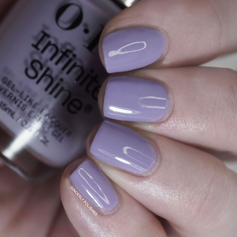
And OPI loves a reference to lilacs for a shade name. I didn’t find this close to either of the purples in the lacquer set, so I pulled in ‘What’s Not to Lie-Lac?’ from Spring which is more similar in tone and in name. ‘Learn to Fly-Lac’ is much more saturated and pink toned than the other, but if you’re looking for a softer, more muted moment ‘What’s Not to Lie-lac?’ will be more your vibe.
***
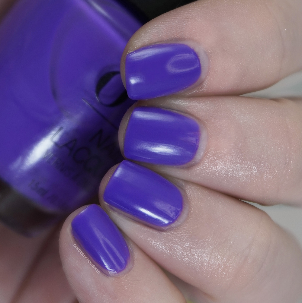
Last but certainly not least we round it all out with ‘Here Plums the Sun’. This is a bright, almost neon purple cream shade. It’s very warm toned, and you can definitely feel the more pink tones to it.
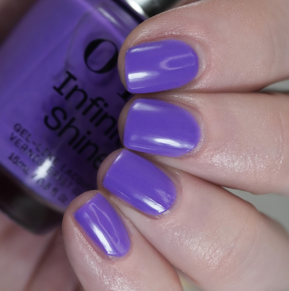
This one feels more intentionally squishy on the nails, almost being a more pigmented jelly formula. It’s a sheer 1st coat, but a 2nd coat comes in and builds it up well. I chose to add a 3rd coat to further build up the color and make it pop even more.
And we finish out with the two purples from the two halves. These were both more jelly formulas, but ‘Glowin’ on Vacay’ is deeper and almost more blue toned.
***
And that’s the set! I’ll be honest I think I found a lot of these formulas to just be ‘okay’. Many required 3 coats and were just more streaky and uneven than I would like. There are times that I think maybe it’s because of the Infinite Shine claims. Also one of those claims is about shine and not needing a top coat and I found a lot of these shades dried with a more satin finish. So what am I working harder for? I’ve been swatching for 10 years and have other shades like these that I like more so a lot are a pass, especially when it’s coming at a higher price.
Pulling some favorites out of the bunch though, I would choose ‘Brighter Daze Ahead’, ‘Pack a Cherry-On Bag’, ‘Limon-Yello!’, and of course ‘Follow the Ice Green Truck’. If you’re finding other specific colors grabbing your attention, the formulas aren’t bad, but maybe you can find a similar one for cheaper! I’m just here to be honest!
What do you think about this set?
********
Upcoming Posts
OPI Most Requested Fall 2026 • Holo Taco 7th Anniversary Jackpot collection • Mooncat x Death Note collection • Holo Taco Spice Rack collection • Wet N Wild Fantasy Makers Aliens Attack collection
********
Follow me!
Instagram: @GingerlyPolished
Pinterest: @GingerlyPolished
Beyond Polish: GINGERLYPOLISHED for 10% off (affiliate code/link)

