Look at this! It’s a spring post! That’s right, I’m finally getting spring posts up. (Even though it’s holding out at a solid 40 degrees here but you know). I had a lovely weekend home for Easter, and rode back on the train today. Am the only one just grossly fascinated with trains? I ride them every day and they still fill me full of wonder.
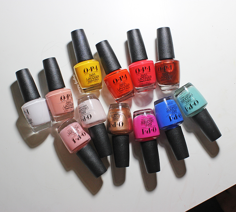
Enough trains. This is a beauty blog (but there’s beauty in trains, right?) and we have a collection to talk about! Today I have the OPI ‘Lisbon’ collection, based off the lovely town in Portugal. I haven’t been there yet, but it’s definitely on my list.
This is mainly full of bright and rich creams and some shimmer. I have the 12 core shades, as well as the 3 Sally Beauty Exclusive shades at the end. There’s a lot of bottles and a lot of nails to get through, so let’s get right into it!
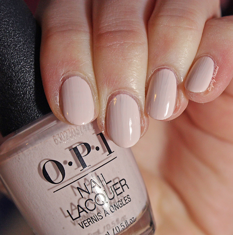
Up first, we have the lightest shade of the group. This is ‘Suzi Chases Portu-geese’, a white with just a few drops of a rosy pink to it. It’s not quite a stark white, and it’s got a warmth and softness to it. It has a pretty streaky first coat, which is honestly pretty standard for these light white shades. I found it could be pretty well opaque with a 2nd thicker coat. I have pretty ridgey nails, so I did need a thin 3rd coat to cover up any last ridges on some nails.
I do love me a good off white shade. There’s just something about a color so light on the nails, and the drop of the rosiness just helps it from being so soft.

Hey look at that hand position! Can you tell I’m trying to switch it up? Maybe more will be like this at some point, who knows.
Anyways, this is ‘Lisbon Wants Moor OPI’, a soft blush shade. This had a good first coat. There were still some uneven streaks, and they were pretty well solved with 2. If you manipulate it too much on the nails, or if you have some ridges like me, you might need a 3rd thin coat to cover things up.
This is a lovely light spring shade, a good palette cleanser.

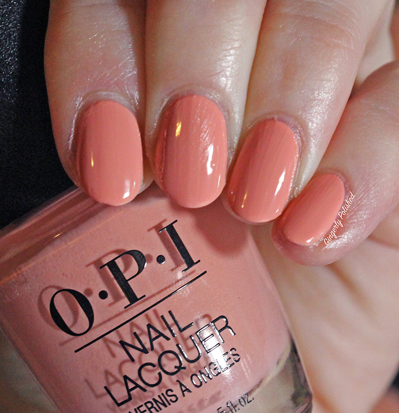
(Ignore my lil smudgy smudgy on that middle nail, after all this swatching and I still heck it up). This is ‘Tagus in That Selfie!’, a more peachy toned pink shade. This one had a good 1st coat – still a few streaks to cover up. This was good on an easy 2 coats for me. Again, another that you don’t want to manipulate too much. You just want to lay it on the nail, and leave it, or you’ll end up with some streaks that might need another coat.

‘You’ve Got Nata on Me!’ is a lovely peachy color. This had pretty much the same formula as ‘Tagus in that Selfie!’ up above. An easy 2 coats – you might need more if you manipulate and play with the coats too much.
‘No Turning Back from Pink Street’ is a bright fuchsia pink. This had a stunning, pigmented formula. It could be opaque in 1 thicker coat. I had some ridges still, so I used an easy 2 coats. It was super smooth, and beautiful to apply.
This is the bright shade I need to make it through this constant 40 degree stint we seem to be eternally in over here.

‘We Seafood and Eat It’ (why do I relate to this title so much) is a bright more coral red shade. This had an absolutely fantastic formula and was pretty well opaque in 1 coat (I used 2 here which is just standard). It’s so bright and pops off the nails.
Does this make me look tan?

‘A Red-vival City’ is bright more orange-toned red. A solid tomato red really. This was another fantastic formula and was pretty well opaque in 1 coat. Depending on your own nails, I had some ridges and nail line showing, so I did an easy 2nd coat.

Overall stunning, and this will transition easily into summer as well.

‘Sun, Sea, and Sand in My Pants’ (I also unfortunately really relate to this as well…) is a bright sunflower yellow shade. I love that OPI is trying out more yellows in collections. That’s right, perfect the yellow formula, gimme more yellows.
This had a pretty good formula for being a yellow. It had a streaky first coat, but pretty good coverage. It’s pretty good in 2 coats, and if you’re not looking for perfection or worrying too much, you’ll be set. I had some ridges that I covered with one last thin coat. It’s definitely good in 3 coats, which is pretty good and standard for a yellow.

They’re smooth, easy coats, and you know, I’ll put them up for a bright color like this. It’s like sunshine on the nails.

‘Closer Than You Belem’ is that minty blue shade that we’ve seen a million of recently, and the same color I just can’t get enough of. This one has some dustiness to it that the others don’t and I love the drop of teal to it to keep it a little more unique.
This formula did not disappoint, and she was beautiful. I was in love while applying, and understood everyone’s great love. It was pretty well opaque in 1 easy coat – I covered any of my remaining ridges with a 2nd, and she was so easy to control. She’s a beauty.

ANOTHER COBALT BLUE. There’s been so many lately. And I’ll keep buying them forever. It’s a sickness really.
This is ‘Tile Art to Warm Your Heart’, and as I said, she’s a cobalt blue. We’ve seen so many of these before. This one surprised me and it was a little more jelly and sheer than I was expecting. Based on all of the previous formulas, I wanted an opaque 1 coat wonder from this thing. But I definitely needed two coats. A lil well meh, compared to all of the other blues I’ve seen recently. Am I just holding the bar too high?
At least this wasn’t a messy removal either – no blue fingers.

Those are all the creams, now onto the 2 shimmers!
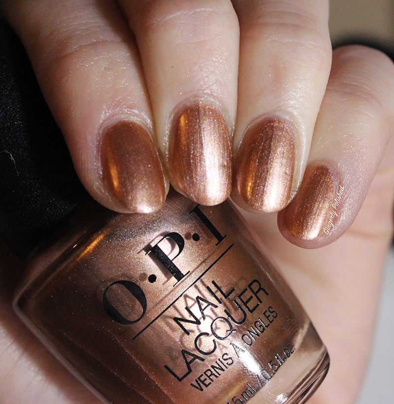
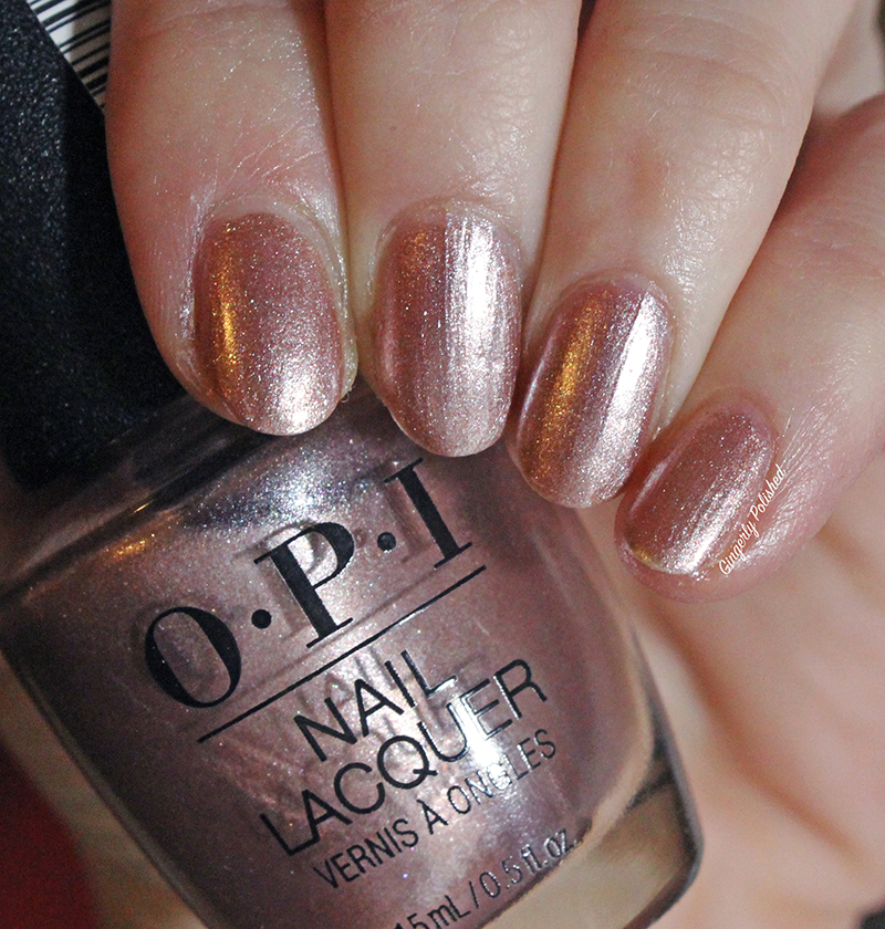
This is ‘Made it to the Seventh Hill’, a shimmery copper shade. This copper seemed a little more unique to me than others I’ve seen. It just seemed more orange? I don’t know what it was about it, but it had some subtle green shimmers in there as well, and I loved it.
With this shade you can do 1 easy coat for an easy nail look – something a little more perfected but not overdone. It’s fully opaque in 2 coats and bright and shiny on the nails. You will get brush strokes, so just paint straight with your strokes.
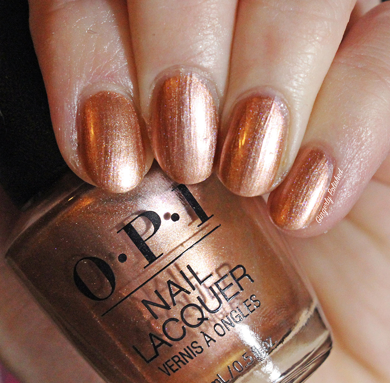
There’s just something about her, I tell ya. It’s just a softer copper shade? I can’t explain it, but I love it.
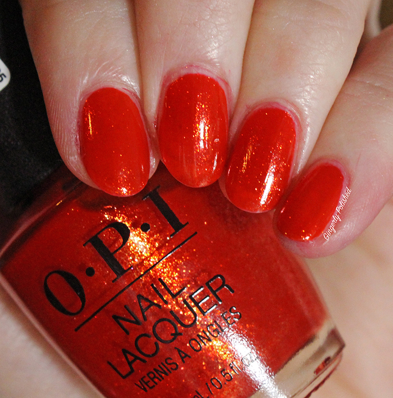
This last shade might be my favorite because it’s the most unique of the group. This is ‘Now Museum, Now You Don’t’, and she’s a shimmery bright tomato red. This can be opaque in 1 thicker coat, or 2 thinner ones. (It’s completely opaque, the lighting on my middle nail makes it look a lil streaky, but she’s good).
This shimmer is stunning, and it seems to glow off the nails. I love this, and the brush strokes disappear nicely.
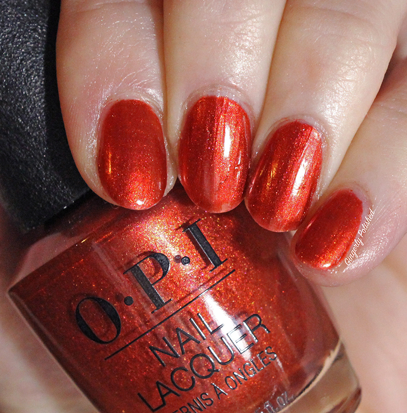
I love this, and this is my favorite of the collection. Look at that glow.

That’s the last of the main collection! I also have the Sally Beauty exclusives.
Now lemme tell you. I was not planning on buying these, and didn’t realize I got the exclusives until they were already on their way. I got too excited when Sally Beauty had buy one get one OPI, didn’t research my shades, and assumed these were part of the main one. Whoops it wasn’t, but now I can show you them at least.

Now, the very first shade is another off white. First is a plain swatch of ‘Set Apart By Tile Art’.

Compared to ‘Suzi Chases Portu-geese’ from above that has a touch of rosy warmth to it. ‘Set Apart by Tile Art’ has a touch of blue to it, so it’s a little more cool toned.


Here I painted them. On my index and pinky shades, I have a straight white shade, to show that the others are a little more off white. ‘Suzi Chases Portu-geese’ is on the middle nail, and ‘Set Apart by Tile Art’ is on the ring finger. It was so hard to make any noticeable difference really show up. You can see that the ring finger is a touch more cool toned.
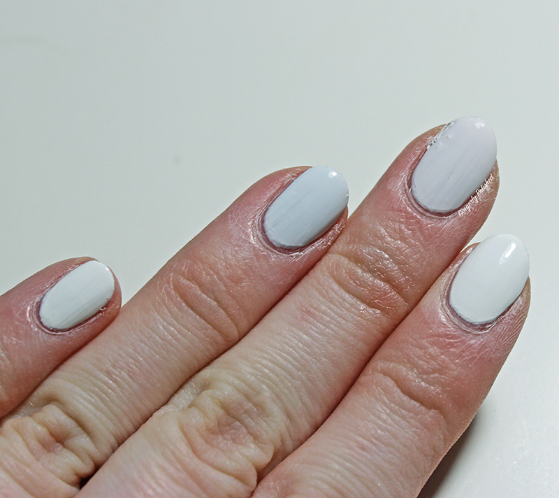
But good lord, these are so close, you definitely do not need both. I’m a little irked that they put in two very similar shades in one collection – provided one is an exclusive, but that exclusive drives some collectors to purchase it more. And it’s just so close. There’s no point at having both of these shades.
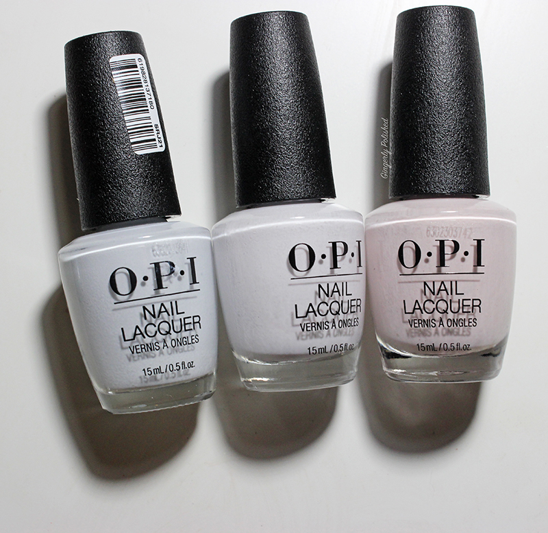
I also showed the bottles. From left to right you have ‘Set Apart by Tile Art’, ‘Suzi Chases Portu-geese’, and then ‘Lisbon Wants Moor OPI’. There’s an obvious difference between the last two, as the very last shade is more rosy and colored. But there’s not enough difference between the first two to justify it.
Alright, I’m done talking about the difference between two white shades. Let’s go onto the other two exclusives because I actually love them and thing they’re worth it.
‘Hittin’ the Portugese Pavement’ is a soft rose gold shade. This is a beautiful 2 coat formula. This is another where 1 coat will give you a soft, perfected nail look. It dries very quickly between coats so 2 coats was very easy. There were very little brush strokes, and this shade was unique for my collection. It’s got more of a pink tone than other rosy gold shades and I love it.
The last shade is ‘I Absolutely Amador-ya’, and yes, yes I do. I do adore this shade. This is definitely more of a jelly formula, so if you don’t have a prominent nail line, you’ll be set with 1 coat. For me, in certain lights you can still nail line, but I still love it.
Whew! 15 bottles is a lot, man. It’s quite the group to have on my desk, but we’re through, and I’m happy! Overall, we’ve got lots of good formulas and colors. They’re lovely and bright, and I think they’ll transition well into summer as well.
My absolute favorites seem to be the shimmery reds: ‘Now Museum, Now You Don’t’ and ‘I Absolutely Amador-ya’. They’re so unique and they just glow on the nails! I love the stray away from a standard cream (although I’ll never say no to an OPI cream). I mean, just look at ‘A Red-vival City’. Unf. Obviously your lighter shades and yellows will take more coats, but those deeper shades are gorgeous. See something you like?
Did you see they’ve already teased the OPI Summer collection, and it’s based on Grease??? I can’t wait! I’ve got the Orly and China Glaze spring collections coming, as well as some new stuff from Sinful Colors! Lots of exciting things.
Stay tuned!
Follow me!
Instagram: @GingerlyPolished
Twitter: @GingerlyPolish
