
It’s been a hot second since I’ve posted (I feel like I say this in every post. Someday I’ll get my life together). But, I graduate college in two weeks. When did that happen? It’s 2 weeks exactly from today! I get all overwhelmed thinking about it.
So my life has been consumed with finishing portfolios and applying for jobs. I have to be an adult soon and I’m not ready.
Let’s just talk about this. Today I have a nail polish review! Look out! I’m still slugging my way through the spring collections. It’s not summer until June in my book. So bring on spring!
Today I have the full China Glaze spring collection. This is called the ‘Spring Fling’ collection and it’s a 12 bottle collection. China Glaze (and OPI) are going to be the real reason I go broke with these 12 bottle collections lemme tell you.
I bought mine off transdesign.com – that website is really why I can afford this addiction, do wholeheartedly recommend.
This post is going to be very photo heavy – with 12 colors and comparisons at the end, there’s a lot that has to be shown. So let’s get right into it!
First up in ‘Blanc Out’. From the name, as you can guess, this is a bright, white polish. This polish also seems to have a couple drops of blue into it, keeping it from being a stark white. This had a more runny formula, it can run so just wipe off the brush. This was opaque in 2 easy coats, and leveled out nicely.

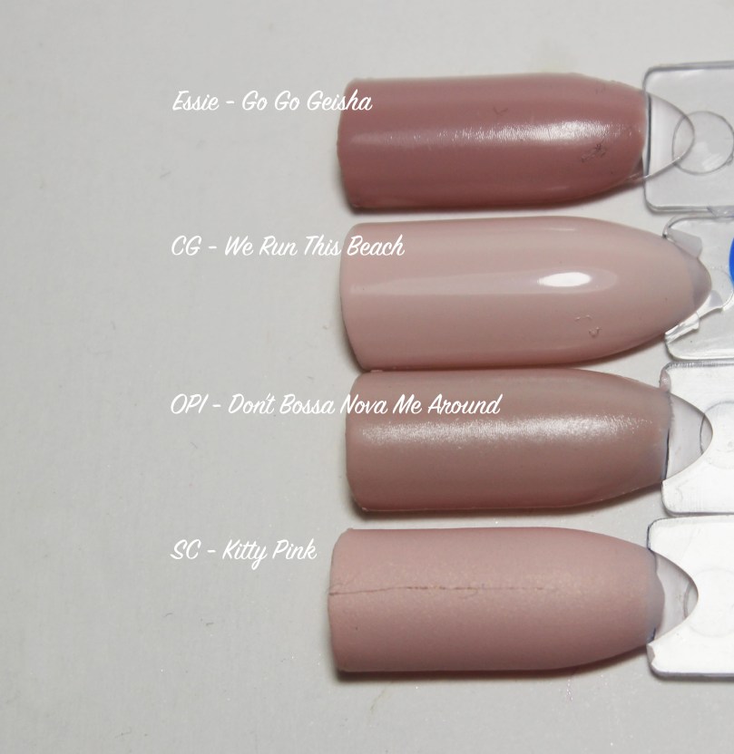
“We Run This Beach” is a nice light, pink toned nude color. It’s a lovely blush shade. Another thinner formula that can flood the cuticles, but it was still a smooth easy first coat. This took only 2 coats to be opaque and is absolutely gorgeous.

Next up is ‘Life is Suite!’. This is a warm, sand-toned nude shade that dries matte. There is slight shimmer that gets lost on the nail. As a matte formula, it dries quickly and levels itself nicely. You can get patches if you manipulate it too much, so just swipe it on and leave it. This was a nice 2 coat formula.

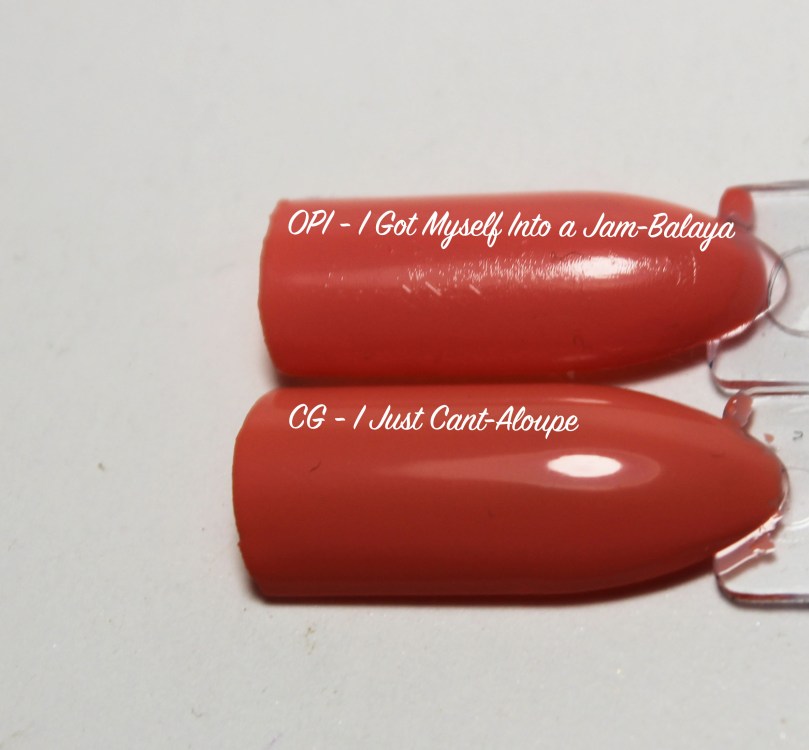
‘I Just Cant-Aloupe’ is a bright coral cream shade. Another thinner formula that can run. It can need 2-3 coats depending on your application. I did have some uneven patches on a 2nd coat, causing a need for a 3rd on some nails.

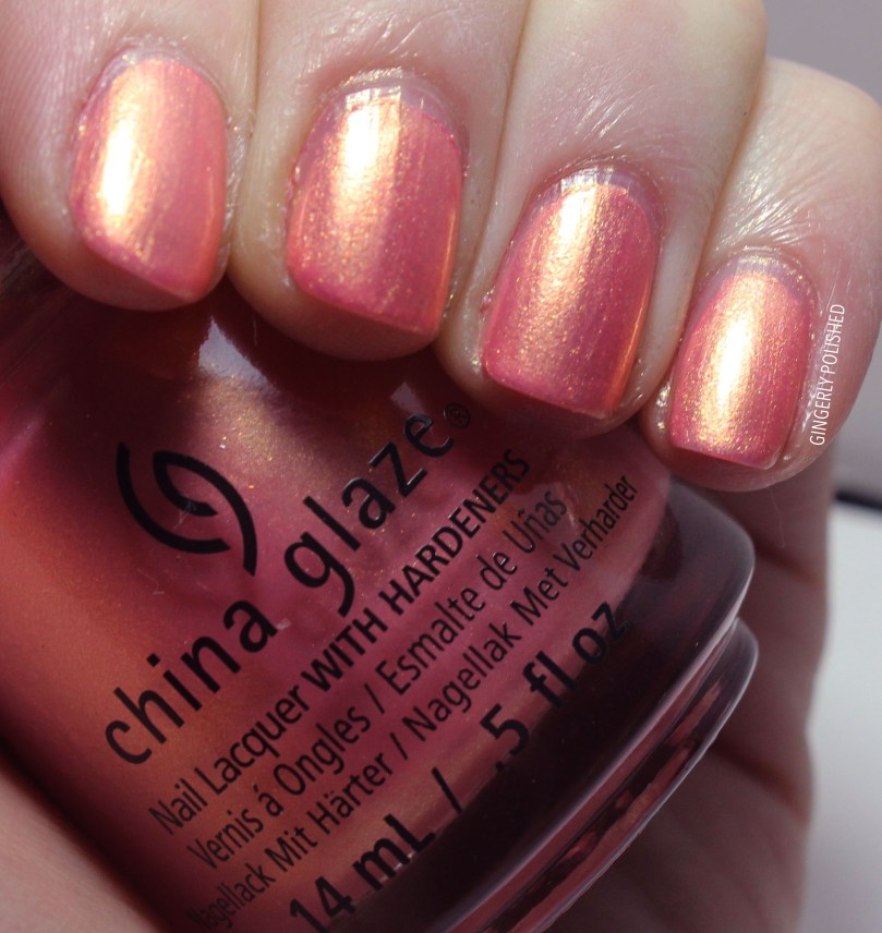
‘Moment in the Sunset’ is the crowd favorite. It was sold out on transdesign.com, but luckily I live in the UP, so my Sally Beauty had an untouched display of it. I can see why this is a favorite. It’s a bright pink-coral with an amazing gold shift to it. With this, you can get away with 1 coat on your nails for a seashell look to them. 2 coats make the shimmer brighter and gives it more depth. Lovely formula.

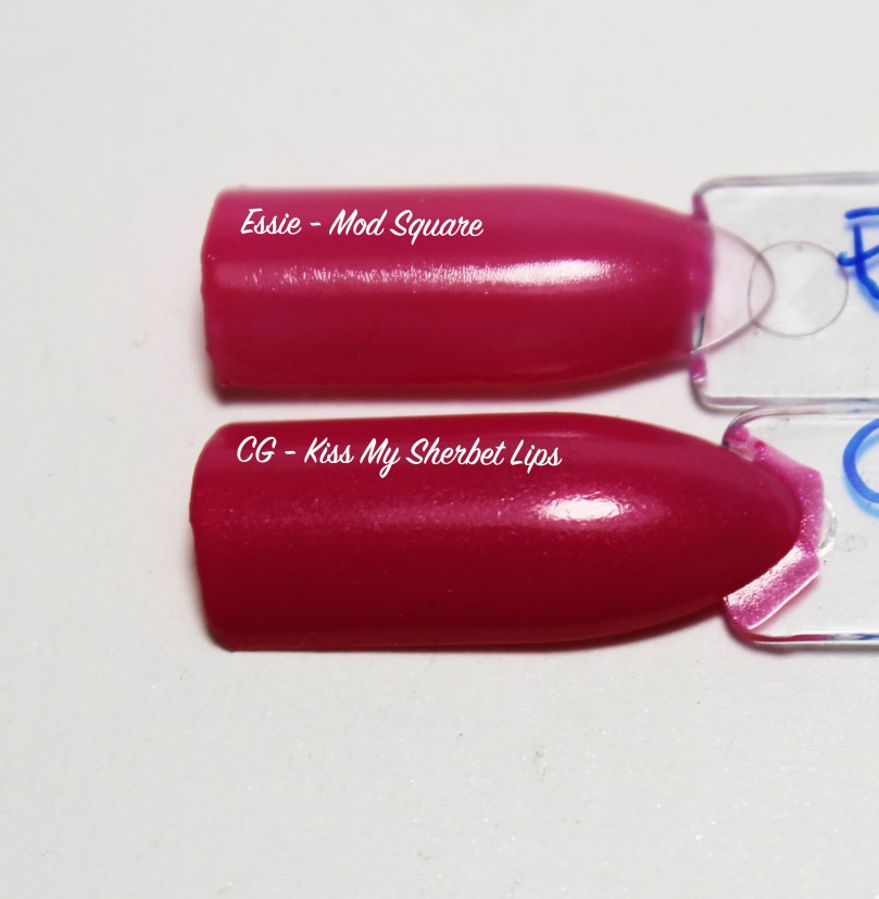
‘Kiss My Sherbet Lips’ is a bright cool-toned pink cream. The formula seemed almost like a crelly, so it’s a nice juicy color. You can get away with 1 thicker coat, but 2 richens it up. There is a subtle shimmer that can’t be seen on the nail.

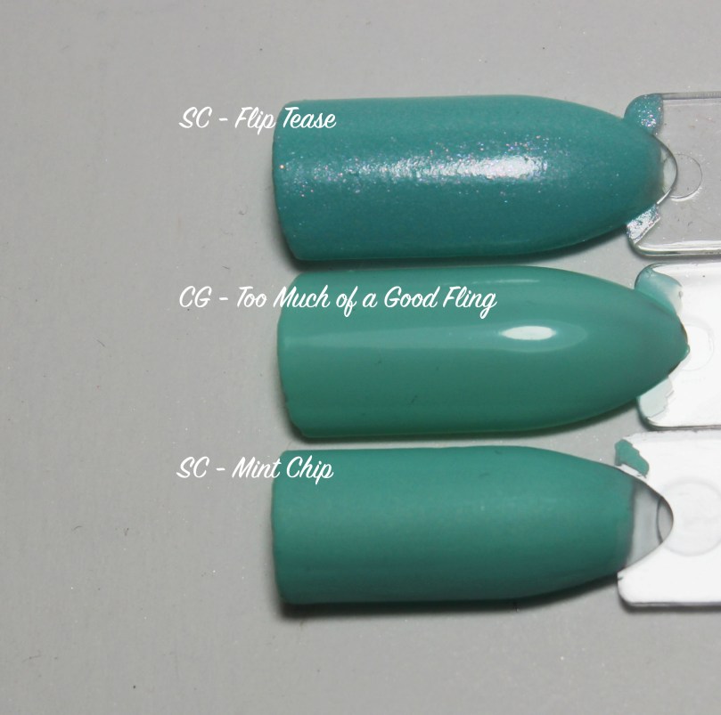
‘Too Much of a Good Fling’ is a bright mint cream. Another thinner formula that you need to wipe the brush off, but still an easy formula. Depending on your application, this can need 2-3 coats. I work in thicker coats, so I was able to get away with 2.

‘Don’t Teal My Vibe’ is a bright teal shimmer color. As you can see, since it’s a metallic, it does have some visible brush strokes – something to keep in mind with any metallic. You can almost get away with 1 thicker coat, but it might flood your cuticles. I used 2 here in this photo.

‘Crushin’ on Blue’ is a bright cerulean blue shimmer. This was another that had almost a jelly-like formula? It’s very interesting. It had a sheer, but smooth first coat. This is another that can get bald spots if you manipulate it too much on the nails. I built it up opaque in 2 coats, but you are again going to have some brush strokes.

‘It’s A-Boat Time’ is a silver metallic with green shimmers (you can barely see them on the nail). This is a more warm toned silver color. 1-2 coats for opaque depending on your application, and the brush strokes disappeared nicely on this one.

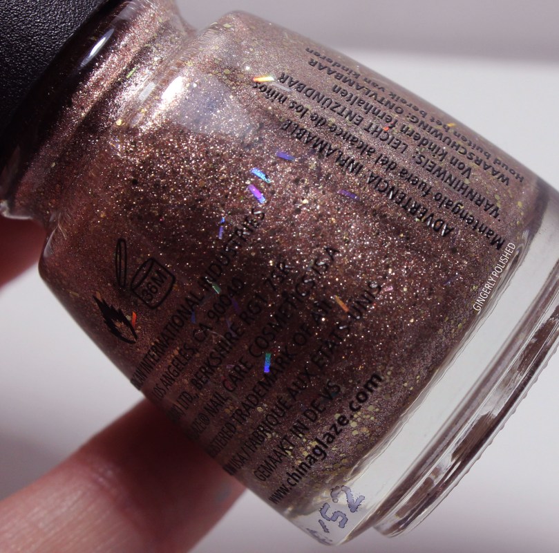
Up next is the controversial one. This gives the classic ‘Pineapples Have Peelings’ vibe, and divides nail polish lovers everywhere. This is ‘Beach It Up’, a coppery base with silver shimmer, round glitters and holographic bar glitters. It has a little bit of a textured finish and honestly looks a little like sand on your fingers.

Guys.. I’m going to say this. I weirdly love this. I wrote on my notes “lil weird” and it is. I put this on as a full manicure and the longer I wore it, the more I loved it. Whoop. It’s just so metallic and interesting. Know your loves and proceed with caution.

It just looks like sand in the bottle!
Last but not least is the topper, ‘Sun’s Out Buns Out’. This is a light coral-pink base with tons of gold shimmer. It’s like ‘Moment in the Sunset’ but a thinner base color and the shimmers are a little bigger.
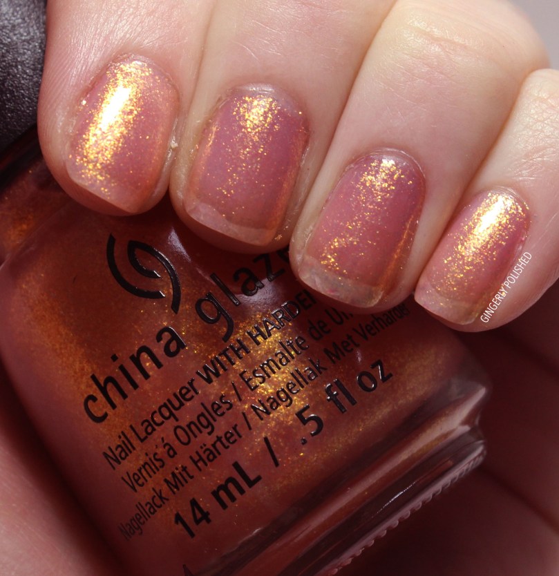
This was 3 coats, so it can be built up to wear on its own like a seashell finish. It has a great orange flash to it. I also included a picture in darker daylight (right) so you can see that in different lights it looks much more opaque.


But over a darker polish. My god. I literally gasped as I was applying this. This is over OPI’s ‘Shhh… It’s Top Secret’, a dark brown, and it became a fall leaf paradise. This look is more for fall, but just look at that shimmer. Gorgeous.
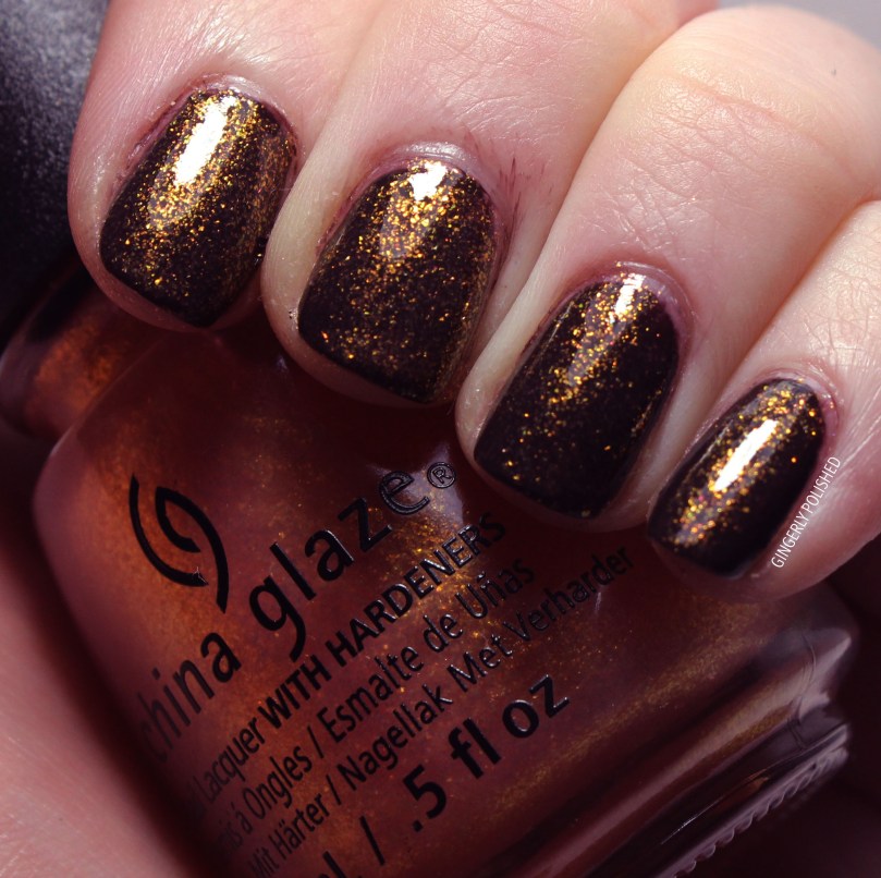
Here it is in different lights and I just, I can’t. I love it.


Up next we have comparisons. These are of the closest colors I could find in my own personal collection.
First, for ‘Blanc Out’. You can see it’s very white, so it’s making my light gray shades look so dark. But compared with Essie’s ‘Go With the Flowy’ and OPI’s ‘I Cannoli Wear OPI’ it’s much lighter.

Compared to the other shades I found, this one is much lighter and creamier. It’s closest to Sinful Color’s ‘Kitty Pink’ from the Kylie Jenner collection, but that is a matte finish, and has a tinge more darkness to it.
These next two are verrrrrrrry close. If you’re looking from a distance, not under studio lights and everything, they look the same. If you’re really going down into it, the OPI shade has a tinge more pink to it.
I honestly don’t have many berry shades. The China Glaze shade is darker and richer than Essie’s ‘Mod Square’.
Swatching the China Glaze shade, I was sure these would compare, but seeing them together, it’s clear they’re different. Both of the comparisons are from the Kandee Johnson collections, and ‘Flip Tease’ is darker and more blue, with pink shimmers, and mint chip is a tad more blue, and a matte finish.
Comparing to my other silvers, ‘It’s A-Boat Time’ is warmer with a slightly green tinge to it. It’s a smoky silver.

Lastly, I compared another China Glaze shade. Besides the obvious texture, ‘Beach It Up’ is also more of a cooler toned copper base shade.

Those were all of the comparisons I could find – for the other shade I didn’t have anything close enough to compare.
So there’s your China Glaze Spring collection! Overall, the colors don’t seem exactly cohesive to me, like I don’t see an overall theme – but in that way I don’t ever mind.
I didn’t really find a bad formula in this – so it’s up to your preference of shade and finish. Some might say ‘Beach It Up’ is terrible for its texture, but I’m so weirdly into it. Your choice really.
What’s your favorite shade from here? Stay tuned for more posts coming up!
Follow me!
Instagram: @GingerlyPolished
Twitter: @GingerlyPolish
Pinterest.com/GingerlyPolish

“Moment in the Sunset” looks like Nars Orgasm blush in nail polish form! 😛
“‘Crushin’ on Blue” is so pretty – too bad about the formula though.
Hmmm I’m torn about “Beach It Up” – love the shade but I’m unsure about the texture. I think maybe it’s better in real life?
“Sun’s Out Buns Out” does look like a water down “Moment in the Sunset” – but it’s a stunner as a topper!
Very helpful to see the comparisons too!
LikeLiked by 1 person
Beach It Up is definitely a personal choice 😂 it’s such a weird texture but I just love it. And it’s so metallic in real life. I’m glad the comparisons help!
LikeLiked by 1 person