
You can see the original review post here.
It’s another comparison post everyone! As mentioned before, one of my main goals this year is to really be better with my comparison posts so I can work on destashing and really curating my collection.
Listen, I’m still working on that. I know these posts can be slow posting up, but they also take me a while. I pull all the polishes, and the sticks and then do photos, and then all the swatches and edits. They’re a lot of work, but I know they’re so helpful to both me and all of you, so I’m so happy to continue doing them as well.
BUT, I’m figuring out a new process and it should speed up the process and make it easier overall. So that means you’ll get lots more comparisons more consistently! Thank you as always for being patient as I figure these all out and work out the kinks on new series and posts! Now, for the comparisons.
As I’ve done before, I pulled a whole range of colors on swatch sticks, so you can see at a quick glance how a color compares to a ton of different shades. And then I’ve taken the closest colors and compared them on my nails to further see if they’re dupes. (These are just the shades that I myself own in this collection, so you may know of different comparisons out there, but this is what I have personally).
Now let’s get into this always long post!
I’m going in the same order as the original post, so up first we have ‘Hue is the Artist?’, a white with the tiniest touch of lavender to it. Next to more pink-toned shade, as well as other cool toned whites, you can really see that purple jump out on the sticks here. You can see here ‘I Cannoli Wear OPI’, which I wondered about when I first swatched this because of it’s cool-toned shift is much darker and more gray.

And as always, I pull the closest colors out to swatch on the nails. From index to pinky we have OPI ‘Suzi Chases Portu-geese’; ‘Hue is the Artist?’; and Orly’s ‘Power Pastel’ (which is also a dupe for OPI’s new version of ‘Let’s Be Friends’).
And again, you can really see the cool-tone purple pull out. ‘Suzi Chases Portu-geese’ is more warm toned and yellow, while ‘Power Pastel’ is more pink toned.

***
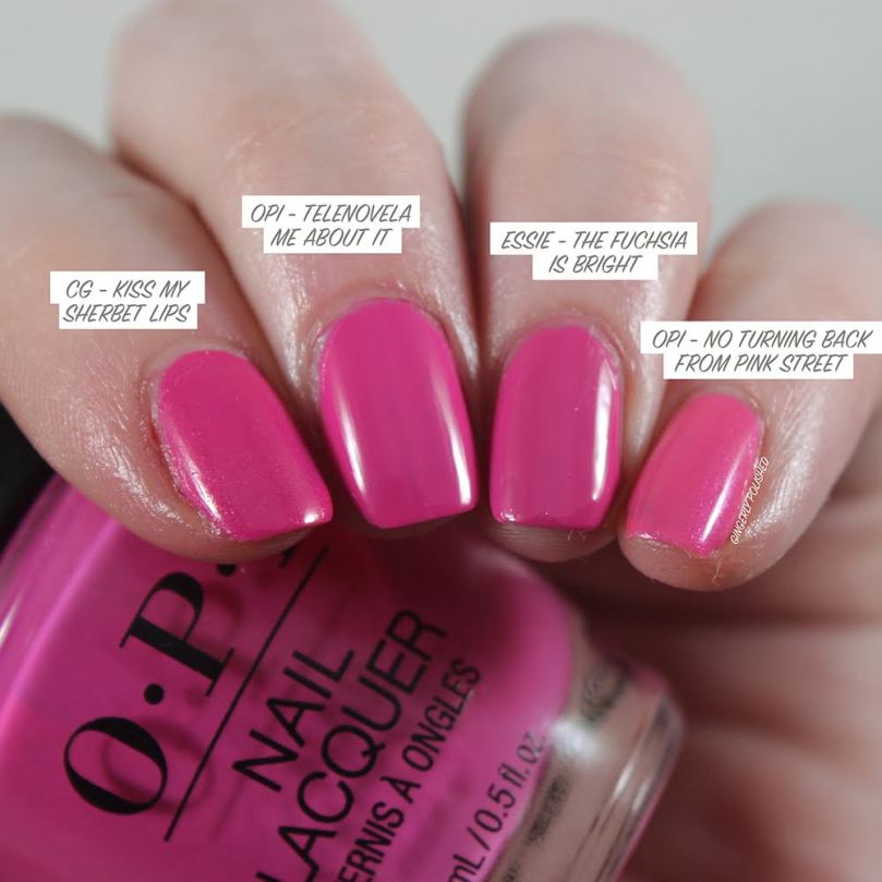
Next up is ‘Telenovela Me About It’, the fuchsia pink with purple shimmer. On the sticks it appears much warmer than a lot of my other fuchsia shades.
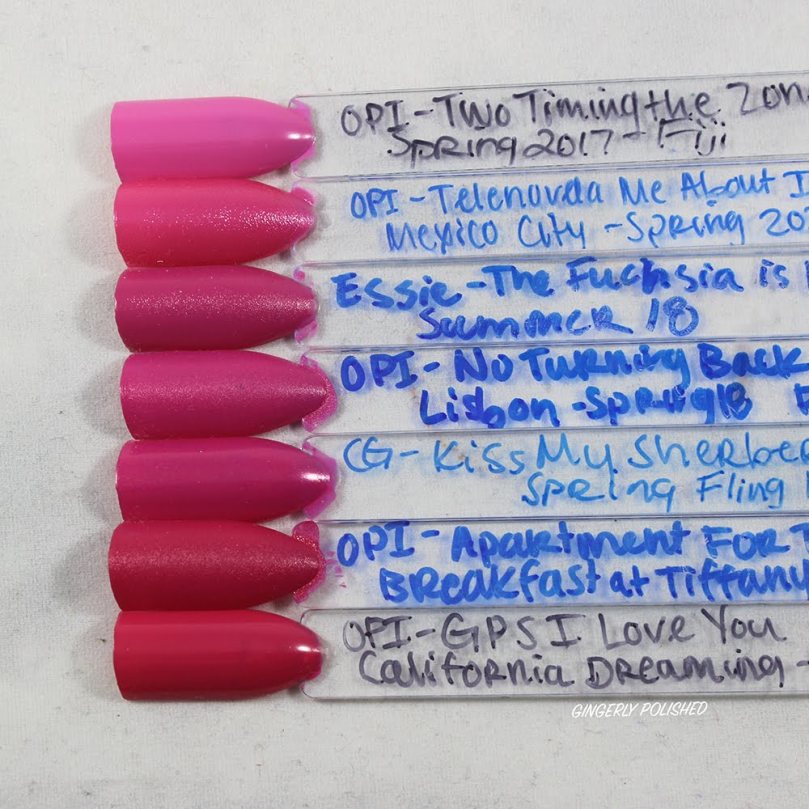
But on the nails I was surprised to see how similar it was to Essie’s ‘The Fuchsia is Bright’! ‘Kiss My Sherbet Lips’ was a touch deeper and much more shimmery, while ‘No Turning Back from Pink Street’ had a touch more warmth to it.

So I think I’m going to destash ‘The Fuchsia is Bright’! It still has the old skinny Essie brush, so the OPI goes on much more easily. I also loved the lil touch of shimmer that ‘Telenovela Me About It’ has.
***
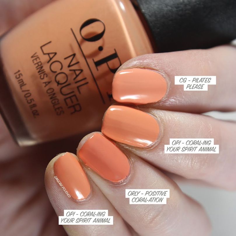
And now the sticks for ‘Coral-ing Your Spirit Animal’. And whew boy, I probably do not need another coral, as I have the full range of all coral variations.
You can see the more peachy-coral tones of the OPI come out when compared to my more orange and nude coral shades.

And now the closest comparisons! I was surprised that I ended up not having any exact dupes for this. (And because I like to do these comparisons, I’m more likely to keep shades unless they’re EXACT dupes of another).
China Glaze’s ‘Pilates Please’ has a touch more peachy coral to it, while ‘Positive Coral-ation’ is deeper and again, more coral.
(I always say these comparisons are both good and bad, as while they weed out dupes, they also help convince me to keep more shades because “they’re so different”).
Now onto our bright reds.
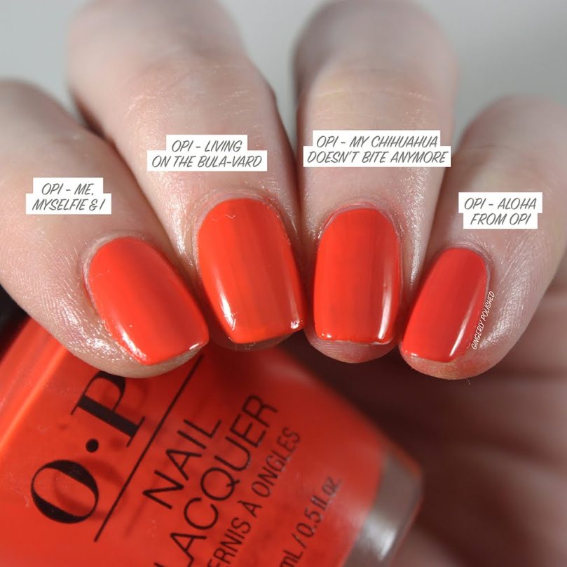
We’re looking at ‘My Chihuahua Doesn’t Bite Anymore’ (that blank stick in the middle there). And well, as you can see, OPI loves their bright orange-reds.

And on the nails, I was shocked to find how many times over I had this shade. I even wore this comparison out and about, and even in bright daylights and different lighting, I could barely tell a difference. If I’m being generous, ‘Living on the Bula-vard’ has a touch more orange, but honestly in day-to-day there’s no way I’ll pick one over the other for that minor of a difference. They’ll both look the same on the nails.
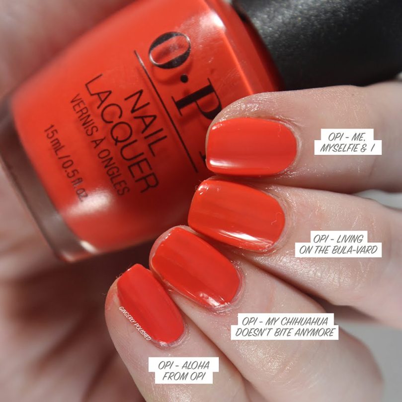
I’m only going to keep one of these shades and I’m destashing the other 3! See, I told you the comparisons do help sometimes, okay. These all have the same 2-coat formula as well, so it’s basically choosing which name I like most.
***
And now for our other orange-red. With it’s deeper color and more burnt-orange tone, it was much more unique in my collection. I only found one I wanted to compare on the nails, and they still differ even more than shown in this photo. ‘Viva OPI!’ is much deeper and more burnt orange than ‘My Wishlist is You’.

***
For ‘Mural Mural on the Wall’, I didn’t have anything close enough that I wanted to swatch on my nails as well (I gotta save some time somewhere), but still wanted to show you the sticks so you can see where the base color lands. It’s definitely more dusty and muted than other shades I have like it. And then, of course, the gold flakes in it make it very unique in my collection.

***
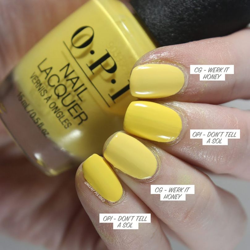
And now ‘Don’t Tell a Sol’, the bright sunny yellow. I basically pulled out the yellows I owned in mainstream brand to show where it is. It’s definitely a brighter and sunnier yellow than most shades I have. Zoya’s ‘Daisy’ is close in base color, but has that bright blue shimmer in it that makes it appear greener overall.

The closest shade I could find with the right tone was ‘Werk it Honey’ from China Glaze. But as you can see, it’s much lighter than ‘Don’t Tell a Sol’. They’re in the same family, just different shades.
***
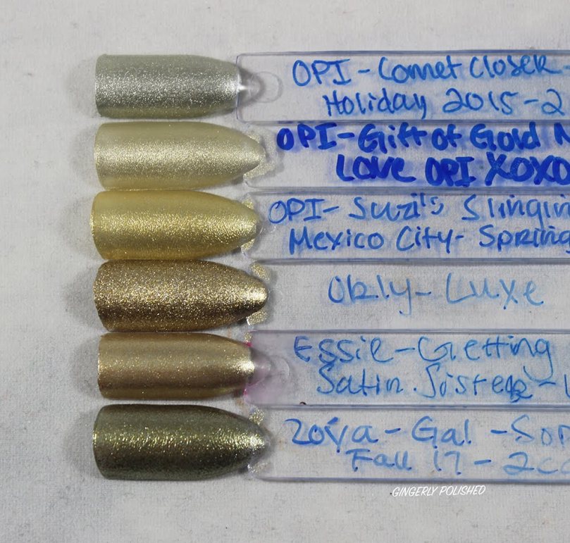
Another that I didn’t have any shades close enough to swatch on the nails is ‘Suzi’s Slinging Mezcal’. It falls right in between a champagne gold and a regular gold. It’s more yellow than champagne, but it’s lighter and brighter than most golds.
***
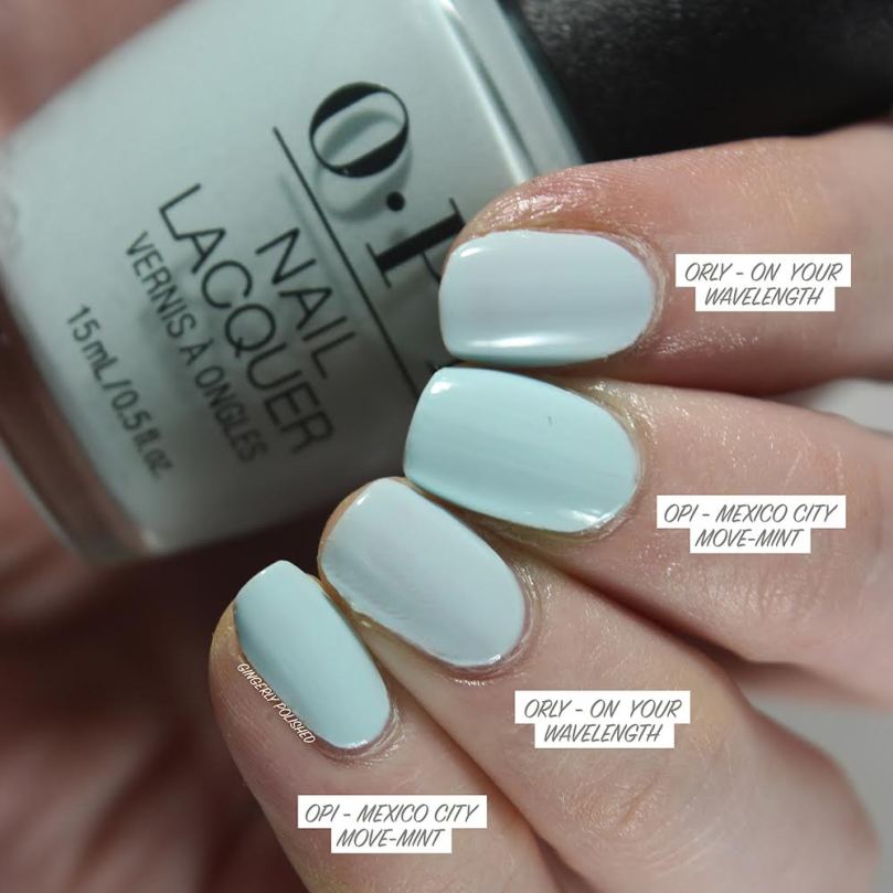
Continuing right along, we’re in the light sky blues with ‘Mexico City Move-mint’. It definitely pulls more green toned than my other sky blues as you can see, yet is a touch deeper than my lightest shades.

The one I pulled that was closest was ‘On Your Wavelength’ from Orly. As you can see they’re close, but ‘Mexico City Move-mint’ is more of a true “mint” and is brighter and more saturated than ‘On Your Wavelength’.
***
‘Verde Nice to Meet You’ pulls deeper and more dusty than most of the minty-aqua shades I have. (Pulling out these sticks really shows me other comparisons I’ll have to make, like those 3 almost identical aqua shades in the middle there).

And again, no dupes here. I was immediately reminded of ‘My Dogsled is a Hybrid’, one of my favorite shades, when I swatched ‘Verde Nice to Meet You’ so I knew I had to compare those. It ended up being more green-toned. ‘Wednesday’ by Zoya, I thought would be closer, but it’s deeper and more teal-toned.

***
Another category I have quite the range on is deeper bright blues. ‘Mi Casa Es Blue Casa’ falls right in the middle of brightness.

This was also another where the differences in the shades were even more obvious in person. (Still working on how sometimes my lights wash out colors).
But as you can see ‘Butler Please’ is much brighter and saturated; ‘Born to Rule’ is deeper and again, more saturated; and ‘Super Trop-i-cali-fiji-istic’ is a little more dusty and muted. So once again, we have no dupes.

***
Lastly we have ‘Mariachi Makes My Day’, the deep grape purple. I’m always so surprised at how few purples I have in my collection, so I haven’t gotten a true dupe yet. These are just the deep purples as well – a lot of my shades were much brighter and lighter, or much more pink toned.

‘Nice Set of Pipes’ is much dustier and cool-toned and ‘Dawn of a New Reign’ leans more warm-toned. Again, these are all safe!

***
And there are the comparisons! I did end up pulling sticks for all 12 shades, though only 2 were shades where I didn’t have anything close enough to compare further. And I was surprised at how few dupes I found! I was expecting to have a lot more overlap than I found here. A lot of shades had just enough of a nuance to them, with different undertones that keep them more different.
Now to normal people, they might be close enough that you won’t need both – which is why I show them anyways, as well as the full expanded swatch sticks. But as I said, for us polish collectors, and especially because I love doing these comparisons, I’m more likely to keep things that are closer. Unless it’s an exact dupe, I do like holding onto it. I like having a bigger collection for comparisons sakes.
That said I did end up destashing 4 polishes from this post, so always baby steps for keeping my collection under control.
********
Upcoming Posts
Nails: Essie Flying Solo • Orly Feel the Beat Spring 2020 • Zoya Calm Spring 2020 • Sinful Colors Sporty Brights • LA Colors Metallics
Makeup: Wet N Wild the 40 Palette • Colourpop Bye Bye Birdie & Smoke Show • Revolution Pro All that Glistens
********
Follow me!
Instagram: @GingerlyPolished
********
Other Comparison Posts
OPI Hello Kitty Holiday 2019 – COMPARISONS
Zoya Sensual Fall 2019 COMPARISONS

Gorgeous swatches! Thanks for sharing.
LikeLiked by 1 person
Thank you! 😊
LikeLike
Thank you for this, very useful.
I can now take chihuahua off my list, as I have two of the dupes.
Unfortunately I now want Don’t Tell a Sol!
LikeLiked by 1 person
Thank you for all your work putting these posts together! In this case, I now know I need Verde Nice to Meet you and Mi Casa es Blue Casa, two I was on the fence about. I think you captured the differences so clearly, your lighting is perfect!
LikeLiked by 1 person
Yay, I’m so glad to hear that! It’s what makes the posts so worth it, and it’s fun to look through my collection and see what I really have. And that’s great to hear! I’m worried the differences don’t pick up well enough sometimes, and that I’m just so used to seeing them but others won’t, so love the feedback!
LikeLiked by 1 person
Hi, thank you for doing these comparisons. Can you also please compare OPI It’s a Boy with OPI Move Mint?
LikeLiked by 1 person
I wish I could, but unfortunately I don’t have It’s A Boy! But from googling photos, they look very close – It’s a Boy might have a touch more blue to it, than the more green leaning mint of Mexico City Move-mint, but definitely very close. I’m going to reach out on Instagram to see if anyone has done the comparisons as well!
LikeLike
[…] to several polishes OPI has released over the past few years, but they did not dupe themselves! Gingerly Polished has some excellent comparisons so I did not even bother trying to do any here. For the name rating, I am going to give Verde Nice […]
LikeLiked by 1 person
Hello! if you had to pick, which orange-red would you say is closest to Viva OPI!? I fell in love with it recently at the nail salon but it’s several years past season and hard to find.
LikeLiked by 1 person
You’re in luck because I think ‘Stop at Nothin’ from their newest Summer 2024 release is so close to that shade!
LikeLike