PURCHASED WITH PR DISCOUNT
You know when you have one really productive day – I swatched like 3 full collections! – and then the next day you go to hot yoga in the morning and throughout the rest of the day, the productivity is gone because you have to fight to stay awake anytime you sit down in your comfy chair? (Can you tell I just started working out again regularly). Well it happened, and that is why this review and post took an extra day to get finished up. I’M ONLY HUMAN. I realize that you only know it took an extra day because I’m telling you, and I create these “deadlines” for myself, but what can I say, we overshare here on this blog.
But at least now I got a built up stash of swatches, so you guys know that there are a lot of posts and reviews coming your way.
Now let’s look at this collection! We’re looking at our very first official spring collection today. This is the OPI Mexico City collection for Spring 2020. As with every OPI collection, it’s inspired by the colors of a certain place, and obviously this is inspired by Mexico City! This is a standard 12 piece collection, mainly made up of cream shades.
As always, I picked this up from polishpick.com. They’re my favorite place to buy new OPI shades (as well as throw in some older polishes I’ve never owned every so often). They have the best prices still (only $5.25 a bottle, instead of $10 from most drugstores!) and their shipping is so incredibly fast and I always have my polish in under a week, usually just a couple days. I know I gush about them a lot, but I’ve literally ordered all of my OPI collections from them since 2018, and I can’t say enough about it. (And if you do order from their site and found it through this blog, you can put in my name in the dropdown – I receive no commission from this, it just shows where traffic is coming from and allows me to purchase shades at more of a PR discount to review).
And now, let’s get into those swatches!
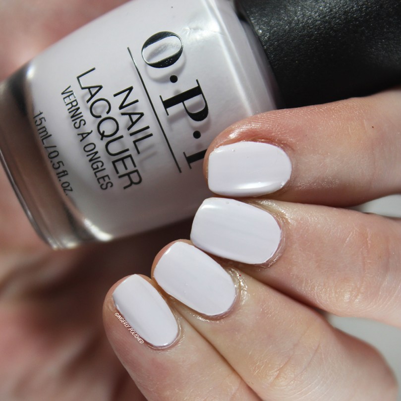
‘Hue is the Artist’ is a very light, almost white shade, with just a couple drops of a lavender purple to it. It definitely has a cool-tone lean to it and it’s less harsh than a straight up white on the skin.
It had a streaky first coat, but that’s almost to be expected with a color this light and white-based. It could be pretty well good with a 2nd coat – most people will be good with 2 coats. Although with my super ridged nails, I did end up having to do one more coat to cover up any last streaks or unevenness they caused. But it was smooth and easy to work with on the nails.
***
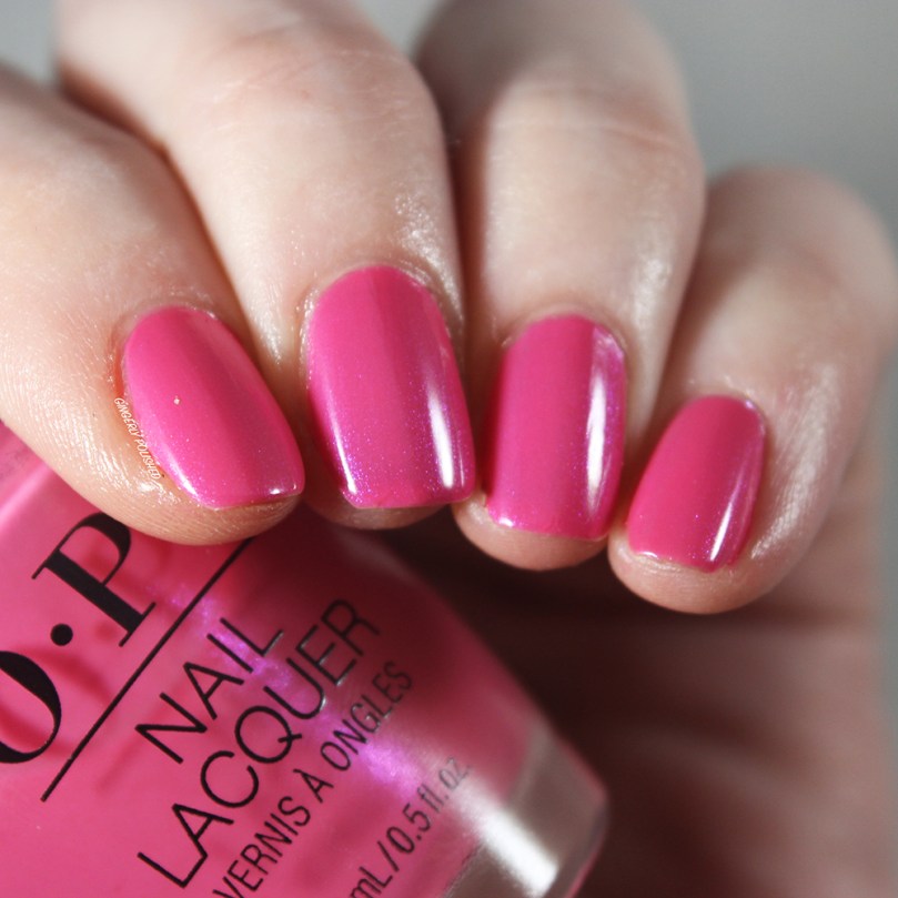
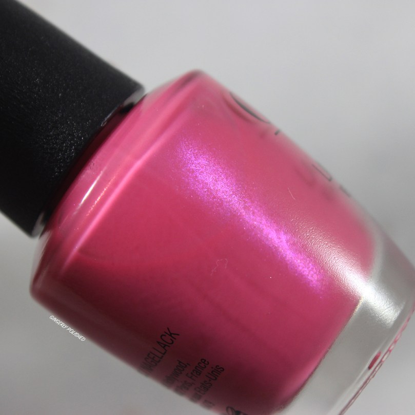
‘Telenovela Me About It’ is a bright fuchsia pink shade with subtle purple shimmer. This was one of the few shades in the collection that wasn’t just a straight up cream formula.
The formula was definitely more of a jelly than a regular cream, so it was a little more sheer. This was 3 coats built up, and the nail line is completely covered. It’s very squishy on the nails, and I ended up loving the base color.
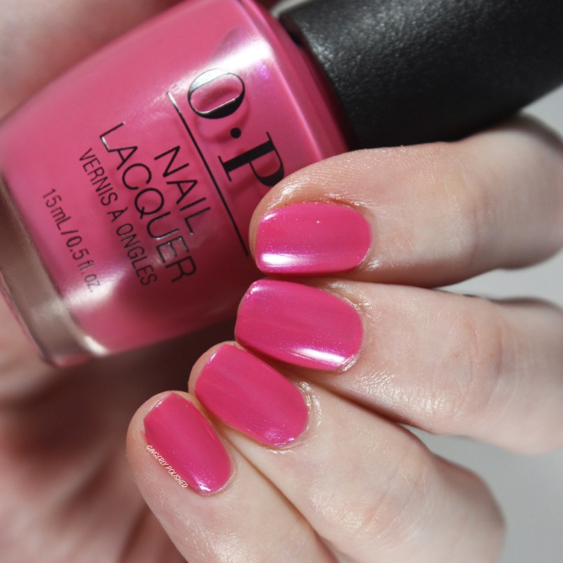
I do wish the shimmer was more apparent, as it definitely gets lost on the nails outside of my bright lights. It gives it a pearly finish overall, but the actual shimmer is hard to spot.
***
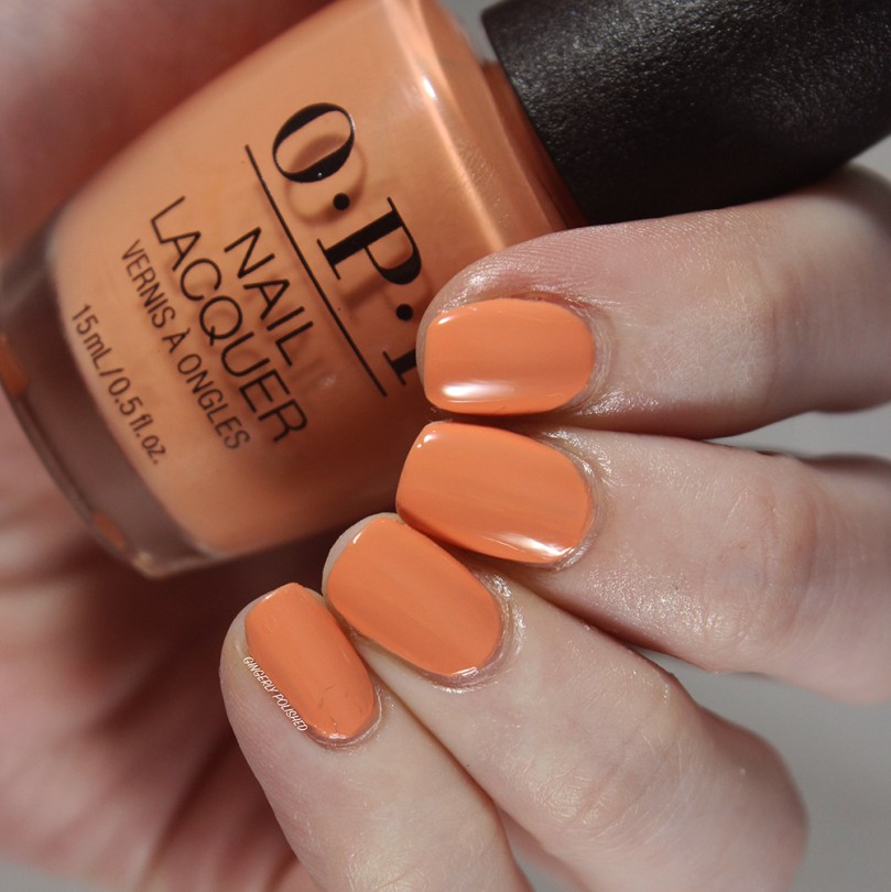
‘Coral-ing Your Spirit Animal’ is a bright peachy cream shade. It can pull even more pink-toned based on your skin tone and the lighting as well. This had another easy cream formula, and most people will be able to get this opaque with 2 coats. Again, I ended up doing a 3rd to cover up any last patches and streaks I had because of the ridges on my nails.
I ended up loving this shade more than I thought I would! It has that peachy-pink color to it that makes it different than most oranges I have in my collection. I’ll definitely have to see how it compares out to other shades I have.
***
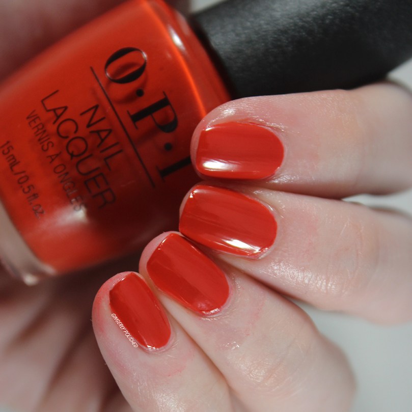
Next up we have two very bright red-oranges. They can end up looking similar, but seeing them swatched out next to each other makes it easier to pick up the differences.
The first one we have here is ‘My Chihuahua Doesn’t Bite Anymore’ (side note, I’m going to have the spelling of Chihuahua forever ingrained into my brain after typing it so many times for this review). This is a super bright red-orange shade. This is much brighter and leans more orange than the one below it.
This was a super smooth formula and once again, could be easily opaque in just 2 coats on smooth nails, and 3 on more textured and ridged nails. It definitely darkens as it dries down, and is a tad darker than the color in the bottle. Still so stunning, and will be a perfect shade for warmer weather.

***
The other red-orange tone we have in the collection is ‘¡Viva OPI!’. This one leans much darker and more brick-toned than the previous. (So yes, obviously you can justify grabbing both).
This one had an absolutely stunning formula, and even with my ridged nails I was able to get this easily opaque and smooth in just 2 coats. I was so impressed and it glided on like butter on the nails.
***
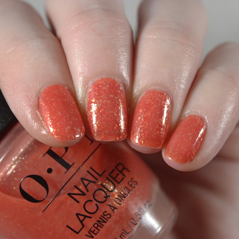
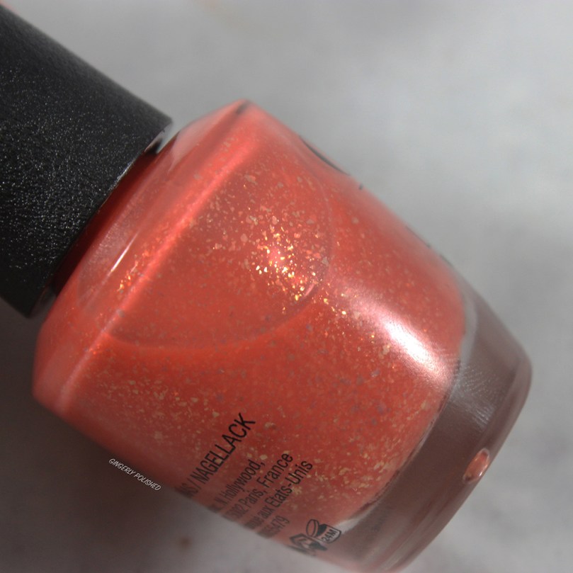
‘Mural Mural on the Wall’ is a lovely dusty coral-orange jelly base with tons of golden flakes all throughout. This was obviously a more sheer formula to let the flakes shine through, but it’s very smooth. Just 1 coat on the nails can be a lovely sheer nail look. It can also be built up with 3 coats like it is here for a full color mani as well – there might be some nail line still after 3 coats, but it wasn’t too noticeable. The flakes distribute easily and are layered up for an overall squishy look.
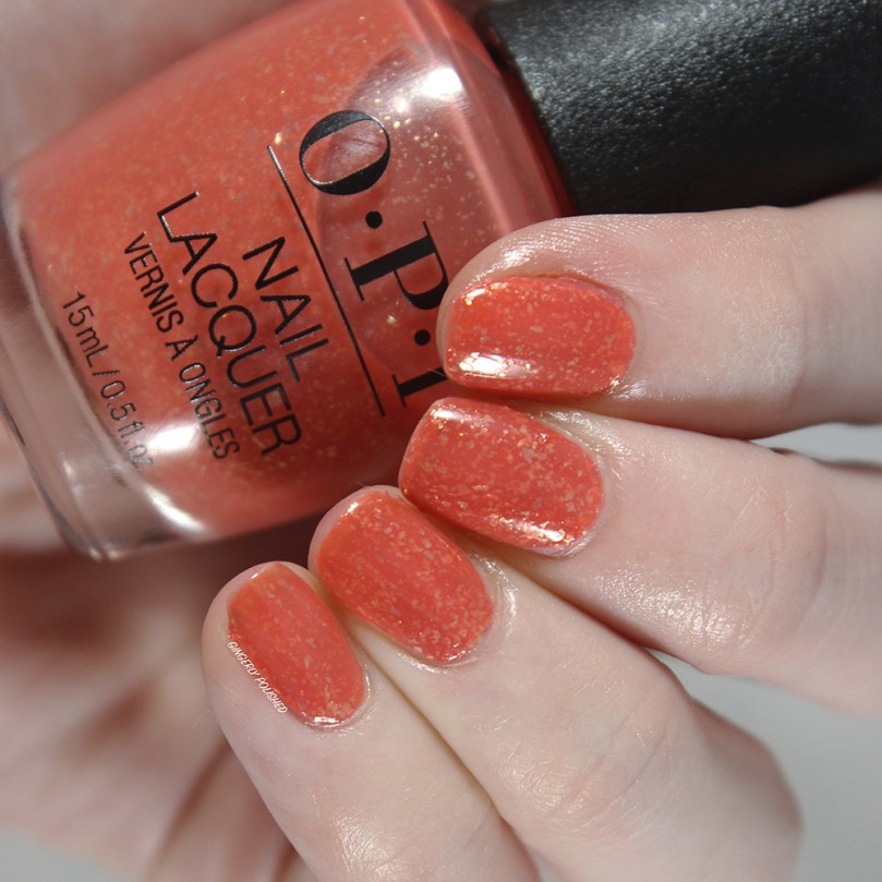
I ended up loving this shade, and of course, I love when a mainstream brand experiments with formula and finish. This was one that worked so well, and it’s a unique polish in my very large collection.
***
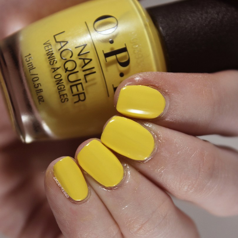
And I don’t think it would be a colorful Mexico City inspired collection without a bright pop of yellow. This is ‘Don’t Tell a Sol’ (Sol=sun in Spanish), and it’s a lovely butter yellow cream. As with any yellow, this had a streaky and uneven 1st coat. But I was able to get it pretty well opaque with a 2nd thicker coat, though I did end up doing a 3rd to cover up any last patches and unevenness.
With this one I definitely recommend floating the polish on with the brush in as few brush strokes as possible. I found if I continued to manipulate and brush it, that’s when the patches would pop up and I would break up the fresh coat of polish. So definitely just float on the coat, and then leave it be for the best success. It’s a lovely standard yellow, and if you don’t have one in your collection yet, this would be a good option! (And of course, I’ll be comparing it to all the other yellows in my collection for a comparison post).
***
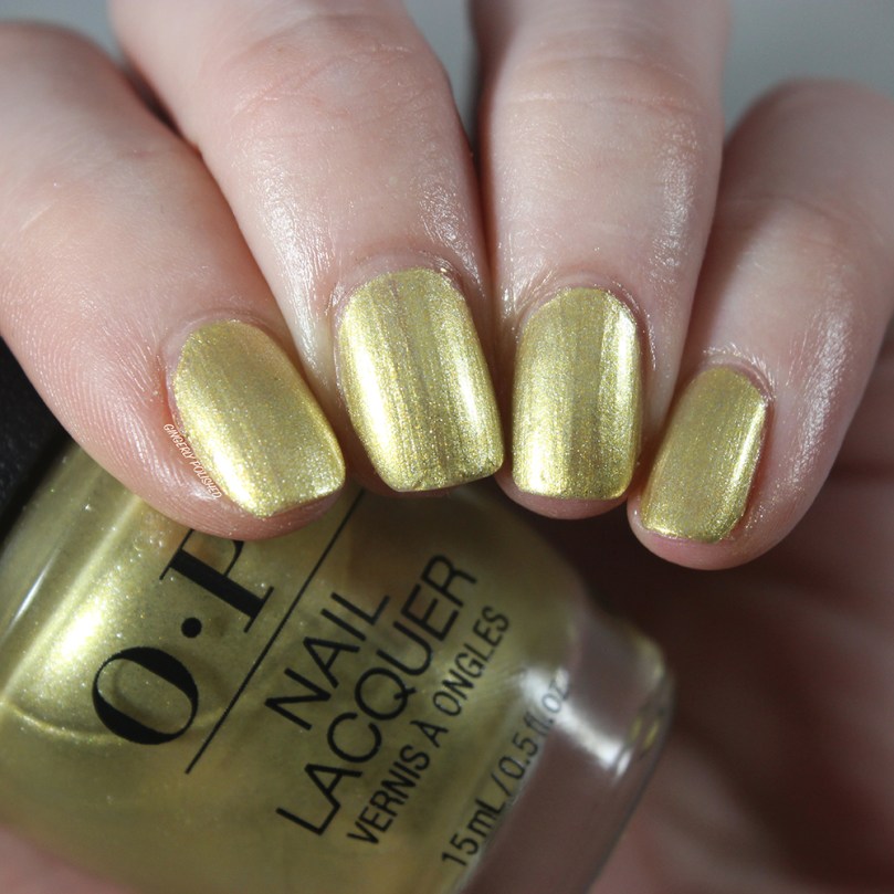
Next up we come to the last non-cream shade, and also a shade that could be dividing. This is ‘Suzi’s Slinging Mezcal’ and it’s a bright champagne gold shimmer shade. This had a smooth 1st coat, but was definitely uneven still at different angles. It was an easy 2 coats though, and was super smooth on the nails.

As you can see, most of the brush strokes disappear as well, so it’s a nice foiled finish. How do you feel about this shade? It’s definitely an interesting color, and falls right in between a gold and champagne. Another that I can’t wait to compare to other shades in my collection.
***
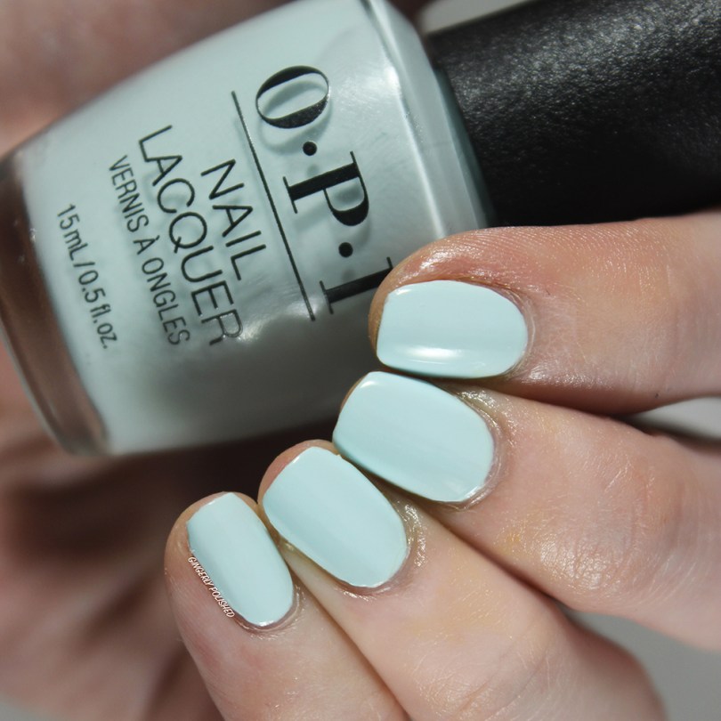
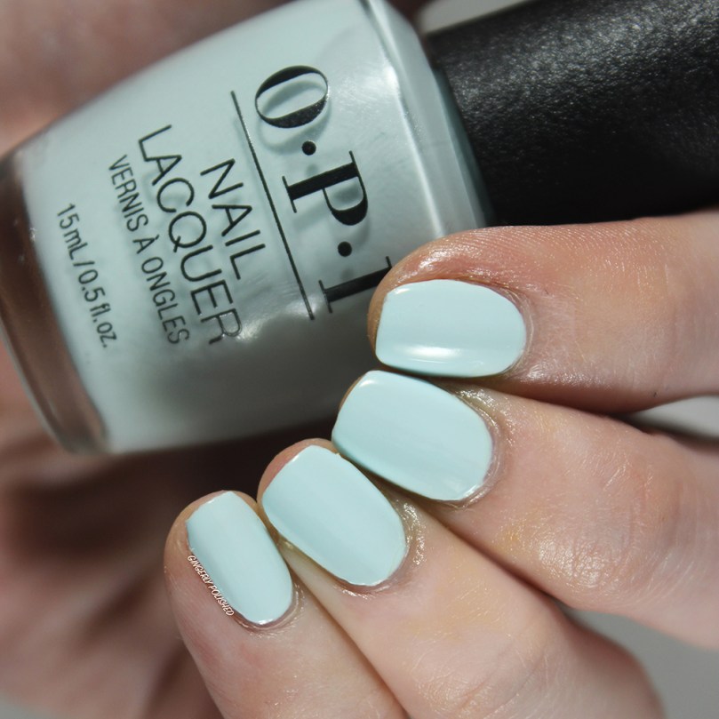
‘Mexico City Move-Mint’ is a super light sky blue that leans slightly more green toned. This was another super light white-based shade, so it did have a streaky 1st coat. And a broken record here – for most people with smoother nails this will be an easy 2 coat formula, however I did a 3rd to cover up the ridges on my nails.
I think it’s perfect for spring, and I’m so glad the formula wasn’t a streaky mess.
***
‘Verde Nice to Meet You’ is a lovely dusty teal shade. I was most excited about this shade when this collection released, and it was even better on the nails. It’s that dustiness and almost muted quality to shades like these that I just can’t get enough of.
This also had a stunning formula and was easily opaque in 2 coats. So smooth and so easy to paint onto the nails! No complaints here!

***
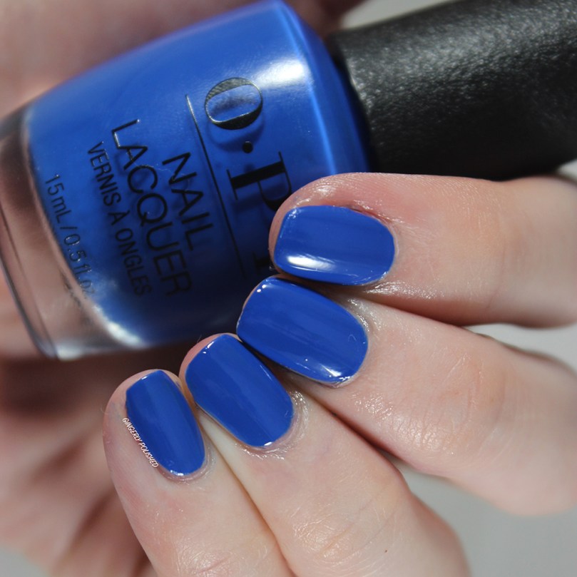
‘Mi Casa Es Blue Casa’ is a saturated cobalt blue cream shade. This was so pigmented and was basically opaque in just 1 thicker coat. Another beautiful formula, and you can just imagine how much I can gush on about this shade.
So nice, and a great color to have in your collection!
***
And we made it to the end! The last shade of the collection is ‘Mariachi Makes My Day’, a deep, more warm-toned purple. It definitely is a purple that has more red in it than blue overall.
This was a pretty pigmented overall, though I did still have some patches after 1 coat. But they were easily covered up and the polish was smooth overall in just 2 easy coats. Another lovely shade.

***
And that’s the first spring collection review of the year! We’re about to dive fully into spring trends and brighter colors (I’m not sure if I’m ready to give up my winter dark shades yet while it’s still so cold here in Chicago. I’ll continue being moody while sprinkling in bright pastels, okay.)
This collection was a solid hit overall for me! Obviously with mostly creams, it might not be the most unique thing if you have a large collection like I do, or if you’re a serial collector of every OPI shade, but I’m always here for a good cream formula. The deeper, more saturated shades had stunning formulas, and were almost opaque in just 1 easy coat. Otherwise I could get most of the others opaque easily in 2 coats. There were some lighter shades that took me 3 coats, but it’s to be expected with shades that go that light.
I loved ‘Mural Mural on the Wall’ with it’s more unique finish that was really successful. I hope OPI continues to experiment like this and give us different formulas and finishes.
I really didn’t have any major complaints with this collection, so you won’t go wrong with any of the shades. I definitely loved a lot of the shades even more once I got them on my nails. As always, it’ll depend on your color preferences and your overall collection! (Don’t worry, I’ll be doing a comparisons post on this very soon so you can see how these relate to previous OPI shades as well as other mainstream polishes.)
********
Upcoming Posts
Nails: Dimension Nails Australian Fire Relief Shades • Orosa Beauty Winter Blues • Sally Hansen New Miracle Gel Shades • Essie Flying Solo Collection • Orly Feel the Beat Spring 2020 collect
Makeup: Wet N Wild The 40 Palette • Revolution Pro All That Glistens • Colourpop Bye Bye Birdie Palette
********
Follow me!
Instagram: @GingerlyPolished
********
Previous OPI Posts
OPI Hello Kitty Holiday 2019 – COMPARISONS
OPI x Hello Kitty Holiday 2019 Collection
OPI Scotland Fall 2019 Collection

Mural Mural on the Wall is so pretty, I love gold flakes and in an orange base? *Swoon* Hue is the Artist and Mexico City Move-mint are the other two calling my name. This whole collection looks so gorgeous together.
LikeLiked by 1 person
I definitely loved it more all swatched out and seeing it all together! It worked together all so well as a full collection!
And those are the 3 shades I definitely loved the most!
LikeLiked by 1 person
There are a few interesting ones 😀
LikeLiked by 1 person