
Just like that, we close out another season of nail polish! In this post, we’ll be looking at the Infinite Shine “bookend” of the Spring release for OPI, and then after that we’ll be getting on into summer and fall!
I blogged about the lacquer half of this set here, but the overall vibe for both of these collections has been about celebrating OPI’s 45th anniversary. And to do that, OPI took inspiration from some of their most iconic shades over the decades and made new polishes to pair with them. I’ve really enjoyed the idea and I’ve been learning so much about OPI history as I pull up each inspiration shade.
I’ll just be copying and pasting the same little description for the Infinite Shine formula that I have in my previous posts about this line!! No need to change it up, it’s all the same important information and thoughts I always have. SO: “The Infinite Shine shades are the ones with the silver caps instead of black, and they run a few dollars more per shade than the regular lacquer. They’re more expensive as OPI claims they’re a long lasting formula that can deliver up to 11 days of “gel-like” wear. These are not gel shades, just gel-like. (If it’s a true gel formula, it’ll be in an opaque bottle as light can cure it). As always, I swatch so often that I can’t fully speak to the longevity. So I’ll be reviewing these shades by color and application, and from there you can make a purchasing decision! In the end you decide what to do with your own money!”: Of course, I’ll also go more in depth on how this affects individual shades as we go through each swatch.
As always you can find these shades at Beyond Polish (along with the lacquer shades as well). If you do shop at Beyond Polish, you can use my code GingerlyPolished for 10% off (I would receive a small commission so no pressure at all). I’ve also purchased from Polish Pick as well.
Now let’s get on into the swatches!
***
We start out with a white, with ‘Kyoto Oyster’. This is a jelly white base filled with a soft, glowing purple shimmer, giving you pearly tone. (If you’ve read any of my previous posts, the order on this one is a little different here! I’ve pulled back on posting on Instagram lately, so I won’t be linking to video posts there, instead having the live swatch video embedded right in these posts. So you’ll see the polish, a description of the color, and then thoughts on the formula with the video below).
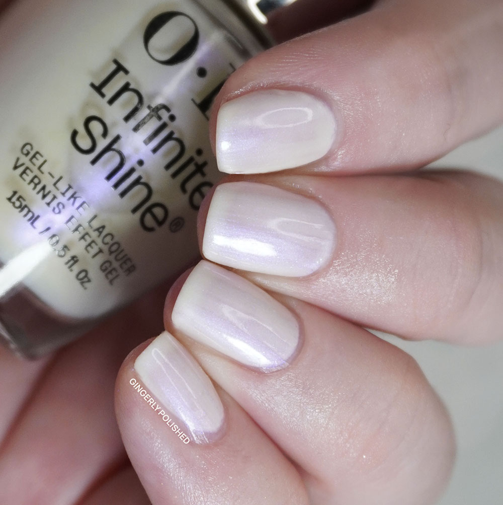
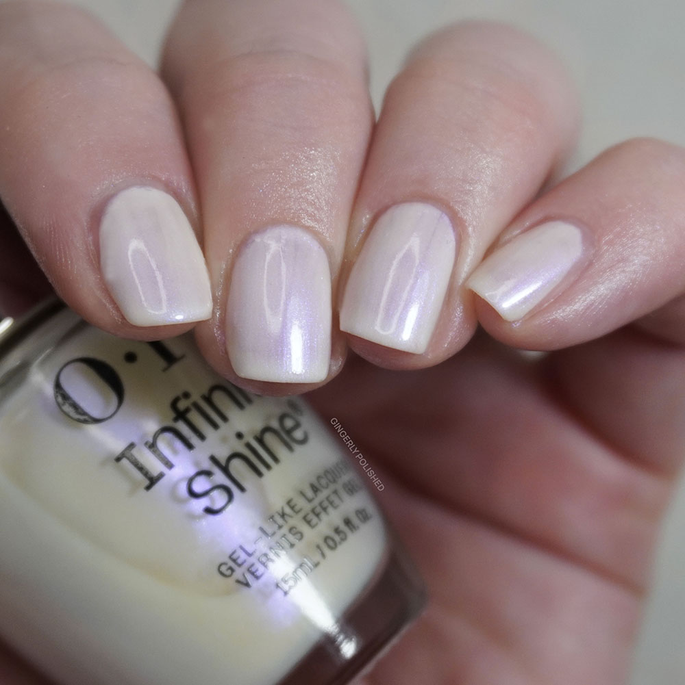
With that jelly base, I did find this to be more uneven with the 1st coat. I did pretty well manage to even it all out with a 3rd thicker coat, but this might be one that feels like too much work on my ridged nails. As always that’s just my own personal experience and those with smoother nails might still enjoy this neutral.
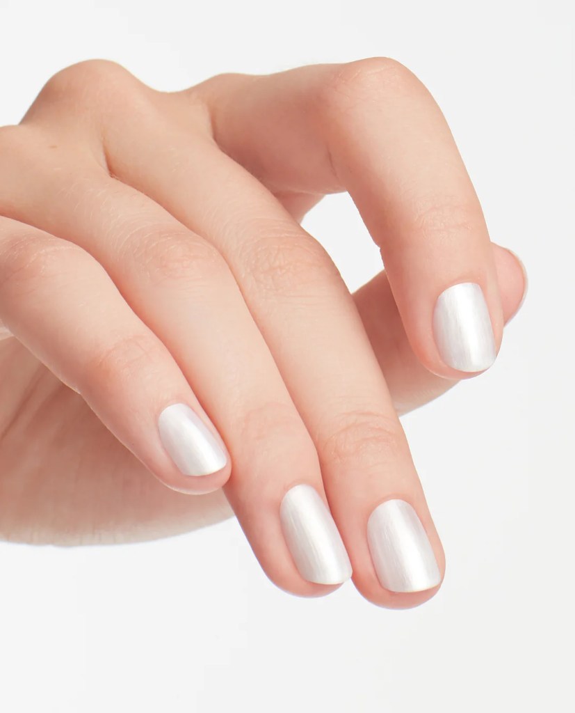
The inspiration for this one, ‘Kyoto Pearl’, is a TRUE icon as it released with 29 other polishes in OPI’s nail polish launch collection way back in 1989. (Once again I referenced this nice little blog post from The Polished Garden which lists out all of the OPI collections and their included polishes.) As you can see and imagine, ‘Kyoto Pearl’ is of course, a true pearly white shade, but more opaque and almost silvery compared to ‘Oyster’. ‘Kyoto Oyster’ gives more of that “inside of an oyster” finish instead, having that bright purple-pink shimmery flash to it.
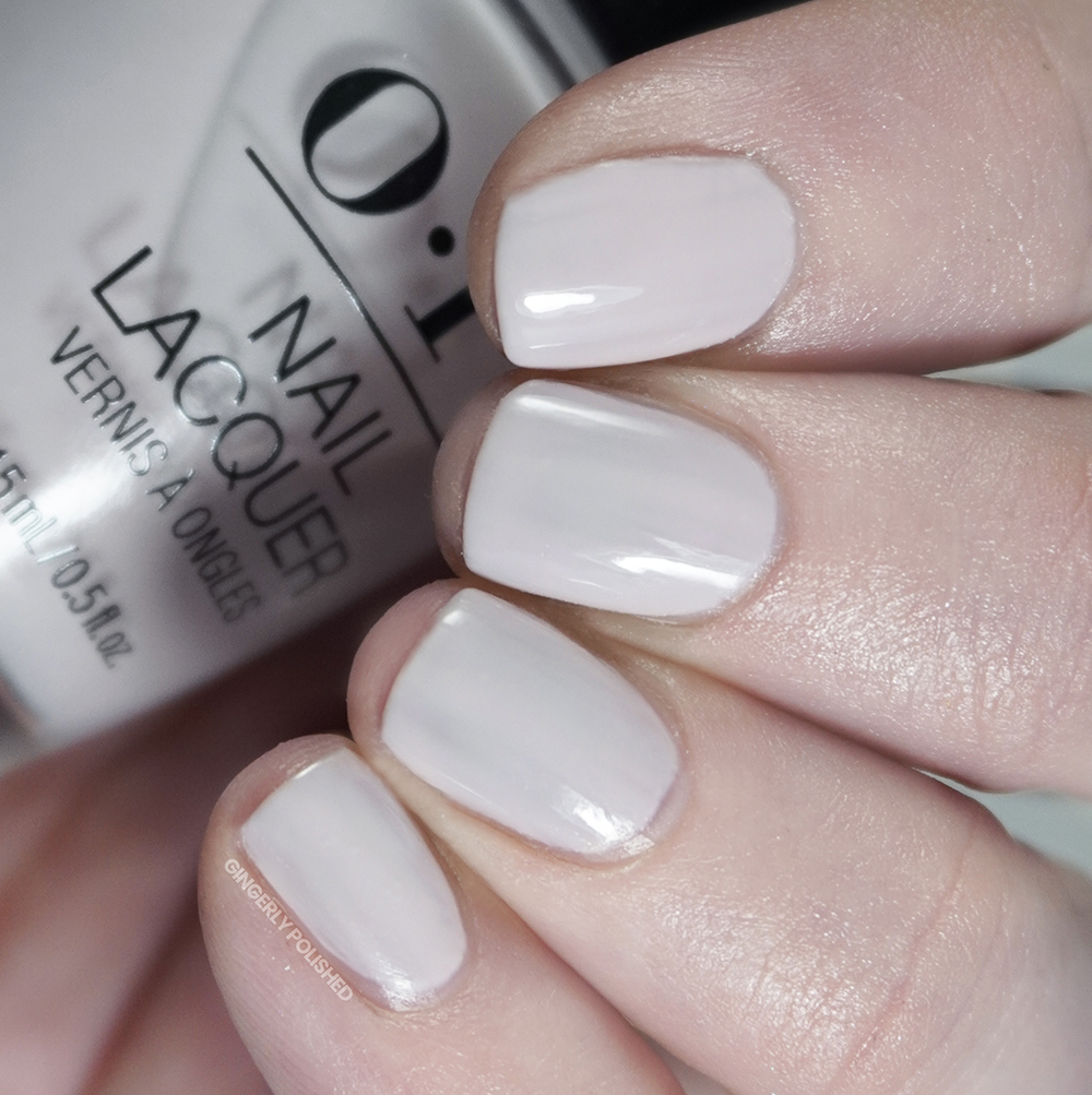
As always, I’m to overload you with as much information about each color as I can, so I’m also going to compare the Infinite Shine colors to any shades from the regular lacquer release that match up. So here we have ‘OPI’m a Bubble Bunny’, but that lacquer is instead a cream finish. I didn’t love either of these formulas, as those lighter more sheer whites can be a little messy on my ridged nails.
***
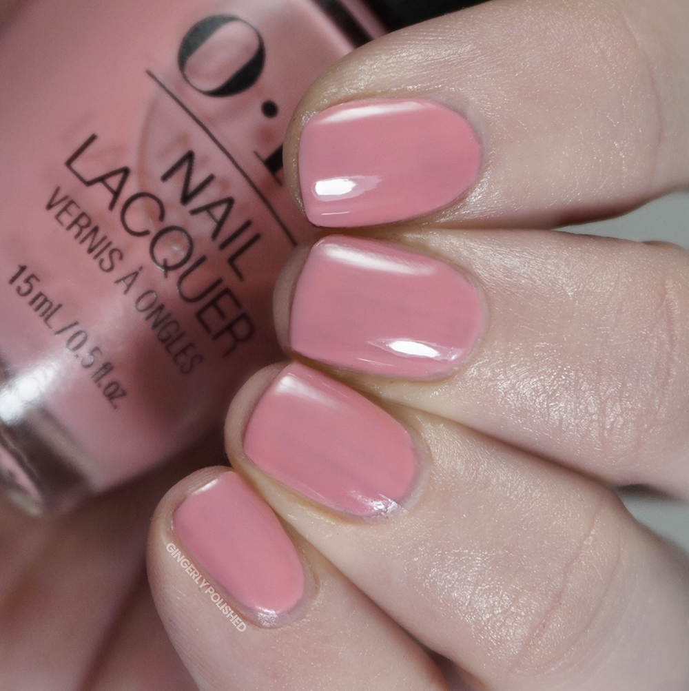
Next up we have ‘Passion-ista’. This is a brighter classic bubblegum pink cream shade. It’s pulling more warm on my nails, so it could be a little shifty depending on your undertones. And I will say the Infinite Shine formula does truly bring out the shine for these cream finishes.
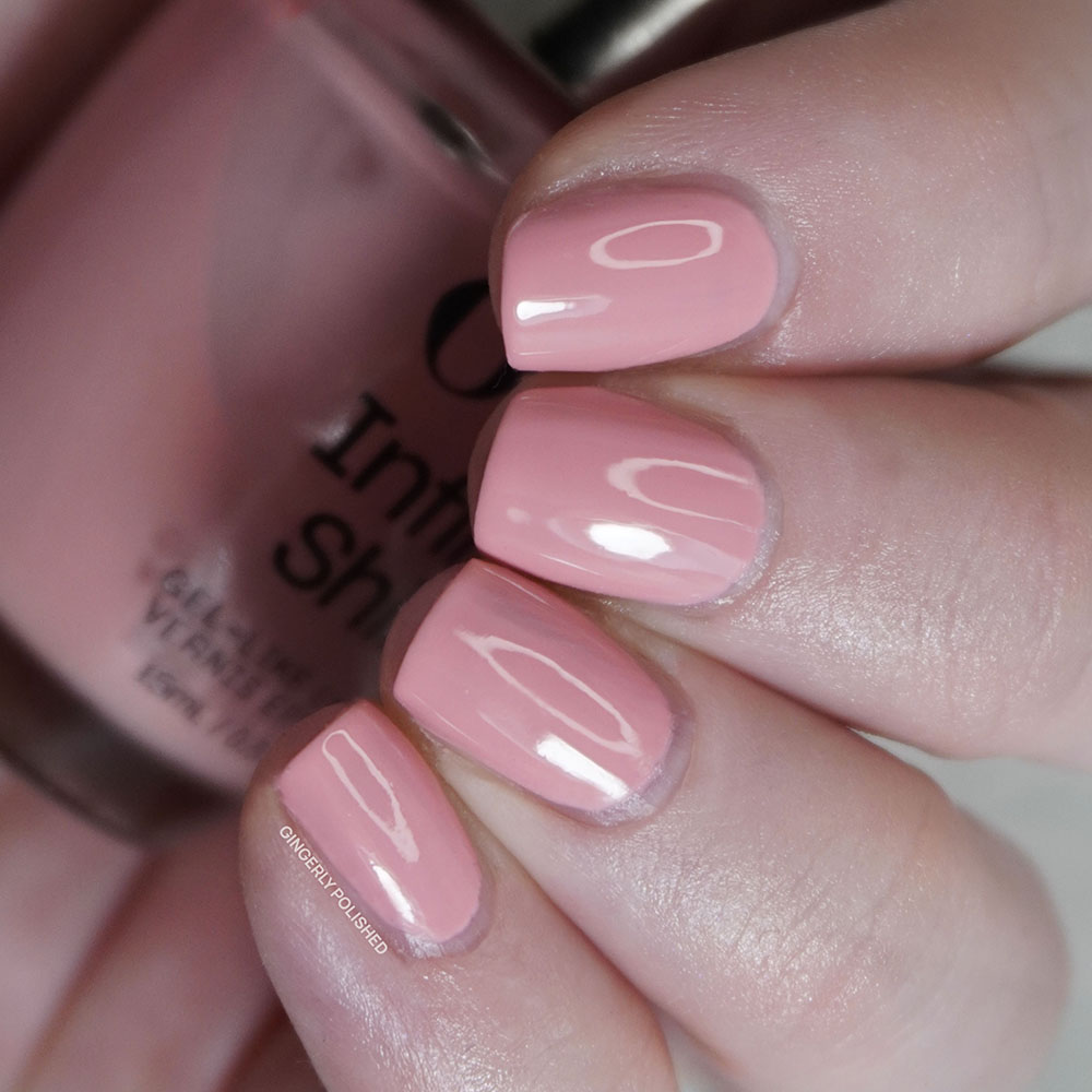
I noted this above, but it might be something about that Infinite Shine addition to the formula that made these creams hard to work with. They feel like they have this drop of jelly to them, which adds squish and sheerness to it and so because of this it’s harder to get them even and level on my ridged nails. I built this shade up with thicker coats to try to remedy this and just ended up with a thicker, almost goopy feeling final finish. Overall, it was just not my favorite, and I have other shades like this from OPI that I like better.
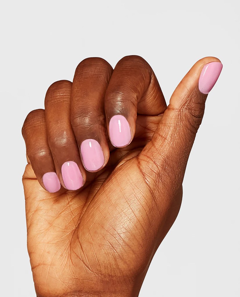
For the inspiration, we’re looking at ‘Passion’, which first appeared in 2004. It was part of a 6 bottle soft shades collection called ‘Sheerly Provocative’, which was, as you can imagine, filled with more sheer shades. The inspiration is much more soft in color and sheer, while ‘Passion-ista’ adds more PASSION with a brighter, more punchy color and opacity.
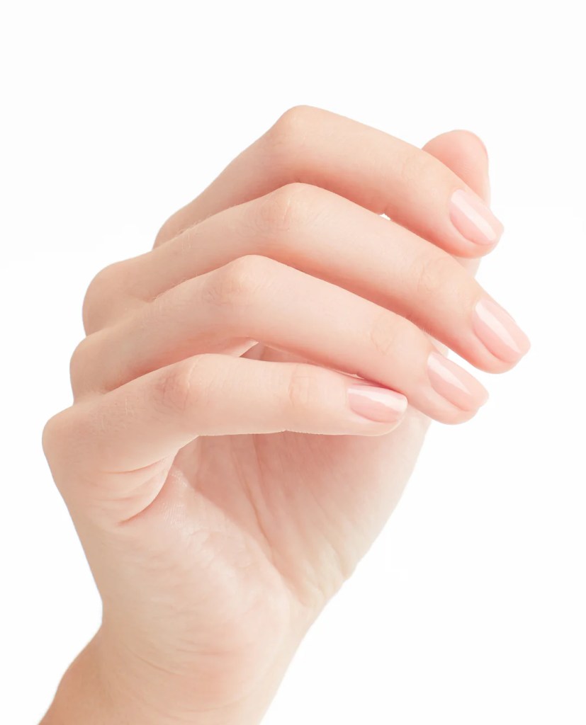
For the comparison, we do have a very similar shade from the lacquer release – it can feel almost repetitive to have both of these shades for one season but they do have different finishes. ‘Bathtime Bubbly’ is more sheer and less shiny, but spoiler alert, I didn’t love the formula for that one either. The beginning of this collection starts out a little rough for my poor little ridged nails.
***
But don’t worry, now we get to a shade I enjoy! In fact I put this one on as a full manicure and have been wearing it for a couple days! This shade is called ‘Good Nighty Aphrodite’ and it’s a lovely warm toned pink jelly base filled with a glowing bright purple shimmer. It’s soft yet almost bright and warm all at the same time. It was more unsuspecting in the bottle, and so it surprised me with how much I liked it once on the nails.
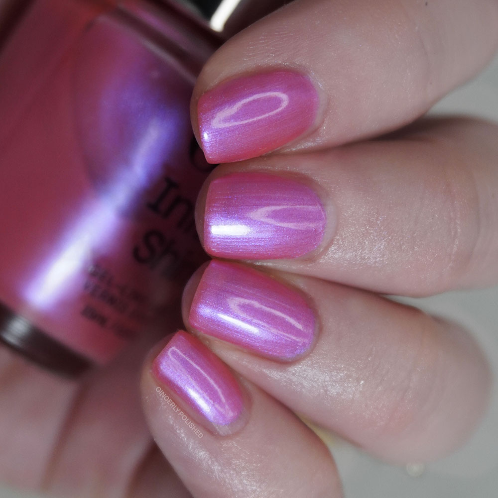
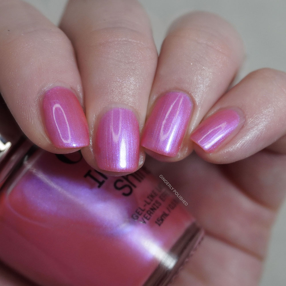
And you can imagine my like of this polish also comes from a lovely formula. It might be something about the shimmer, but even though it had a jelly base I found it to be much more even in each coat of application than just a plain cream. With smoother nails this could be one that you can wear at any level of opacity, but I was able to get it fully opaque and smooth with 3 coats. The shimmer can look a little streaky on first application, but it all levels and smooths out as it dries. So don’t worry, we got a win.
The inspiration for this one comes from the ‘Greek Isles’ Spring collection of 2004, being called ‘Aphrodite’s Pink Nightie’. It’s a fun little name that I had heard of before, but I hadn’t ever actually owned the nail polish before. Now if this is the so called ‘Pink Nightie’ that Aphrodite herself is wearing, it might be a little SHEER (sorry I thought of that joke and had to follow through). Our new polish ‘Good Nighty’ once again amps up the pigment in comparison and gives more of a glow.
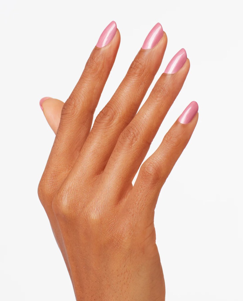
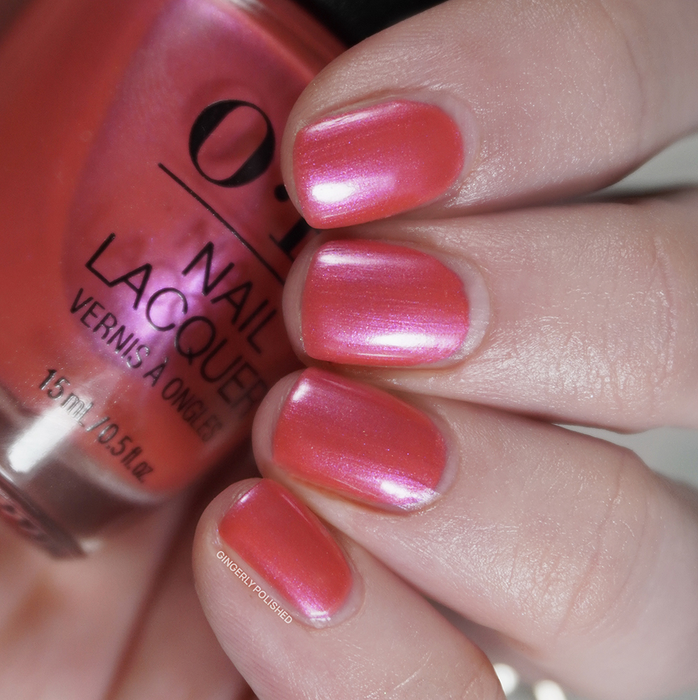
This is the first pair of polishes I’m comparing that are more than slightly different between the lacquer and Infinite Shine releases, but I still like to show them next to each other. For our lacquer side, we have ‘Pompeii Pink’ which is much warmer and more coral leaning. And on the right, you can really see how cool toned ‘Good Nighty Aphrodite’ leans when put next to it.
***
When I saw this shade in the bottle next to ‘Good Nighty Aphrodite’, it almost seemed like too much overlap to have in one 12 piece collection. After all there are so many polishes to choose from after 45 years, but alas I’m not within the mind of OPI. This shade is ‘I’m Not Really an Influencer’ and on the nails it does look more different, with different finishes, so you can choose which pink hits your fancy. This one does have a deeper, almost more fuchsia pink base and instead has a scattered flakey silver shimmer all throughout.
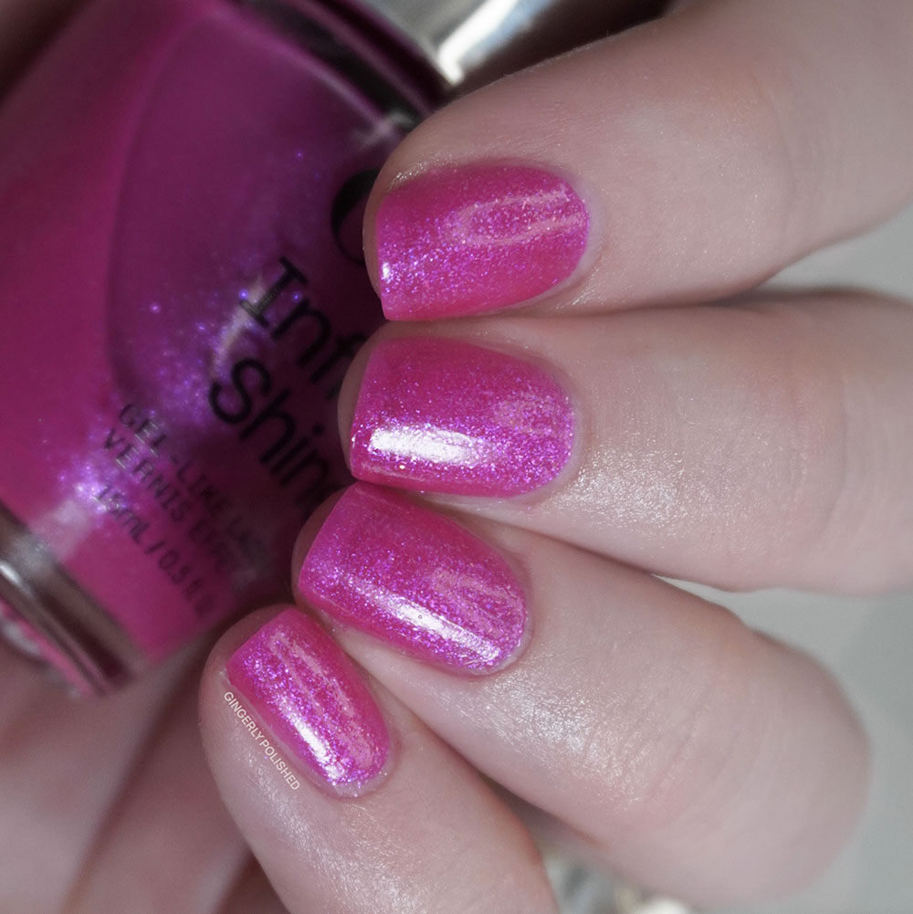
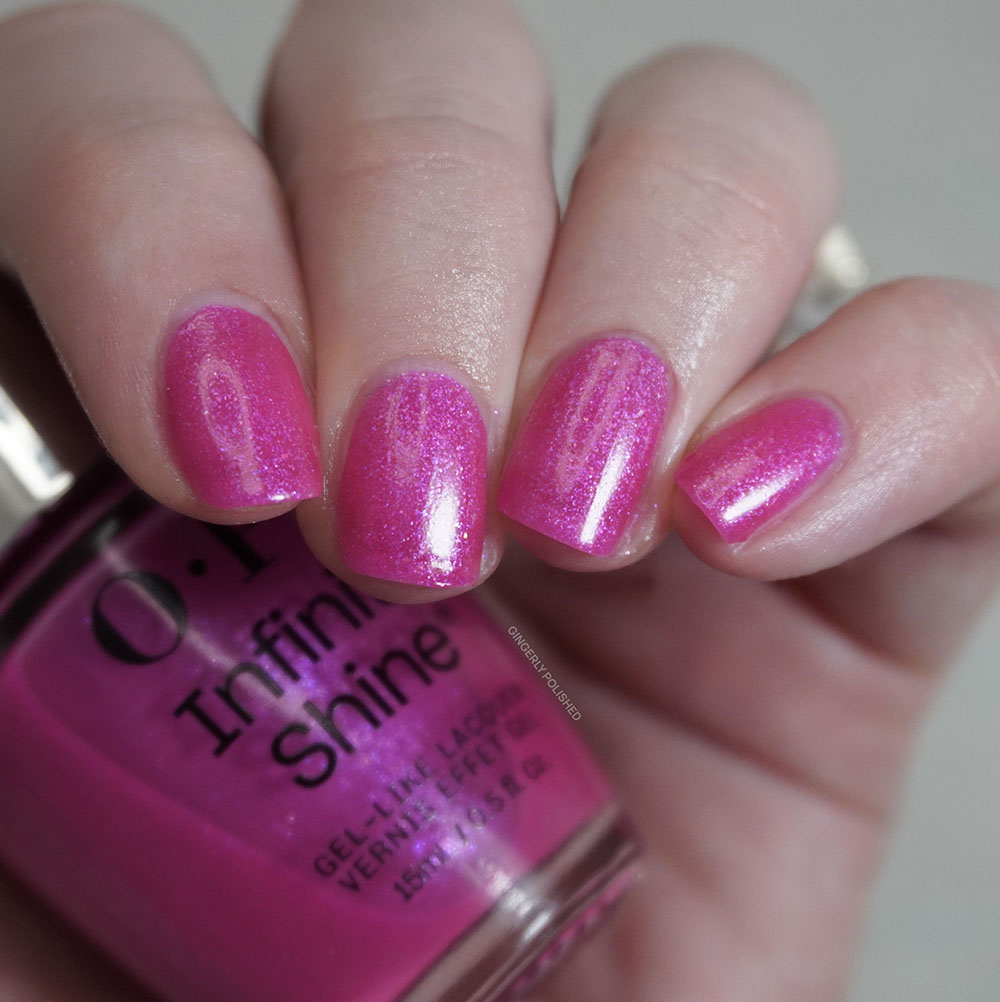
Again it’s a more sheer base but with a little more pigment than previous ones so I found it was more opaque and easier to build up. There were some uneven moments in the 1st coats but a 3rd evens it all out and finishes out the bright look. This is a shade that’ll be lovely for summer as well!
If you haven’t recognized already, this shade is another addition to the ‘I’m Not Really a Waitress’ family. ‘I’m Not Really a Waitress’ came out in the 1999 Fall/Winter Hollywood collection, and founder Suzi has said that shade and name are an “homage to anyone labouring for a dream”. It’s become one of OPI’s truly iconic names, with Suzi’s book being named after it as well. The next shade, ‘I’m Really An Actress” then came in the Hollywood collection from Spring 2021. This 3rd member truly departs from that red of the inspiration shade and maybe I would’ve loved a little trio of reds, but alas we’ll take a nice shimmery pink.
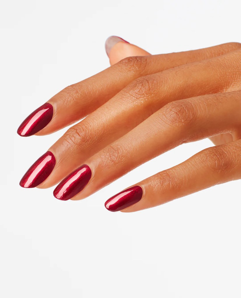
I didn’t have a similar shade from the lacquer collection, so instead I wanted to show you the two similar IS shades right next to each other to help show the comparison. Again, I know these have different finishes and shimmer overall, so maybe they’re not TOO similar.
***
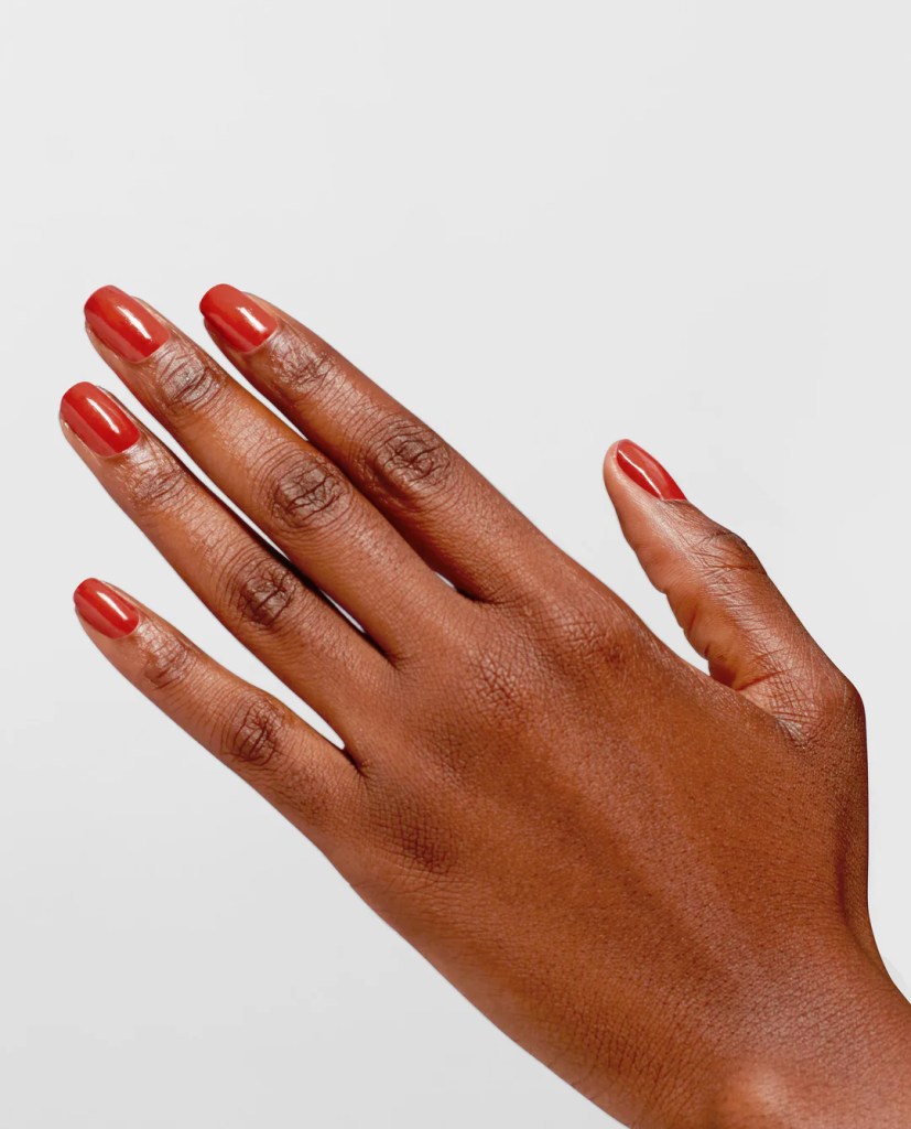
Next up is ‘Shock ‘Em Orange’. A very bright, shocking orange, one might say. This is, of course, a bright red-orange jelly base filled with a bright almost golden glass fleck shimmer. Once again, I’ll give it to them, these Infinite Shine shades do dry with a wonderful amount of shine.
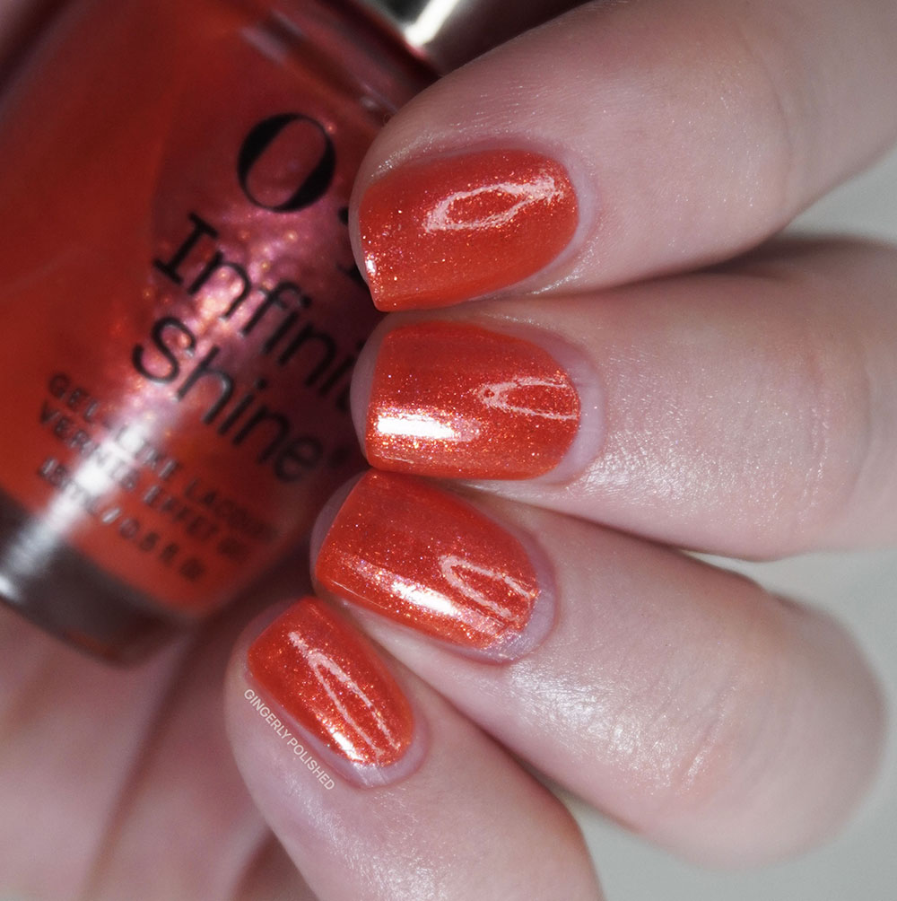
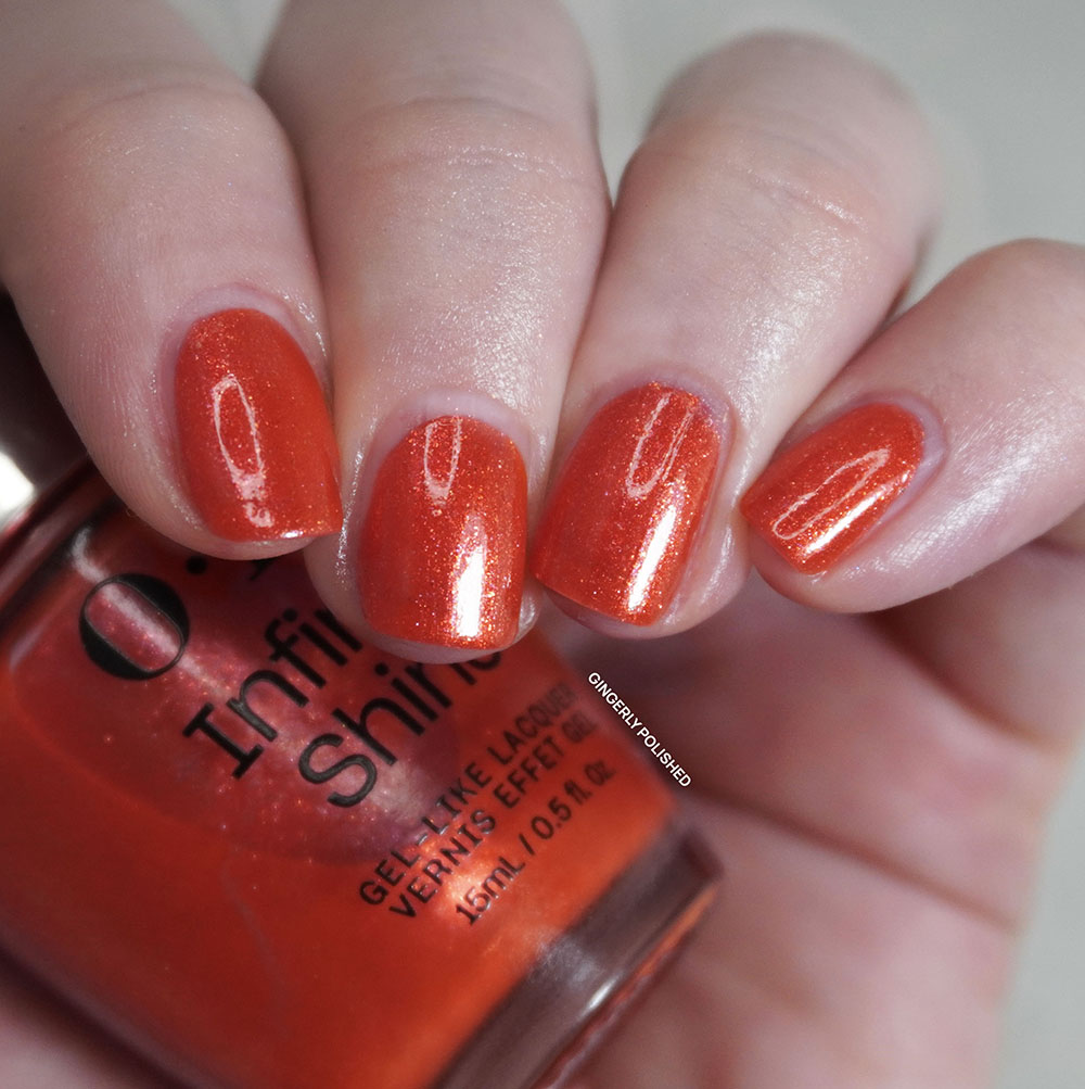
This one is a touch sheer, feeling like the formula of ‘I’m Not Really an Influencer above’. It was pretty well opaque with just 2 coats, though I did notice a tiny bit of sheerness at the end of my nail that I would added a 3rd to further build on. It’s smooth to paint on and it’s another lovely spring shade.
‘Shock ‘Em Orange’ is inspired by ‘Knock ‘Em Red’ and listen, I do love this pair together, both in names and nail colors. Unfortunately I wasn’t able to find much about ‘Knock ‘Em Red’ so if you know more I would love to hear! It is also a more orange toned shade, but ‘Shock ‘Em Orange’ truly amps up the color and makes it even brighter on the nails.
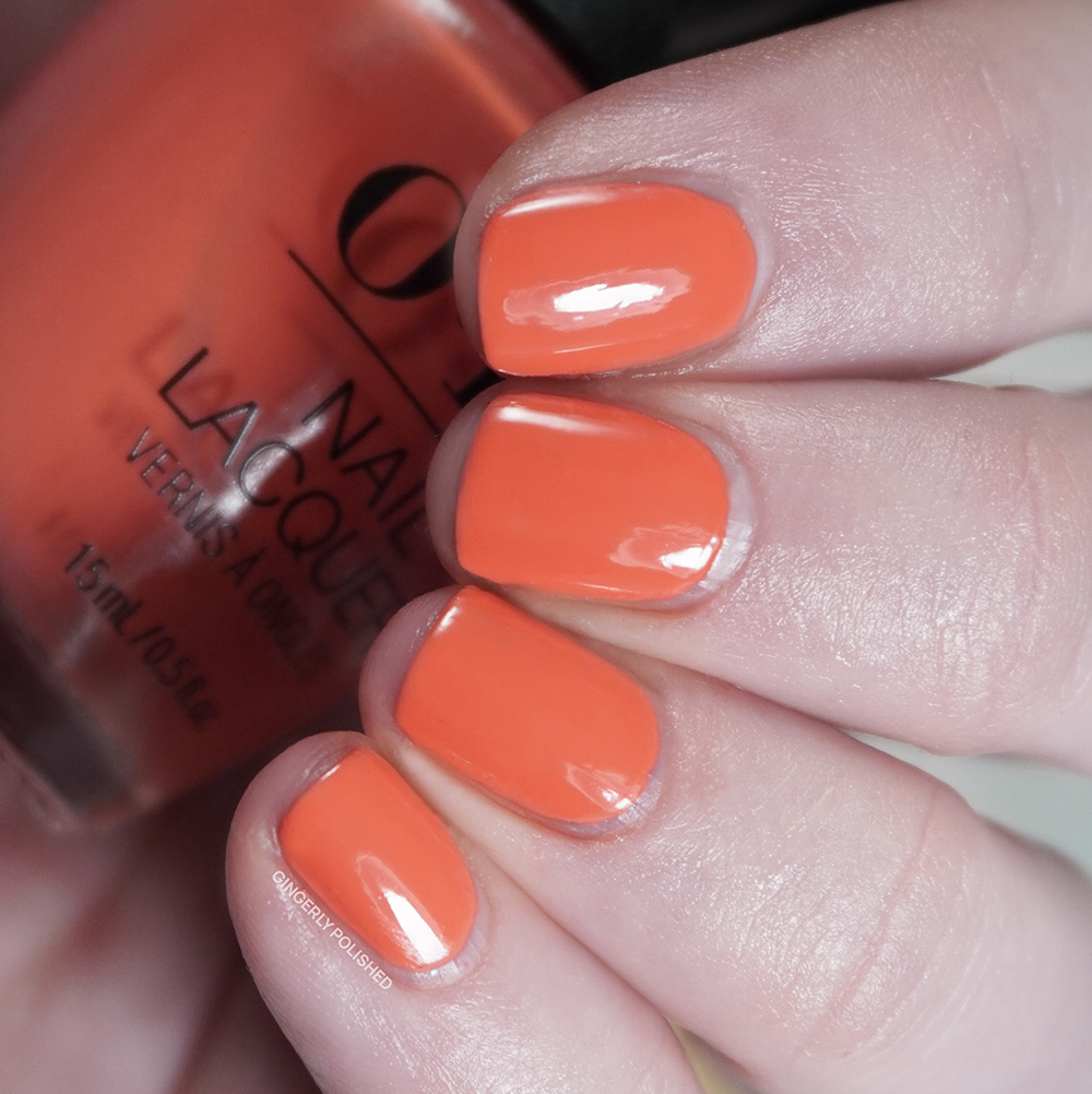
For our lacquer comparison, we have an orange in each set, but they’re very different, with ‘Shrimp Cocktail’ being a bright, coral toned peachy orange cream.
***
‘Dulce de Latte’ is a warm toned peachy neutral cream shade. This one does pull very warm and it might not be the best on my cooler undertones, but I can’t ever resist any sort of peach (okay maybe the formula on this one will push me away, spoilers).
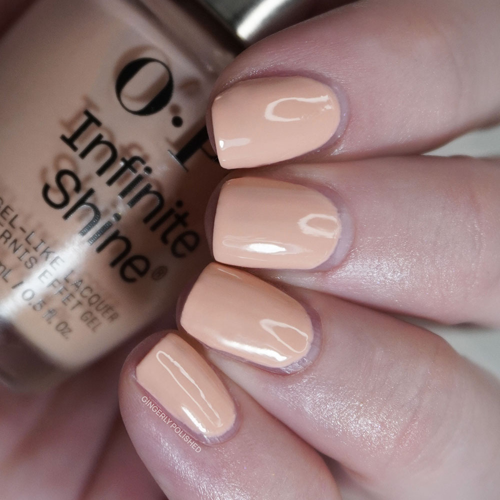
Now I enjoyed the color, but man, these Infinite Shine creams are giving me more trouble than OPI’s normal cream formula, and they’re not earning their extra price. You can see I used 3 coats here, and even with a thicker 3rd coat it was still uneven and just wouldn’t level and felt goopy on my nails – just like ‘Passion-ista’. Just a pass here even if I love the color.
Our inspiration is another tasty little treat, ‘Dulce de Leche’, and it makes sense that it came from the South America collection that released for Spring/Summer of 2002. That shade is much more cool and almost rosy toned on the nails.

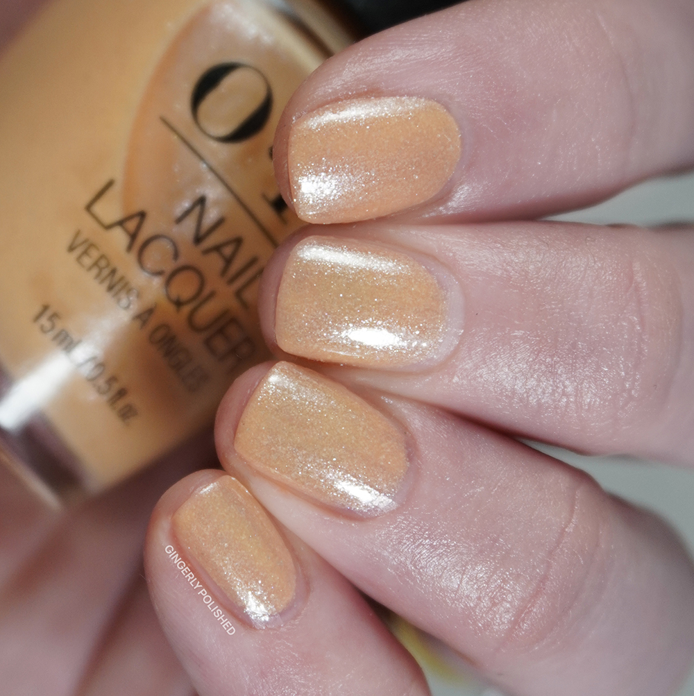
Once again our comparison features 2 very different shades, but I always like to show the same color families so you can choose the vibe you’re more into. I was surprised at how much I ended up loving ‘Queens Rule’ on the left, as it was sheer but even and gave a lovely little subtle nail look.
***
Oh Baby! No that’s not just an exclamation over a friend’s new child, it’s also the name of this next polish (that was bad I’m sorry). ‘Oh Baby!’ is a warmer toned almost yellowy green cream shade.
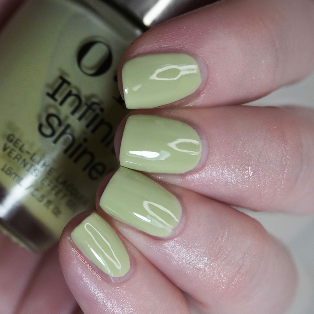
I don’t like when I have to CONTINUE to be a negative Nancy in as post. I promise I normally enjoy OPI’s cream formulas, but again something about these Infinite Shine creams were just HASSLING me. This shade was once again uneven and was skipping with each new coat and just look at how uneven the final finish is on the nails. Oh baby? More like OH BROTHER. (I’m so sorry, there was something about this specific shade name that had me on one).
Now this shade is a lovely little combination (compromise?) of inpsiration shades. ‘It’s a Girl’ was birthed (sorry) in 2010 in a pink soft shades collection, while ‘It’s a Boy’ came along in 2016. So it’s nice that in the year 2026, we finally have a shade for the nonbinary baby in your life.
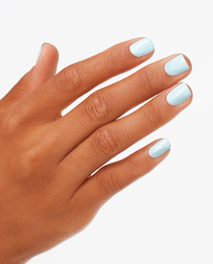
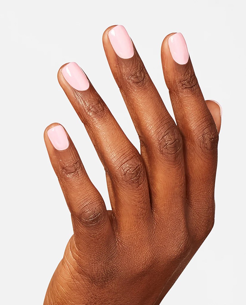
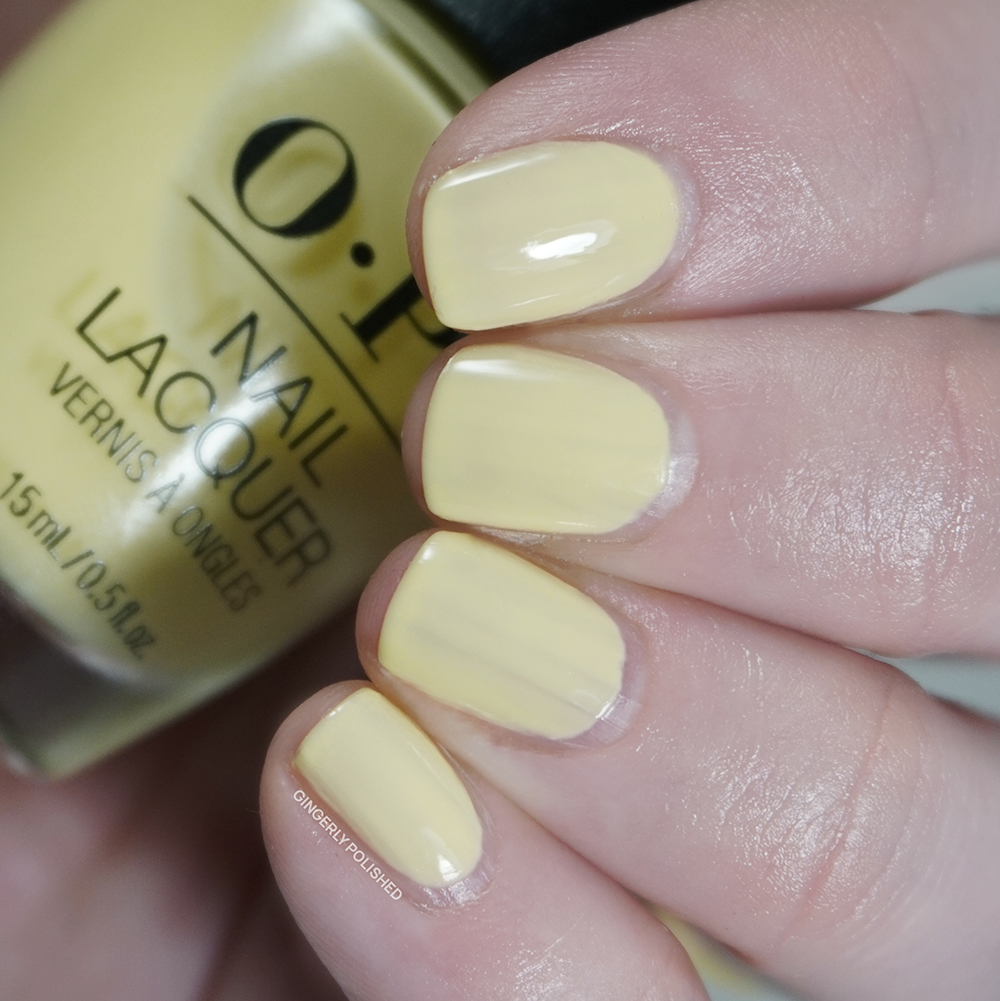
We didn’t have any greens in the lacquer release, but we did have a disappointing formula in a yellow. ‘Sunny Bunny’ is the sheer daisy yellow version of ‘Funny Bunny’ and listen if you have smoother nails, you’ll probably be like “why are you complaining about either of these shades, they’re fine?”. It’s because these ridged nails mess up polishes and it’s the burden I have to carry. Someone has to hold it down. Maybe I wanted to pair these up as “my disappointing children”.
***
We move right along to ‘Big Apple Green’, and yes, let’s escape to the city. This is a BRIGHT and vibrant blue toned green. It almost wants to pull on over into a teal, but next to a blue you’ll really see how green it still is. At least that shine is gorgeous and really makes this almost look like plastic on the nails (in a good way).
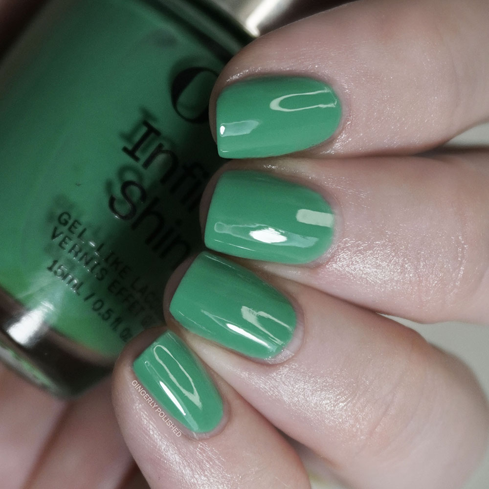
Now with that much color I was expecting a more pigmented formula, but again it must be something with that Infinite Shine addition that makes it more sheer and squishy. I did have some patches after 2 coats, but luckily this one built up better in 3 coats and was a lot more level and smooth on the nails. So not the worst, but I feel like I have some similar shades like this from OPI already that are more opaque.
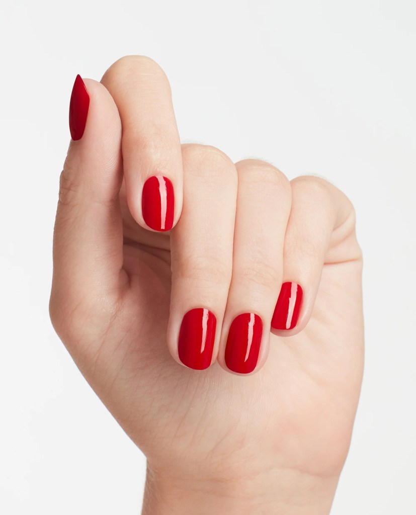
Let’s talk about its inspiration! ‘Big Apple Red’ is an icon for a reason, being a rich sultry cherry red cream shade that released in 2000 in, of course, a New York themed collection. It’s very cool toned, and it feels very New York on the nails. ‘Big Apple Energy’ is a perfect little companion, using that same cherry red base. They say ‘Big Apple Red’ “got off the subway and found it’s bolder half”. I can’t say I had ever associated green with New York, but you do you, Suzi.
***
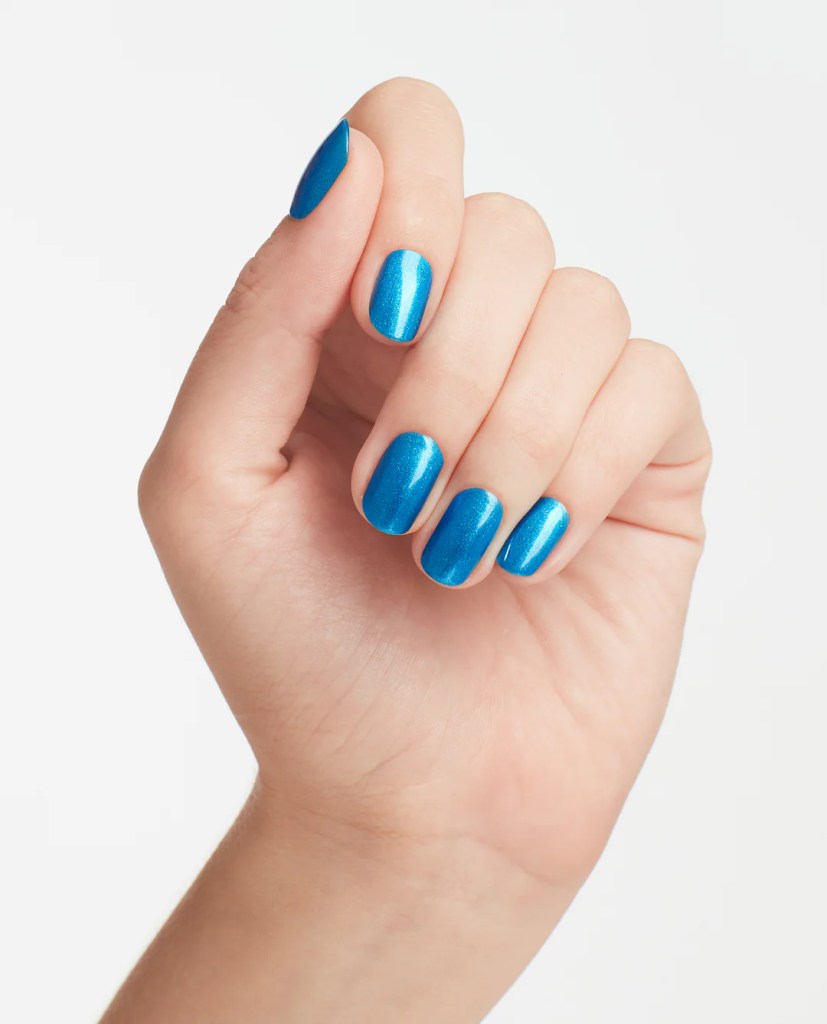
‘Sea Me Now’ is a bright, lighter pale blue jelly base filled with an aqua blue shimmer. Built up on the nails it can almost have a more punchy aqua-green tone to it, and that shimmer just gives it a little something, like shimmering water.
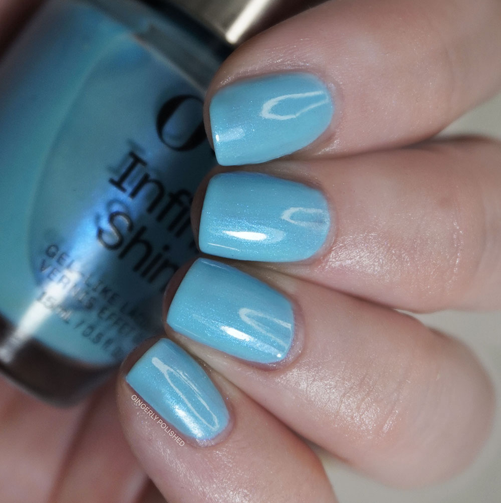
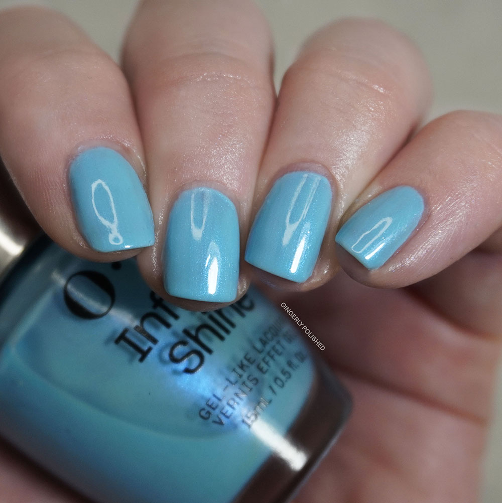
Formula-wise you can again see this one is more sheer and uneven, with patches of color and pigment getting stuck on the nail as I tried to apply. I then worked to float additional coats on as well as I could, but I was still having issues with the polish pulling and creating streaks. If you have smaller or shorter nails, you might not have as many issues but as always I’m just here showing my own personal experience with a shade. So be careful with this one is what I’m saying, maybe not the most friendly waters.
‘Do You Sea What I Sea?’ is our newest “icon” shade, releasing in the Fiji collection from 2017 (though I guess that’s almost TEN years ago already). It also makes these the first pair of shades where I’ve swatched both sides on this blog! Feel free to read about the Fiji collection here and see how far I’ve come since then! That specific collection and photos were taken on the floor of my parent’s house, where I was figuring out swatching in a new place, fresh off graduating college as I figured out my next steps. ‘Do you Sea’ is much deeper and more of a metallic shimmer finish, and this one was swatched up in the condo I bought with my husband and our dog. A sweet little moment down memory lane for me.
***
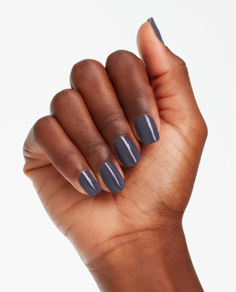
Okay okay okay we’re now onto another shade that I liked so much that I wore as a full mani!! These moments of good formulas kept me going through this collection. This is called ‘Less is More’ and as a collector I have to say actually MORE is more, but fine I guess that’s not what we’re talking about. This is a GORGEOUS dusty blue shade, right in between a blue and purple, which makes it mysterious and hard to fully describe. It’s dusty and muted and will absolutely be in my fall rotation of polishes.
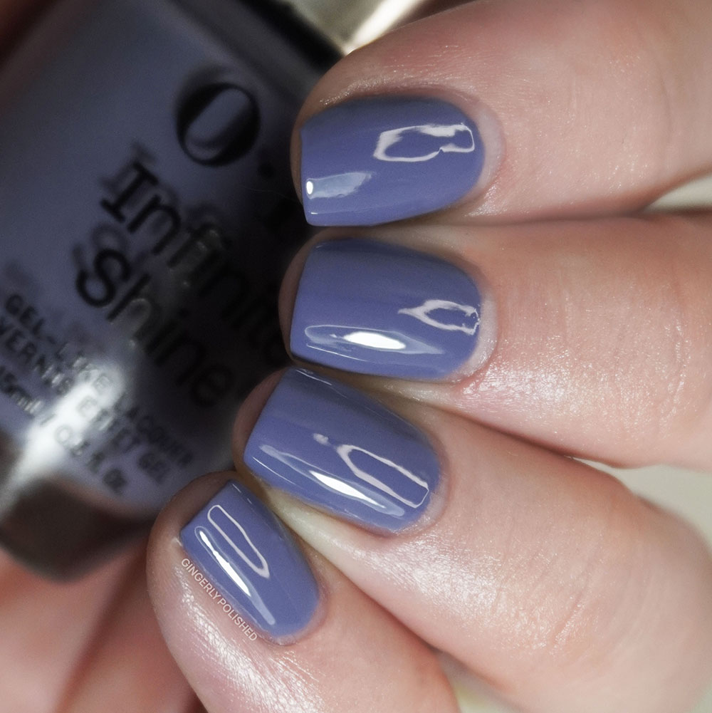
And thank god this formula is GORGEOUS. This is the level of pigment I’ve been expecting from all of the other creams in this set and maybe it’s lighter, white pigments taking those others down. This shade was easily opaque in just 2 coats and it was smooth and lovely, and phew I just needed this, I needed to see it wasn’t just me.
And we have another set of shades where I’ve swatched both! ‘Less is Norse came from the Iceland Fall 2017 collection and it’s one of the only full OPI collections I’ve kept intact as I’ve destashed. By the time this shade released and I swatched up the collection, I had gotten my current job, moved to Chicago and was figuring out lighting in my new lightbox and new apartment. These two shades are very similar and perfect if you’re looking for some moody shades. ‘Less is Norse’ gives us a deeper and more gray toned moment, so thankfully I can clearly keep both of them forever, thank you.
***
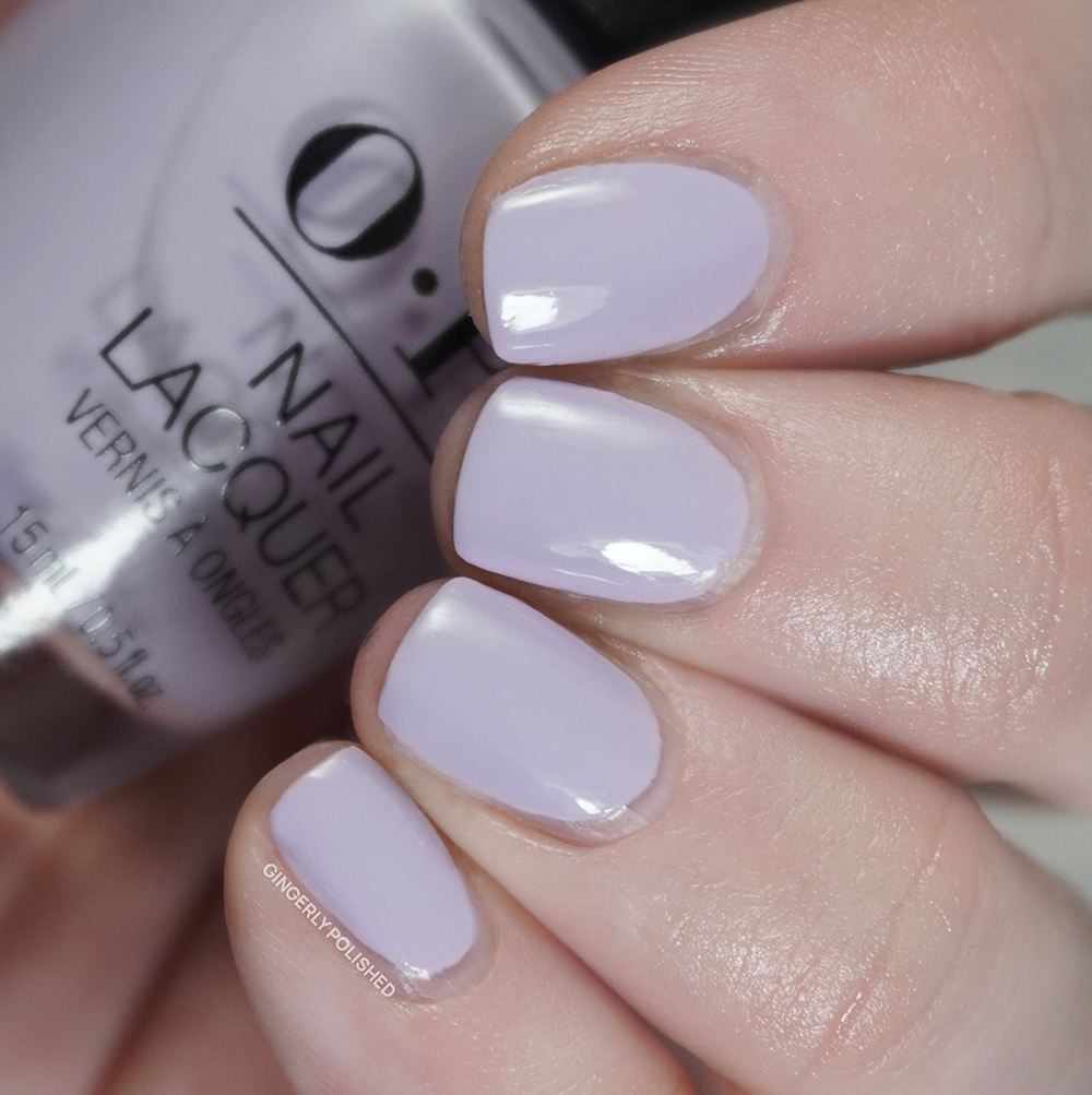
We’re into the home stretch! ‘What’s Not to Lilac?’ is our next shade and as the name might suggest, this is a soft lilac purple shade. I was just about to say it’s warmer but it also has some cooler moments, and some would say the word for that would be neutral. It’s a little more muted and a lovely little purple.
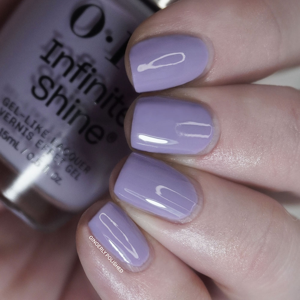
This was another that started out a little rough and uneven and I was prepared to write off yet another cream in this set. Luckily it actually built up well and was fully opaque with 3 coats. I might’ve been able to finish this with a 2nd thicker coat, but it’s another shade that I do recommend floating onto the nail as much as possible, as too much fiddling can pull the polish up and make it uneven. It’s not as bad for a lighter shade, and seems to be the least finicky of the bunch.
‘Do You Lilac It?’, our icon, came from a Brights collection in 2005 that released with a whopping 24 shades at once! These two are very similar, but ‘Do You Lilac It?’ seems to be a little brighter with more pinky tones (OPI’s swatch isn’t quite doing that part justice) while ‘What’s Not to Lilac?’ has some dustier tones to it.
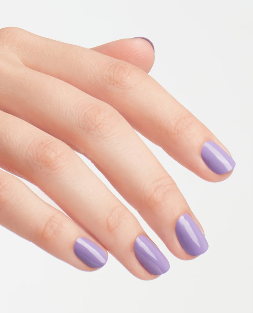
We have another set of shades to compare from the two sets, but again they’re not too similar. ‘Mod About Me’ is a softer, more pastel purple that had also scared me at first with formula but came through to full opacity in 3 coats. So we have 2 separate little purple moods to choose from.
***
Last but certainly not least we finish out the set with ‘Lavender Bath’. This is a white based cream shade and as the name implies, it has just the tiniest drop of pinky-purple to it, adding some softness that keeps it from being a stark white on the nails.
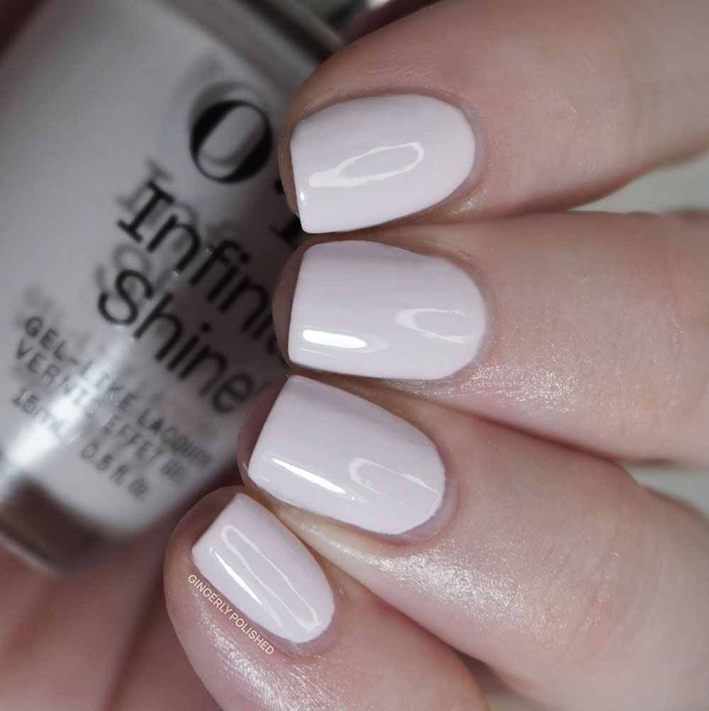
This one had a more sheer first coat, but look at that pigment and how it builds up with the next coats!! This is all I was asking for with the other cream formulas, so what’s the explanation now for why those were meh, huh OPI? Anyways, like I said it builds up in 2-3 coats and doesn’t feel goopy and thick on the nails, and I’m just so glad to end on a lovely final note after that rollercoaster.
Our inspiration shade is ‘Lucky Lucky Lavender’, which comes from the Hong Kong collection for Spring 2010. ‘Lucky Lucky Lavender’ has much more lavender to it, being a bright, lighterr pinky shade. ‘Lavender Bath’ sucks out the color, but it’s a fun little neutral. I can’t ever hate too much on a off white shade.
I did mention this shade for the ver first comparison above, but I also wanted to show it next to ‘Lavender Bath’. They’re very similar colors, but ‘OPI’m a Bubble Bunny’ dials back the pigment even more for an even softer finish and more sheer look.
***
And WHEW. Listen, that was quite a the up and down of emotions and formulas for this set, wasn’t it. There were a couple of standouts, being ‘Good Nighty Aphrodite’, ‘I’m Not Really an Influencer’, ‘Shock ‘Em Orange’, ‘Less is More’ and the ending purples. But then we had some creams that were just not hitting the bar. I’m hard on OPI because I’ve been swatching up their shades for 10 years now and I know what they can do, and there was just something off about some of these formulas. Especially for the higher price of Infinite Shine, I’m expecting better and I’m here to help you save money and get better polishes!! We just don’t have time for streaks and uneven creams. I’ve liked previous IS creams, so I really am not sure what happened with the ones in this release, and I’m hoping it’s a one off and not a permanent formula change.
********
Upcoming Posts
OPI Trip to the Brite Side Summer 2026 • Girlcult Peach Festival collection • Holo Taco 7th Anniversary collection • Mooncat Deadly by Nature collection • Cosmic Brushes The Lovers Eyeshadow Palette
********
Follow me!
Instagram: @GingerlyPolished
Pinterest: @GingerlyPolished
Beyond Polish: GINGERLYPOLISHED for 10% off (affiliate code/link)


SPRING?! OMG and I thought it was bad I spied aisle after aisle of Christmas decor in Hobby Lobby over the weekend… 🤣 But seriously – I spy some “musts” here – particularly the darker green – that I just may be adding to my own collection come next Spring! Thanks for a great review and these excellent swatches!
Blessings,
C
LikeLike
Don’t worry we’re actually “behind” in schedule here, we’re catching up 🤣 But that darker green is truly so pretty especially with the shine on it! And thank you for reading!!
LikeLiked by 1 person
Awesome- I can’t wait to see it in person!!!! I have a green polish collection problem – why stop now? 😁
Have a blessed week!
-C
LikeLiked by 1 person
Thank YOU for posting! And I just now realized the year makes this collection a past one. 😂 Can you tell it’s been a week? I guess I am the one who is a bit behind!!!
Have a blessed night!
~C
LikeLiked by 1 person
You’re so good!! I’m hoping to be caught up in the “right” season soon!
LikeLike