
I know, I know. I’m a little late to the game with this, but I’m still posting it. Hey man, it’s my blog isn’t it? I’ll have the summer collection from OPI coming up soon as well!
But for now, let’s stick to spring. As usual this is a 12 piece collection (OPI is how I go bankrupt with these 12 piece collections), full of mostly creams inspired by the tropical island of Fiji. I picked mine up off Ulta’s website when I had a buy one get one free coupon for OPI.
Into the swatches! Comparisons will also be at the bottom! My lighting is a little different on this one too – I’m at my parents house so I went with good ol’ fashioned daylight! But they’re all color accurate.
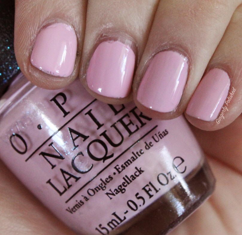
‘Getting Nadi on my Honeymoon’ is a light bubblegum pink cream. This was an easy formula, but it was more sheer. This took me 3 coats, with a thicker coat for the last one. I’m not going to lie, I expected a little more from this one. I know OPI has pinks with a little better formula, and you know, it’s just a pink cream. Maybe you don’t need this one. Oops starting a wee bit negative – but i’m learning how to be more tough! This is better for you guys! ANYWAYS.
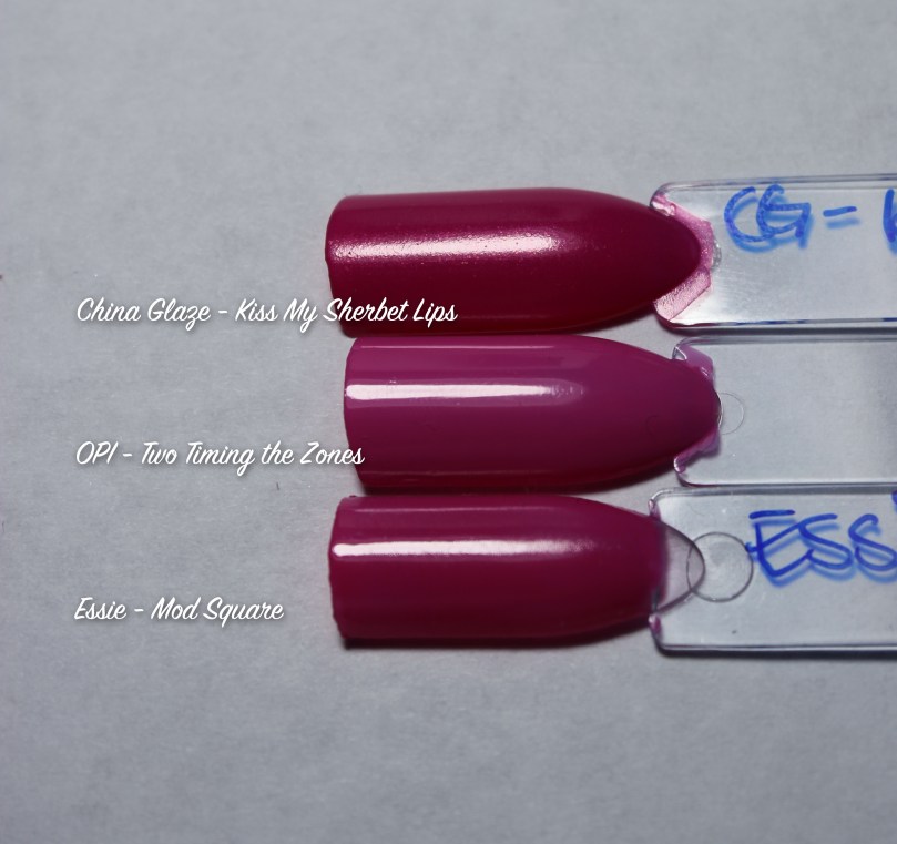
‘Two Timing the Zones’ is a cool toned Barbie pink cream. This was 2 thicker coats. Depending on your application, you can need 3 coats on some nails. But it was a smooth easy to control formula. Nothing groundbreaking.

This is ‘Living on the Bula-Vard’. This is a bright tomato red cream. This was another smooth 2 coat formula. I did do thicker coats, and I found you don’t want to manipulate it too much or else you can cause it to be streaky. So just lay it down and leave it. It’s a bright fun color for the summer!

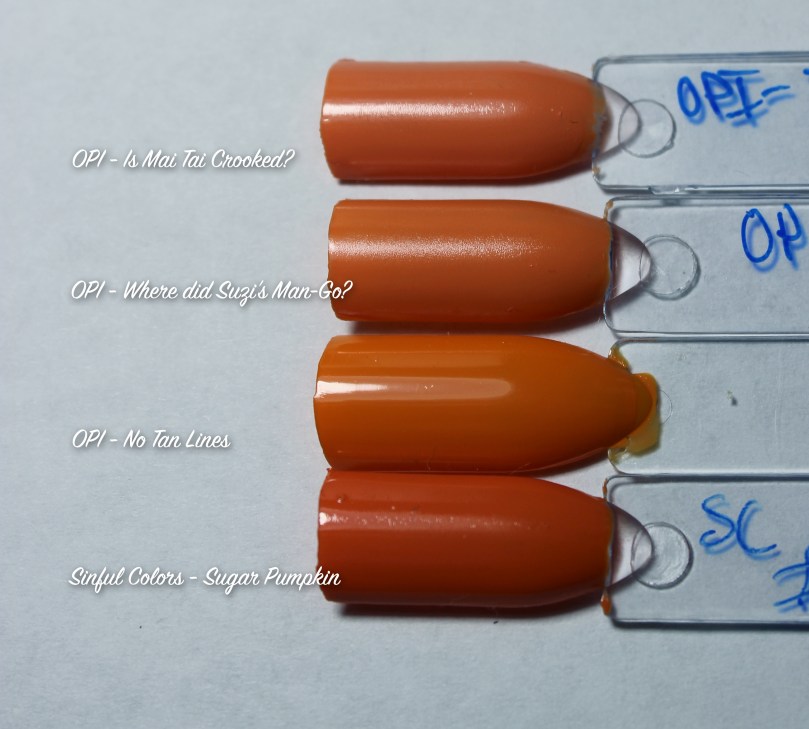
‘No Tan Lines’ is a bright orange cream. It’s like the cheese powder for mac and cheese, you feel me? This was a sheer first coat, but it evened out after 3. Bright oranges are hard, so for this unique color I didn’t mind, and it was an easy formula. Just depends if you want the color and want to have 3 coats.

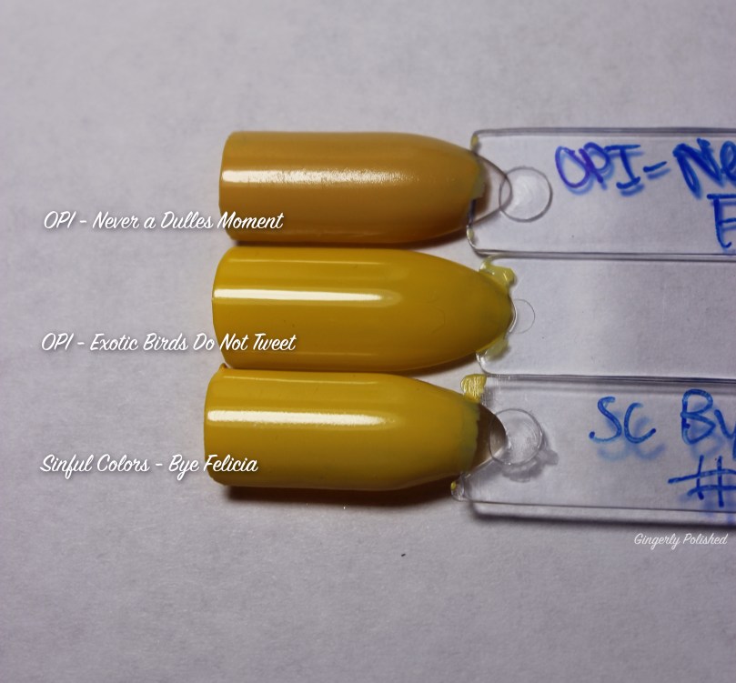
This is ‘Exotic Birds do not Tweet’. And well. You can see it. I wish this was better. I’m always looking for the next great yellow, and well, this wasn’t it. Yellows are hard so I forgive you OPI. This was 3 coats, and still streaky. Unless you’re laying on super thick coats, I don’t think you’ll get the yellow manicure you’re hoping for. So this is a pass. Kudos for trying.

On the complete opposite side of the spectrum, ‘Is That a Spear in Your Pocket?’ a dusty teal cream. Besides a hilarious name, always on that game OPI, this was a beautiful formula. This was an absolute one coater, absolutely stunning. Pass on the yellow, pick this one up instead. Beautiful, smooth, easy to control. I’ll stop gushing.

‘Suzi Without a Paddle’ is another one of the pastel shades. This is a super light sky blue cream. This was a smooth cream formula. This was surprisingly opaque in 2 thicker coats, maybe 3 if they’re thinner. I honestly didn’t think this was a bad formula for a pastel, so if you’re looking for one, pick it up.

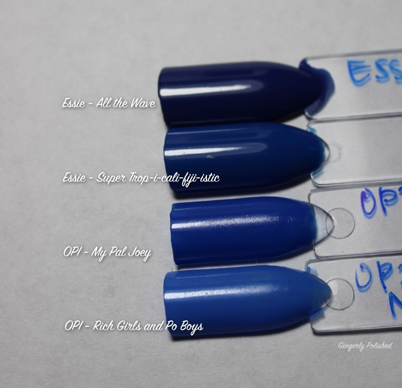
Alright this name is a mess to type, hang on. ‘Super Trop-i-cali-fiji-istic’ oh my god. It’s a bright cobalt blue cream. Another stunning polish and formula. This was another one coat, easy to control formula. 2 just richens up the color and makes it brighter. Love it. Pick this one immediately because you can never have two many bright blues.

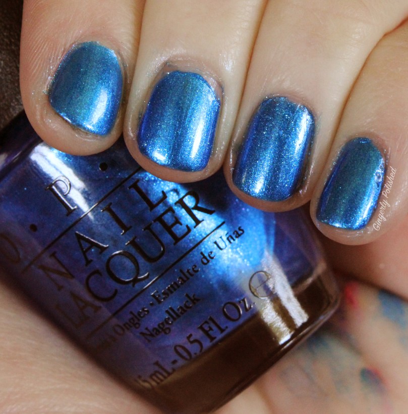
‘Do You Sea what I Sea?’ was an elusive polish for me. I ordered this collection from Ulta when OPI was buy one get one free, and they all arrived in a box together, barely padded. Luckily all survived, except for the original bottle of this polish. That’s right, shimmery blue everywhere. I took it up to my local Ulta store and they had one left that I could trade out. So word of warning when ordering lots of nail polish online at Ulta.
ANYWAYS. After all that I wanted the best out of this polish. And it is a very shiny blue metallic. There’s no brush strokes and it was an easy 2 coats. But maybe I was expecting more brightness and dimension? Am I asking for too much? Does anyone else get this? I mean, it’s still beautiful. Lovely formula. If you love it, get it. That’s all I’m going to ramble on about.
‘Polly Want a Lacquer?’ is a lilac cream. It’s a thinner formula, so it can flood the cuticles if you apply too much at once. Although it was thinner, it wasn’t streaky. So it evened out in 2-3 coats. It was honestly a beautiful color and not terrible formula! If you’re looking for a lilac this is a good option!

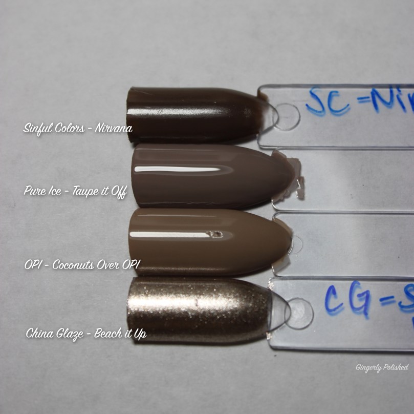
‘Coconuts Over OPI’ is a lovely nude beige cream. This was another thinner formula, but it did dry very fast, so doing 3 coats to even it out was very easy and quick. This was also another one to float on the nail. If you manipulate it too much, you can get streaks in it. But it’s a lovely nude shade. One of my favorites really, even with needing 3 coats.

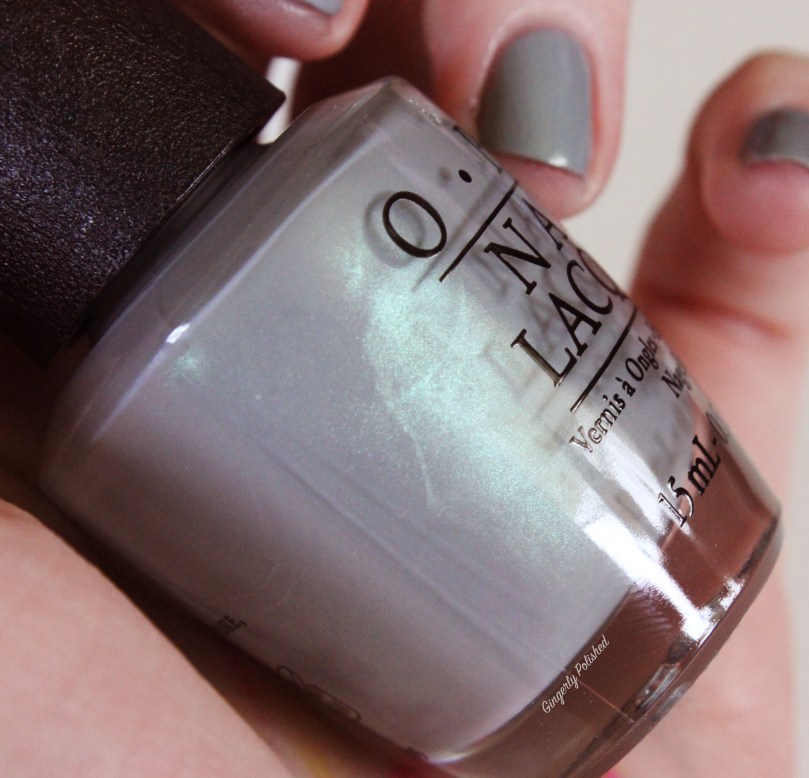
And finally what might be my favorite of the whole collection, ‘I Can Never Hut Up’. This is a beautiful light gray cream with green shimmer. The shimmer isn’t super apparent on the nail, but it does give a nice little green tone to the gray that’s so unique. This was opaque in just 2 easy coats. Absolutely stunning – if you only pick up one polish from this collection, make it this one – for the unique color and beautiful formula.


FINAL THOUGHTS: So there’s your OPI Spring collection (FINALLY)! It’s mainly all creams, and as you can see it’s a full rainbow of colors. There’s definitely some hits and misses in it. I’m going to be honest, it felt like a really average collection to me. (I’M SORRY OPI). But of course they’re still my favorite brand, and I’ll continue buying all their new polishes.
But it wasn’t all fails – if you only pick up 3 from this collection, make it ‘Is That a Spear in Your Pocket?’ (teal), ‘Super Tropi-cali-blah-blah’ bright cobalt blue, and ‘I Can Never Hut Up’ (beautiful gray). The others are all on a ‘if you want that specific color and can deal with whatever formula’ basis really.
And if you want to see how these colors compare to others keep reading! There are comparisons below!
‘Getting Nadi on my Honeymoon’ – it’s a touch more cool-toned than other light pinks I have.

‘Two Timing the Zones’ – a little bit lighter, and almost has a touch more purple to it than other shades.
Hard to capture it correctly but ‘Living on the Bula-Vard’ has more orange to it than others! Surprisingly I don’t have too many reds to compare it to.

‘No Tan Lines’ has more yellow in it, and is brighter than other orange shades I have.
Very close to a shade from Sinful Colors, and I did like the formula of the Sinful Colors shade a little more. ‘Never a Dulles Moment’ from the fall collection is dustier, in case you’re wondering.
No dupes here! So excited to have this shade in my collection! (I wonder how it compares to OPI’s ‘C.I.A’ shade from their fall collection… which I don’t have unfortunately).

Next to my other light blue shades, ‘Suzi Without a Paddle’ is almost pulling a touch more green, and lighter.

Who doesn’t need more cobalt blues?
Very close to ‘Blue Bayou’ from Sinful Colors – however, ‘Do You Sea What I Sea?’ is a little deeper, and seems more opaque in formula.

Surprisingly I don’t have many lilac shades! This was the closest comparison I had!

I definitely need more browns in my life.
Last but not least, ‘Moss Have It’ from Sinful Colors has that same green tone, but is not a cream. Such a unique shade!

And that’s the end of the longest post ever! Enjoy your OPI Spring 2017 collection! Stay tuned for more!
Follow me!
Instagram: @GingerlyPolished
Twitter: @GingerlyPolish
Pinterest.com/GingerlyPolish

“Living on the Bula-Vard” is so eye catching – it would be perfect for pedis!
Haha “Super Trop-i-cali-fiji-istic” is just so ridiculous name – I do like the shade a lot though!
Ooh your favourite shade “I Can Never Hut Up” is probably my favourite too. It’s so subtle but unique. I’m adding it to my wish list!
Thanks for all the comparison swatches too!
LikeLiked by 1 person
You picked all my favorites! And I always know I want to see comparisons, so I make sure to put them in!
LikeLike