
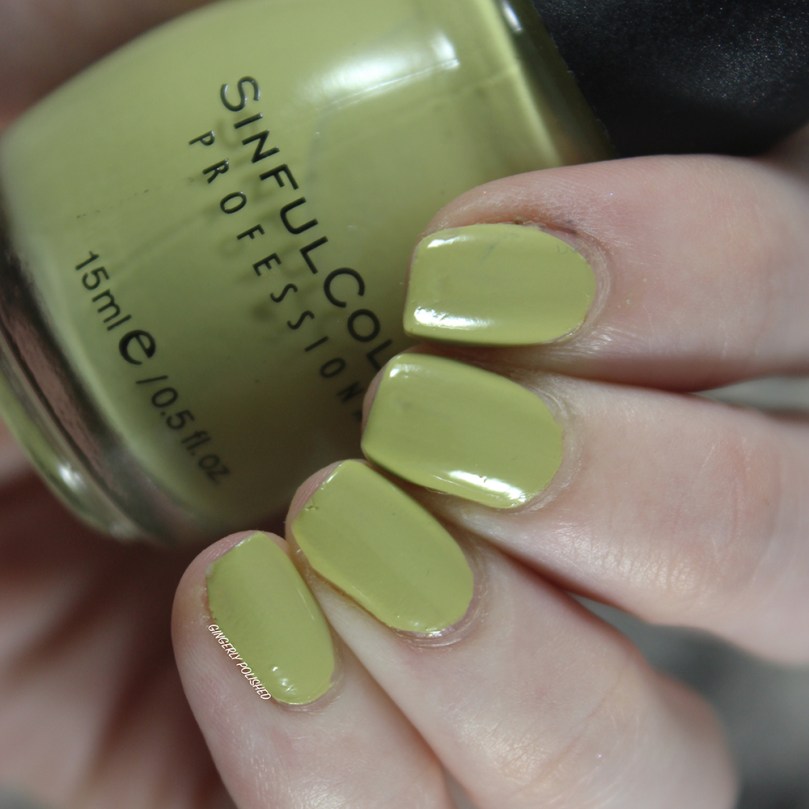
Now, it’s no secret that Sinful Colors is the biggest part of my collection. They’re the brand I started reviewing when I started this blog way back in 2016, because they’re so dang cheap (and I was on a college student budget at that point). And they come out with tons of collections a year, so they easily build up quickly. These collections are often with fun and interesting finishes, so it can be harder for me to let them go.
So for this month’s #MonthlyManis, I made it a #SinfulMarch! I only pulled Sinful Colors polishes and I focused on all of the singles outside of collections. I had a period there where I was very obsessed with just collecting any older Sinful Colors polishes that I could, just because they were older Sinful Colors. I had a weird collector moment, where I just wanted them all just to have them all.
And then I came to my senses and realized that wasn’t feasible, especially with how many other polishes from different brands that I constantly have coming in. I live in a studio apartment in Chicago, and I don’t have the space and storage to collect them all and keep them if I don’t like the polish at all. So my main goal this month was to go through this large group of untried polishes and see what I just don’t love, and what I can pass on. There are other people out there who collect Sinfuls, and have great archives of them, so I’m not needed to do that. It was a big thing for me to realize that I don’t need to keep everything, and letting go of things that I just don’t like is alright!
Now obviously I still have a lot to go in this group. I started out well trying polishes but then of course, events happened and I wasn’t wearing polish as often. But now I’m getting into a better routine of painting my nails and cycling through polishes. And especially once my swatch sticks get here, I can continue to put the polishes onto sticks and feel out formulas that way as well! I’m getting rid of polishes that I just didn’t like at all, and especially with non-unique colors, if I didn’t love it, they were gone. I have too many dang polishes to keep ones I don’t like at this point.
So let’s look at the ones I was able to try this month and whether or not I’m keeping them!
I’ll say this month’s group of polishes was definitely a lil more sheer and uneven overall. I was trying a lot of older polishes, and I must say I wasn’t loving most of them.
Actually, for a lot of these polishes, I wonder if over the years the formulas have sheered and thinned out more. Because with googling to find out more information about them, I see posts when they were originally picked up and easily opaque in just 2 coats. So definitely makes me wonder if it used to be better, or if I just got some dud ones. Well, either way, I still can’t keep a polish for the idea that it used to be good. Either way, there’s a chance that someone will be able to make it work and look better than they did on me! Onto the shades!
***
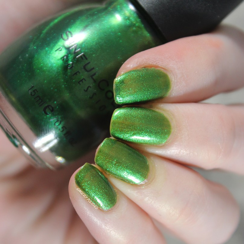
This first one is ‘San Francisco’. This is a beautiful shimmery emerald green in the bottle, but on the nails, oh boy. This was a sheer mess for me. This was 3 coats built up on my nails, and as you can see, it’s nowhere close to that rich color in the bottle, and is an uneven watery mess.
This was the first one where I knew I couldn’t keep a polish just for “collector’s sake”. I don’t have nearly enough space for that, and it’s especially not worth to keep a shade I’ll never use because I hate the formula. I’m sure I have other emerald greens that are way more beautiful, so she’s gone.
***
And the next one that followed, I had an inkling that if the formula wasn’t good, it was out and I wasn’t wrong. This is ‘Pull Over’, a bright yellow shade with a touch of orange to it. As you can see, 3 coats and it’s still very ridge-y and uneven. 3 coats is my limit for most shades – especially for one as common as a yellow. Since I have other polishes of the same formula with better formulas, it’s outtie.

***
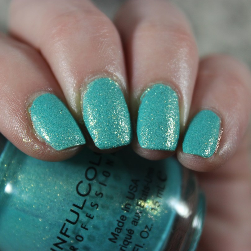
After those 2 shades, I had to pull out one that I knew would be better and not so much work. This is ‘Treasure Chest’, a gorgeous aqua blue textured polish with bright gold shimmer. This came out in a collection called Crystal Crushes, and it contained 8 textured polishes. It released in 2013, way before I was fully into polish, so I was so excited to grab this in a destash! I’m still sad I missed out on some of Sinful Colors older collections, as they had some really cool finishes and formulas.
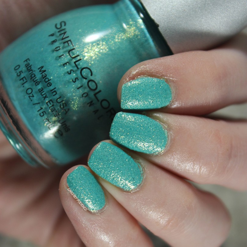
This was an easy two coats, and does dry slightly textured. But what I love most is that even though it dries more satin-matte, that glitter just makes it so sparkly and shiny. I’m a sucker for textured polishes, so I’m glad to have this in my collection. It’ll be staying.
***
And another win! This is ‘Standing Bloom Only’ and it was released as part of the Spring collection for 2015. In that collection they had 3 of these ‘Bloom Blast’ shades which were more sheer crellies with larger pieces all throughout. I’ve picked up 2 of the 3 of them in a destash, and once again, I’m always glad to grab some of the older SC collections with their cool finishes!
‘Standing Bloom Only’ is the version with a sheer, milky pink base with larger metallic pink and white hexagon pieces. This was 3 coats built up. As you can see it’s still a little sheer, but I don’t mind with this one! the base allows the pieces to show through and layer up, and it’s such a fun look.
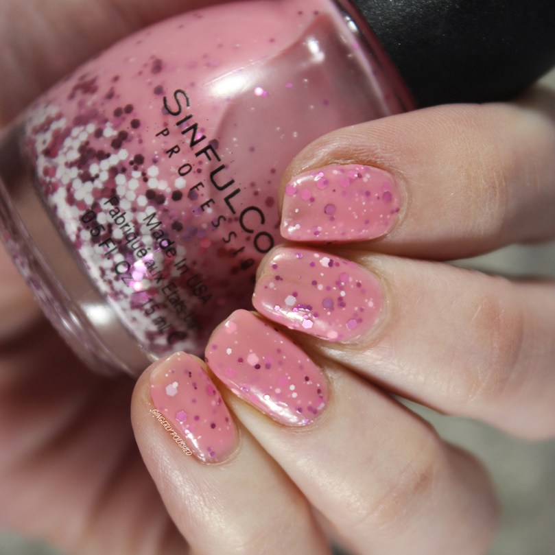
Honestly perfect for spring, and such a fun look! It’ll be staying.

***
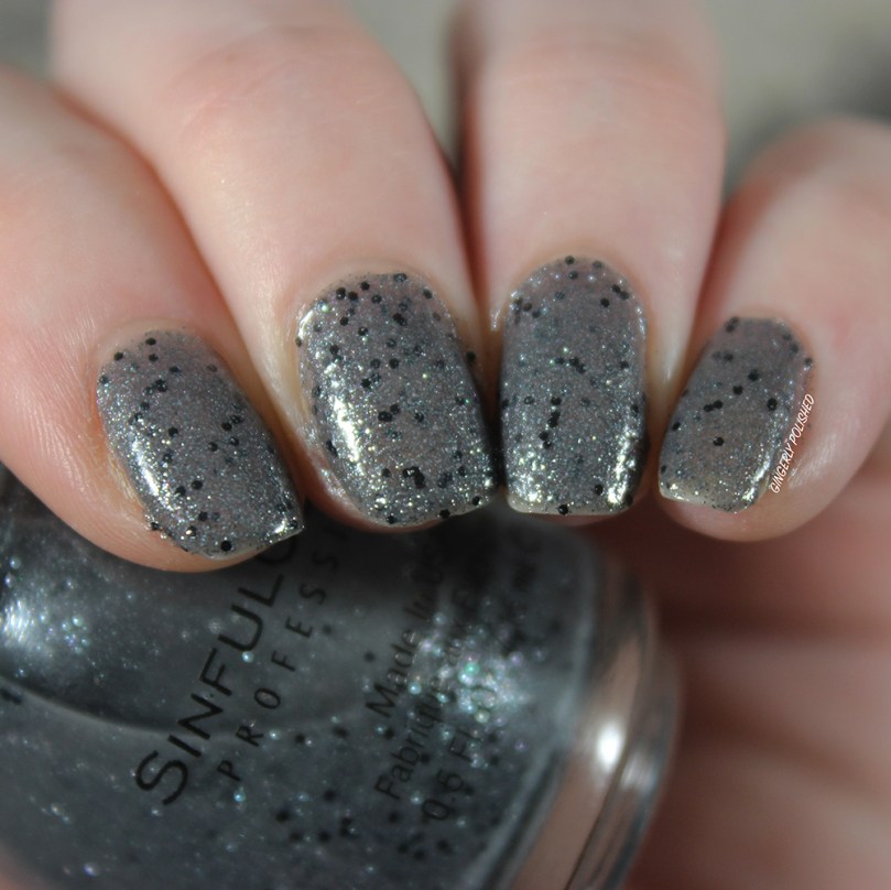
Next up is another interesting finish that truly intrigued me in the bottle. This is ‘Stone Cold’, a sheer gray base with tons of blue-gray shimmer and larger black glitter pieces. This was released in their Halloween 2015 collection, along with ‘Devil’s Stare’, one of my favorites!
This was definitely a little thinner, but I was impressed with how much it built up in 3 coats. This was one that was so interesting to me, and unique in my collection, so I definitely want to keep it!
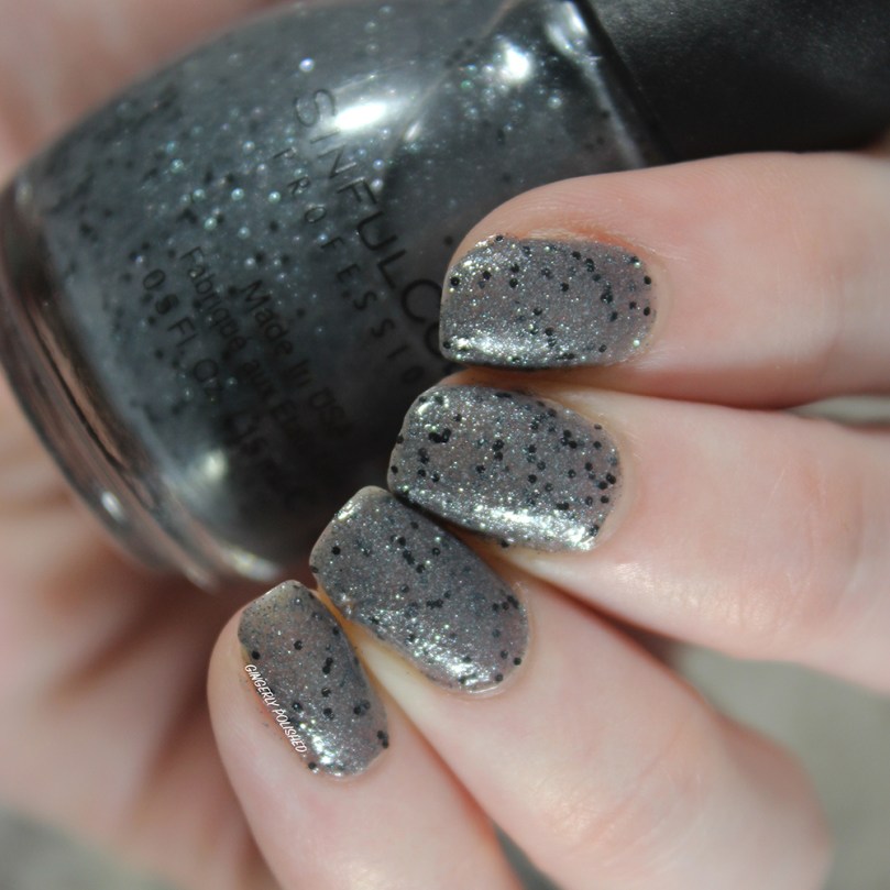
I think next time I’ll layer it over a gray cream base so it’s more opaque, but either way it’s not too difficult to work with.
***
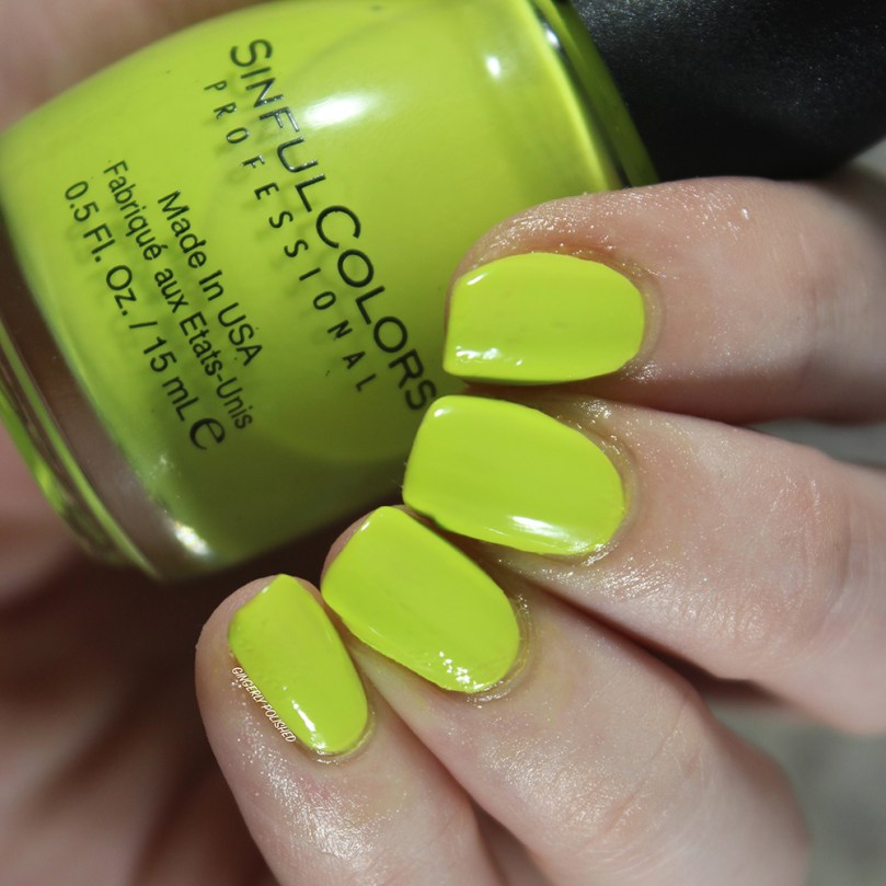
This next polish is an example of the category of “an absolute pain in my butt with the formula, but that color has my heart”. This is ‘High Strung’, a bright neon green shade. This came out in 2013 in a collection called the “Bright Essentials” with 2 other new shades. And lemme just say, neon formulas have come a long way.
This was another thin, watery mess and this was FOUR coats built up. Even with thicker coats glopped onto the nails, it was still uneven, and just a little rough. In fact I’ve used this twice, and it’s already made a dent in my bottle just because of how much polish is needed to get a full opaque mani.
But here’s the thing, I just love that color so much. I need to search around for that perfect lemon-lime neon green shade with a better formula to dupe this, and when I find it, this will be out of my collection.
***
I’ll be honest I think the main reason I picked this next one from the destash list, it was mainly for the “Wild Card Glitter” sticker. I was so intrigued at what that meant, and often, the limited edition Sinful Colors are my favorites. This one was part of the ‘Play Your Cards Right’ collection that came out in Spring 2016. (That was right before I got into polish collection and blogging! I started my blog just a few months and a few Sinful Colors collections later).
This is ‘Trump Card’, and it’s a white base with bright golden shimmer. It does dry with a satin-matte finish. And I was surprised with the formula on this one! Normally with their shimmery polishes like this, they’re thicker and so easy to paint on. And again, this one was definitely more thin and watery than others I’ve used – so that made me think about the age again. This was 3 coats built up and as you can see, it can probably use another one to fully cover up any last streaks. I’m pretty sure I have some shades that are very similar to this in my collection with better formulas, so this one will be going.
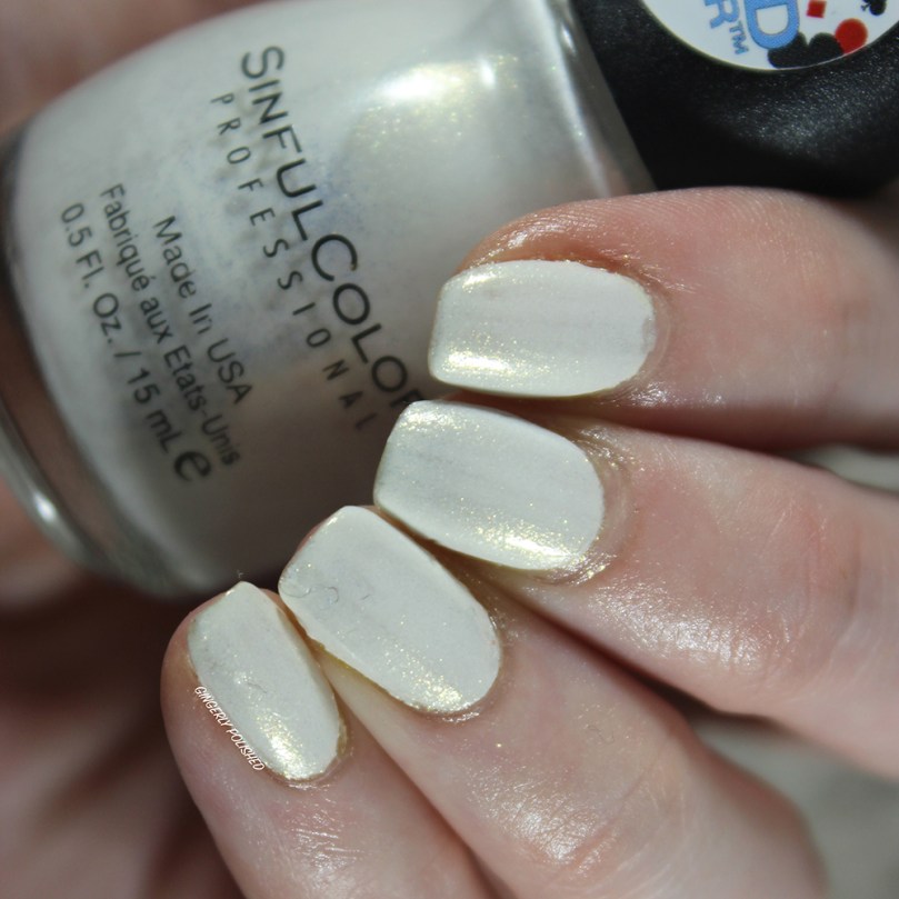
(Also enjoy that lovely little brush hair that got stuck in my ring finger nail)

***
Last but not least, we have ‘Adventure Island’. This came out in the Open Seas collection all the way from 2011! This was Sinful Colors answer to the OPI Pirates of the Caribbean collection, and they duped a lot of shades in that one. This was the counterpart to ‘Stranger Tides’.
This was another more thin formula, and this was 3 coats. And as you can see, it’s pretty well opaque. However, I do have ‘Stranger Tides’, its twin from OPI, and I like that one better so I don’t need both! This one will be going as well!
***
Destashed: 4/8 + 1 that will be gone as soon as I find a dupe. So half of the polishes, not too bad! Like I said, I’ll def be continuing once I get my swatch sticks and as I continue to cycle through and try them. And I’ll be sure to update the destash progress as I go! Stay tuned!
********
For the next month I’m thinking I’m going to continue on with the same theme and go through my individual Essie shades! I have a lot of one-off polishes in my brands, so I want to cycle through them all before I start digging deep into collections and pulling comparisons. So stay tuned for the Essies in March!
********
Upcoming Posts
LA Colors Metallics • Sally Hansen Beautifiers + Sheer Shades • Sally Hansen x Jelly Belly • OPI NeoPearl Regular & Infinite Shine collections
********
Follow me!
Instagram: @GingerlyPolished
********
Previous Posts
Monthly Manis: February 2020
Essie Spring 2020 – Swatches & Review
Nailtural Malibu Collection – Swatches & Review
Sinful Colors Sporty Brights – Swatches & Review

Wow…. that ‘Treasure Chest’ color thooo… Amazing!
LikeLiked by 1 person
It was definitely my favorite that I wore this month! I wish I had gotten the full collection when it was out!
LikeLiked by 1 person
These are so nice. I am loving the texture. Reminds me of a China Glaze one from the Sea Goodess collection. Must confess I love textures 😀
LikeLiked by 1 person
San Francisco is THE WORST. I wore it last year (thought it would be fun to wear it on a weekend trip to SF) and ICK! I slapped a holo top coat on it to slightly salvage it… the holo distracted from the sheer patches 😛 Also, Trump Card has a name that is just kind of ew to me now, I think that first word has been ruined for me. Treasure Chest is beautiful though, wow, that’s stunning! It seems like SC used to do more textures like that.
LikeLiked by 1 person
Such a let down! And such a tease in the bottle, I couldn’t even be bothered to try it out as a topper! And oh I definitely feel that same way, I had the same thoughts on the name while swatching it!
And very true! I hope we get some more straight up textures like this! They’re super good at doing interesting finishes and textures all around, so I can imagine we will sometime soon.
LikeLiked by 1 person